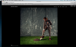
So I am doing my favorite site, Prentice Danner. Danner is a photographer and as you can tell by the website he likes things to be simple clean and not distracting. Sure I love website with lots of elements and creativity, but when it comes to the mind of this photographer, I want to be consumed by his work and not the other things. The navigation is simple and too the point. I promise to be colorful again next week.


The simplicity of this website emphasizes the photographers work, not the person.
I find a common trend among different types of websites and I believe that most photographers set up their site similarly… simple and emphasizing on their work. One of my favorite photographers, Jimmy Chin, has a very simplistic site design with a white background and minimal amount of other “stuff.”