Avatar

Avatar


From the get go Avatar was intended to represent a heightened level of technology and a whole new viewing experience. Set in an alternate universe where a race of part human, part alien species have physical, emotional and spiritual powers far advanced to humans, James Cameron knew that the advertising for this film was going to have to represent something spectacular and mysteriously unearthly.

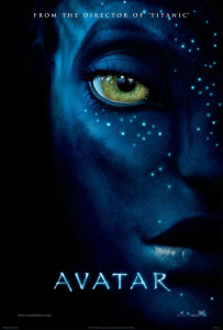
With that in mind, here was one of the posters used in the Avatar campaign. Simply picturing one of the Pandora natives, this picture doesn’t need anything more than this one mystical face to capture a viewers attention. With blue skin, terrifically bright green eyes and intriguing dollops of light tracing their way across this Na’vi’s face, the image looks very real and foreboding. What really captured me here was the way the Na’vi’s (I think this is Zoe Saldana’s Avatar, Neytiri) face leaps of the page as if it is 3D rather than an ordinary 2D image. The importance of making this image pop was huge to stay in keeping with the kind of viewing technology this film represented.

The use of black in the background makes the face even bolder and unearthly and light is used in a very unusual way. Rather than introducing any natural light into the image, the artist has made the Avatar’s skin glow which further separates this face from a human species. And the extremely large and bright eyes of the Avatar make this species seem as if it knows something you don’t, staring boldly off the page.

Overall I believe the artist did a terrific job of creating an image that would have lasting results and would encourage its viewers to seek out further what this movie was all about. With limited wording, the information is simple. “From the director of Titanic” is a smart move that instantly wins over a whole audience that have seen and loved Cameron’s Titanic for the historic masterpiece that it is. This one sentence ensures the viewer that the advertised movie will not disappoint – or at least that there is something new and special to be seen.

Lets see what Mr James Cameron will come up with next…

Week 3 post — Japanese Earthquake Relief Poster

I really like this poster because it shows how well subtly can work when it’s executed well. The red circle in the symbol for the ‘rising sun’ on the Japanese flag and cracks represent the 2011 earthquake and tsunami. The typography is small and simple, but the message is clear and concise.The white space really adds to the simple effect and bold red color of the rising sun draws your eye in from a distance. I also like the dusty edges of the frame that break the white space evenly, but still everything is very subtle. The type, although small, pops because of it’s isolation on the page.  I think the mix of powerful symbolism here and the simple message make the audience draw a conclusion very quickly about what the message the poster is trying to convey.


help japan poster

help japan poster

poster of movie Oblivion

oblivion-poster

I think the poster of Oblivion, a 2013 American movie based on a post-apocalyptic science fiction, is very shocking and attractive. We can clearly see the eroded Empire State Building and the adjacent buildings occupy most of space of the poster. And the white and huge fall, which cascades down between the buildings, overwhelmingly draw our eyeballs. As one reason makes the scene so impressive, the angle of the shot is from the ground to the building’s top, making us feel small and dread. The second reason is that the Empire State Building in Manhattan is very familiar to most of us, so it make us feel shock to imagine such a scene. In addition, the male figure and the “aircraft” not only show the huge comparison between the small figures to the grand and imposing buildings, but also reveal that they are not at the present time, but in the future. The words may be sans serif geometric typeface with a specially spilt design. These thin and white words give us a strong post-apocalyptic feeling, which are very appropriate to the background of this movie. Honestly, I watched this movie right after it screened because I was attracted by this poster. Although the movie was not as good as I imagined, its poster did gain its marketing goal and drew a great amount of people’s attention.

This is Birdemic

600full-birdemic_-shock-and-terror-poster

Everything about this poster conveys the look and feel of a “Birdemic”. The designer’s use of “Ariel Bold” for the title creates a sense of impact, and helps reinforce the film’s serious tone. One of the things I really like about this poster is how the designer created a “three dimensional space.” You’re not seeing just one element, but you’re seeing many elements and it helps tell the overall story. The way the birds are closing in on an unsuspecting sleepy town really creates a feeling of claustrophobia and terror.

KONY 2012 Invisible Children Poster

Evernote Camera Roll 20130912 151656


The colors, bold typeface, and the eye-catching image all work to make this poster successful. The use of complementary colors attracts the viewers to be engaged with the poster.  The designer chose the bold yet modern typeface to imply the importance and urgency of this issue. The boldness arouses confidence and sense of call to action to the viewers. Furthermore, the icon is very symbolic and engaging at the same time because the contour of elephant and donkey symbolizes the icons for the dominant American political parties Republican and Democratic. The crossing of these two icons in this poster implies that all parties must unify in this movement and work together for the same cause. It also shows the hierarchal importance of this issue, saying that this movement is in the higher hierarchy than the political differences of the parties, which emphasizes even higher importance of this topic. It definitely achieved its marketing goals because it was bold, attractive, clear, and distinct in its delivery. If anything could be improved in this poster, it may be to address more of the actual issue what we are dealing with. However, this itself is good enough to fulfill the purpose of their campaign .


Lemon Poster by Ethan Kleinberg

lemon volkswagen

This famous 1960’s poster “Lemon” was apart of DDB’s “Think Small” campaign for Volkswagen. Not only was this poster revolutionary in many ways, but also it is visually and stylistically attractive. Before this, posters used to example the poster, sometimes having the text cover most of the poster. This has small print, but just one word stands out– “Lemon.” Additionally lemon, before this poster, used to mean a bad car; a mistake, a screw-up. When a consumer looked at this poster, you had to stop and think. Why would they call their own car bad? What does it mean? Besides the choice of text, the style is beautiful. White and black with a lot of white space. Just the beautiful car sitting there. So simple, yet elegant; exactly what DDB wanted to portray. At first it looks small and strange-looking, like a lemon, or a screw-up, but the simplicity is elegant and advantageous for an owner. It uses white space and color (or lack thereof) impeccably. It is one of the most important posters of all-time, it even was referred to on “Mad Men”, and it is personally an advertisement that I will always admire. About 75 years later and this still wants to make me want to buy that Volkswagen.

Poster of The Prestige

the_prestige_poster

A mystery and thriller, The Prestige is one of my favorite movies. With a dark background featuring three main characters in the film, the poster highlights a creepy, mysterious and thrilling atmosphere the film is trying to sell. What impresses me is the women in the middle. Seeing from a distance, it’s hard to tell what the slim and cursive outline in the middle is: is it the woman’s hair, or smoke? Such illusion perfectly resonates with the mysterious tone of the film, and is further highlighted by the line “Are you watching closely?” I also like the all-cap texts on this poster, which make it consistent, serious and exciting.

SHARE – WWII Propaganda Poster

SHARE WWII Poster


Ahh, World War II: An era of immense nationalistic sentiment. The American war machine needed its various sources of fuel, and the only way to obtain those resources was through the American people. But how do you get all of the mothers of the US to relinquish their sugar needed for scrumptious homemade apple pies? Through excellent use of the visual hierarchy in propaganda posters, of course.

The yellow background of the poster stands out, and brings the reader in from afar. Then, the eyes begin at the word “share” and follow the perspective towards sugar. Even the clouds help provide depth and guide the reader. The shear simplicity of the message and its portrayal in the poster is what makes it effective. It’s also important to note the distinct lack of “patriotic” colors and wording. The poster doesn’t ask for war resources out of patriotism, but rather the “common sense” of giving. There’s no distractions, and no bull. The government just wants some sugar. They’re just simply the neighbor next door.


The Checkerboard Criminal

TBC

One of my favorite movies is The Breakfast Club, and this poster captures one of the prominent characters in an effective way, and also includes the logo of the movie, as well as the title. The contrasting colors of the blue and the checkerboard red pushes the classic pose of Judd Nelson to the forward, as the deep red is a warm color, against the cool blue background. The iconic fist pump during the ending scene of TBC to “Don’t You Forget About Me” is one of the most well known endings in cinematic history, so this poster effectively captures the entire theme of the movie – creating new friendships from different people that you never thought you could. Bender is the glue that keeps the club together, so it is only right to have him front and center. The checkerboard is his shirt, one of the other symbols of the movie. Overall, beautiful representation of the movie in a minimalist way.

Keep Calm and Carry On Poster

Keep Calm and Carry On

Originally, this poster was intended to increase British morale before the Second World War. Now, this poster has become even more famous. I see this poster almost everywhere, and I believe that it has a powerful message. It tells its’ viewer to not worry about what is going on, but to remain calm, and to keep moving along. Not only is its’ message very strong, but it is designed very well. The Gill Sans typography that is used remains the same throughout the entire poster. It is white, bold, and stands out very clearly in front of the bright, red background. The typography, color, and design are very clear and keep the message short and simple. I don’t believe anything should be changed to this poster to improve its effectiveness.