
I had a very good time getting to know the formal principles of design and especially the typeface families. I never knew so much went into all the little details. I learned to appreciate the print content that is out there. After taking this course I understand better the value of design in communicating messages. One thing I notice in my everyday life is that magazines seem worth the money to buy now that I know how much goes into making the product. I’ll miss a lot of the faces from this class. Good luck, God speed, cheers. Merry Christmas.
Category Archives: Posts
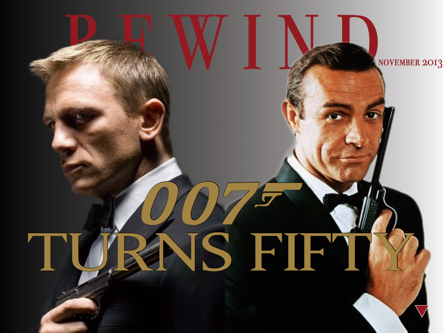
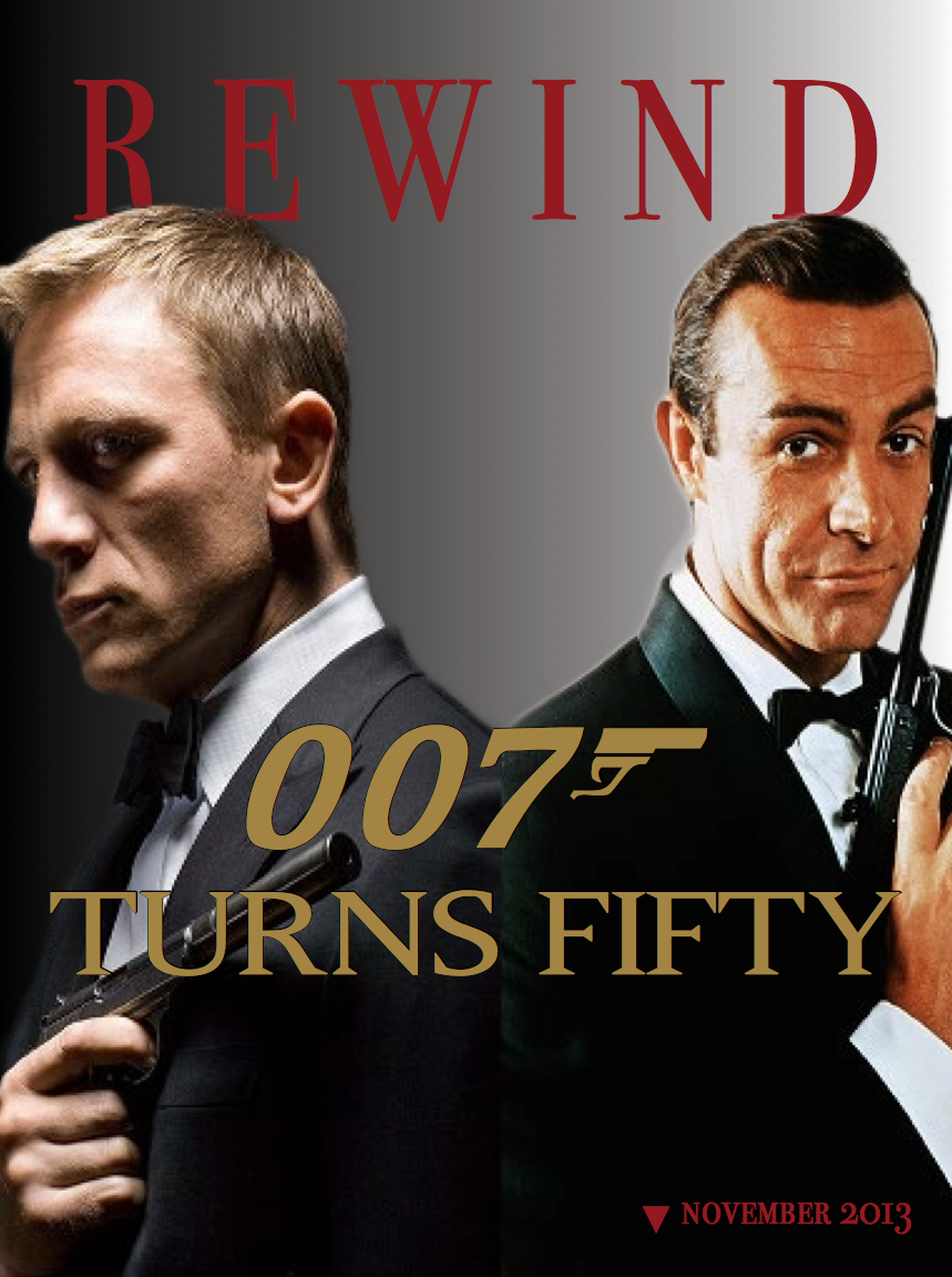
What I have learned…
This semester really opened my eyes to the amount of time and effort that goes into creating all the visual aspects of this world. I have really enjoyed learning about what grabs peoples attention, how to use colors, layouts, lines and photos effectively, and overall, just how to create a clean and well designed product. It has been nice to have a new level of creative freedom that is not given with a lot of classes. Its also been an interesting challenge to continue being innovative and think of new ways of presenting things. I think this class has taught me an enormous amount over the past 15 weeks and will hold me in good stead as I continue to develop my skills and abilities.
iPad Design
iPad project
What I Learned
I have learned so much in graphics class. Every time I look at a website, flyer, menu, etc., I notice the layout and design. I critically analyze the piece, and I take notice of the typefaces chosen and the gestalt principles applied. Before this class, I never considered how much work went into laying out the information we read. Now, not only do I have a new respect for every layout I see, I can also label the principles used and comment on the visual hierarchy. I also learned so much about the Adobe programs that we used. I worked with photoshop a little bit before, but InDesign and Illustrator were totally foreign to me. Now, I am able to work all three programs, and I believe it will give me an edge in the world of public relations. I truly appreciate all I have learned throughout graphics class this semester.
Knowledge Gained
This semester, I have learned a lot from this class. Overall, I have gained a greater awareness of graphic design and principles. This is something that I will be able to take with me in almost everything PR-related that I do. Additionally, I learned how to use Adobe Photoshop, Illustrator and InDesign. Knowing how to use these programs is something that will give me an edge, and allow me to perform graphic design tasks in my future career. Thank you for a great semester!
iPad Design
Headlines and Decks
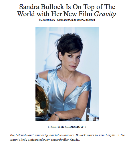
This feature story uses the phrase “on top of the world” as a metaphor for Sandra Bullocks latest notable accomplishment. This use of clever wording in the headline allows the reader to understand what the story is going to be about and lures them with the knowledge that Bullocks new movie “Gravity” is a huge hit.
In the case that a reader perusing through the pages of Vogue is not aware of Bullocks latest theatrical film, the deck goes on to explain what the story is specifically, filling in the gaps of an unanswered questions.
Both the headline and the deck do a really great job of tying Bullocks feature film “gravity” with the story with clever wording including “on top of the world”, “new heights” and “outer-space thriller”. The combination of this language with the picture below work to create a very enticing and effective headline. This is furthermore reinforced with the fact that Bullock is wearing what appears to be some sort of high fashion space suite with her arm resting on a gold space helmet. The sum of the individual parts of this feature story are hugely impacting and work to draw the reader in for more.
Forge Magazine Ipad Cover
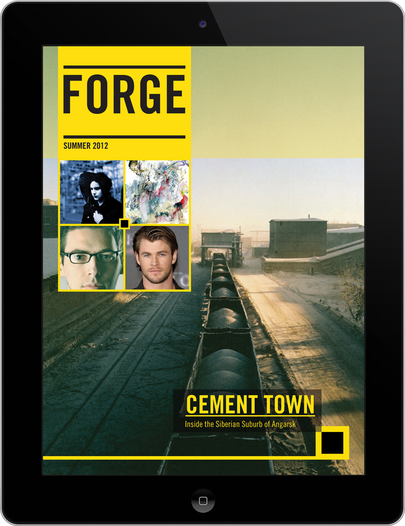 This cover differentiates itself from other Ipad covers by minimalizing text. Instead of having cover lines, there are photos that I presume can be tapped on to reach the story. Also, the cover makes use of only two primary colors. The combination of black and yellow allows for a sense of illumination, especially when used in text. The photo on the cover has a good amount of perspective, driven by the train cars that get smaller as one looks further back. Often times covers forget that having only a little bit of content on the cover can be good. Covers are often crowded and lack a sense of visual hierarchy.
iPad magazine – EW
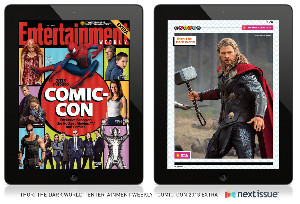
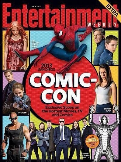
There are slight differences on the iPad magazine cover and the actual magazine cover, like the orange circle that says “Go to ew.com/digitalissue to read on your tablet!” because obviously, you would not need that if you are reading the magazine on an iPad. Everything else, however is the same, just scaled down for the size of the iPad. Stylistically, the red circle matching Entertainment was a bold move, and is smarter than using one of the other square colors as the color of the nameplate. The cut outs of the characters of each movie and show with the different color background adds to the effect of the “comic” portion of Comic Con, as it started as a comic convention.