
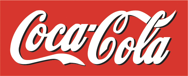
Coca-Cola has a simple, easy to read, and distinct script typeface. Coke has been around for more than 100-years, and while their wordmark isn’t the most creative, it’s instantly identifiable with their brand. It’s important to note that Coke primarily uses a red and white color scheme, but because they have such a distinct typeface, it wouldn’t matter if they used black and blue or purple and pink.
![]()
Geico uses the Eurostile bold extended font. The designer made a font that would stand out on most layouts with bold capital letters. While the wordmark is nice and works well on a letterhead or a blank white background, it’s not that memorable. When people think of GEICO, they’re probably going to first think about the Gecko. It also appears that GEICO and Nokia share the same font.
I like the wordmark design of Coca-Cola. It’s interesting I just saw a piece of news comparing the wordmark design of Coca-Cola with Yahoo (which recently changes its logo). Over a long period of time, Coca-Cola’s wordmark and logo has remained very stable, suggesting a consistency of their brand image and brand positioning. This wordmark of Coca-Cola looks classic, yet chic and fashionable. White stands out from red, while shadow adds more details to it. I like it.
Though I agree the Coca-Cola typeface is classic, I disagree that if one were to change the colors it would still be as identifiable to the brand. For example, Ford utilizes a typeface similar to that of Coca-Cola, with a change from red to blue color-wise. I’d say the “C”s are the strongest element of the typeface, so if another company used a “C” in the same typeface it could be confused with the Coca-Cola brand.