
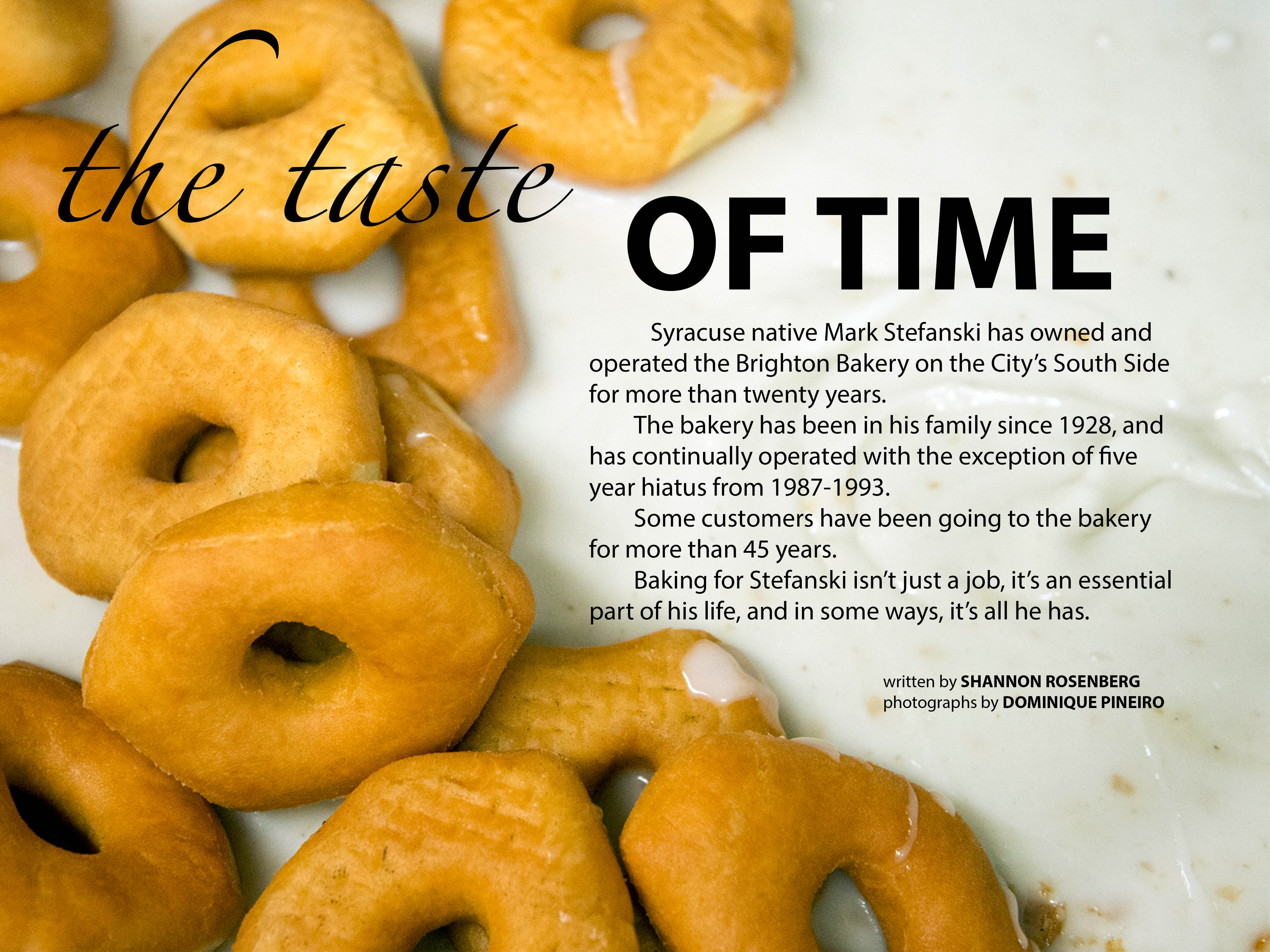
I knew nothing about graphic design before taking this class. Now, I know the core principles and am able to recognize how apply them when I work on a project. I also know more about fonts than I ever thought I would in my entire life.
Author Archives: Dominique Pineiro
Ipad Mag Floating Redo
GQ iPad Cover
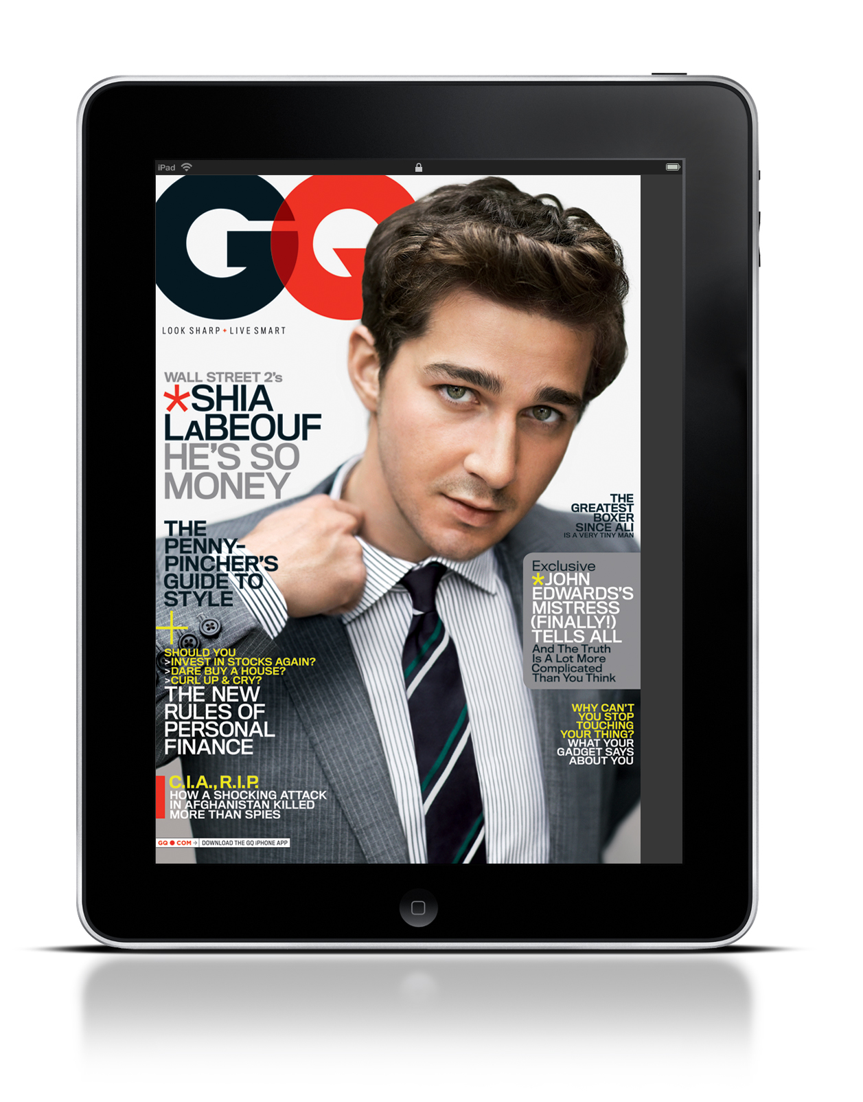
GQ’s iPad magazine differs very little from their print format. They use Gotham font on all of their covers.
Sports Illustrated Headline and Deck
Headline: Boston Strongman
Deck: David Ortiz is brute October force, inarguably one of the greatest postseason sluggers ever, but there is a Tao of Papi that goes beyond the raw power and three rings. As a study in resilience and seizing big moments, his story is the story of Boston itself.
Magazine Layout
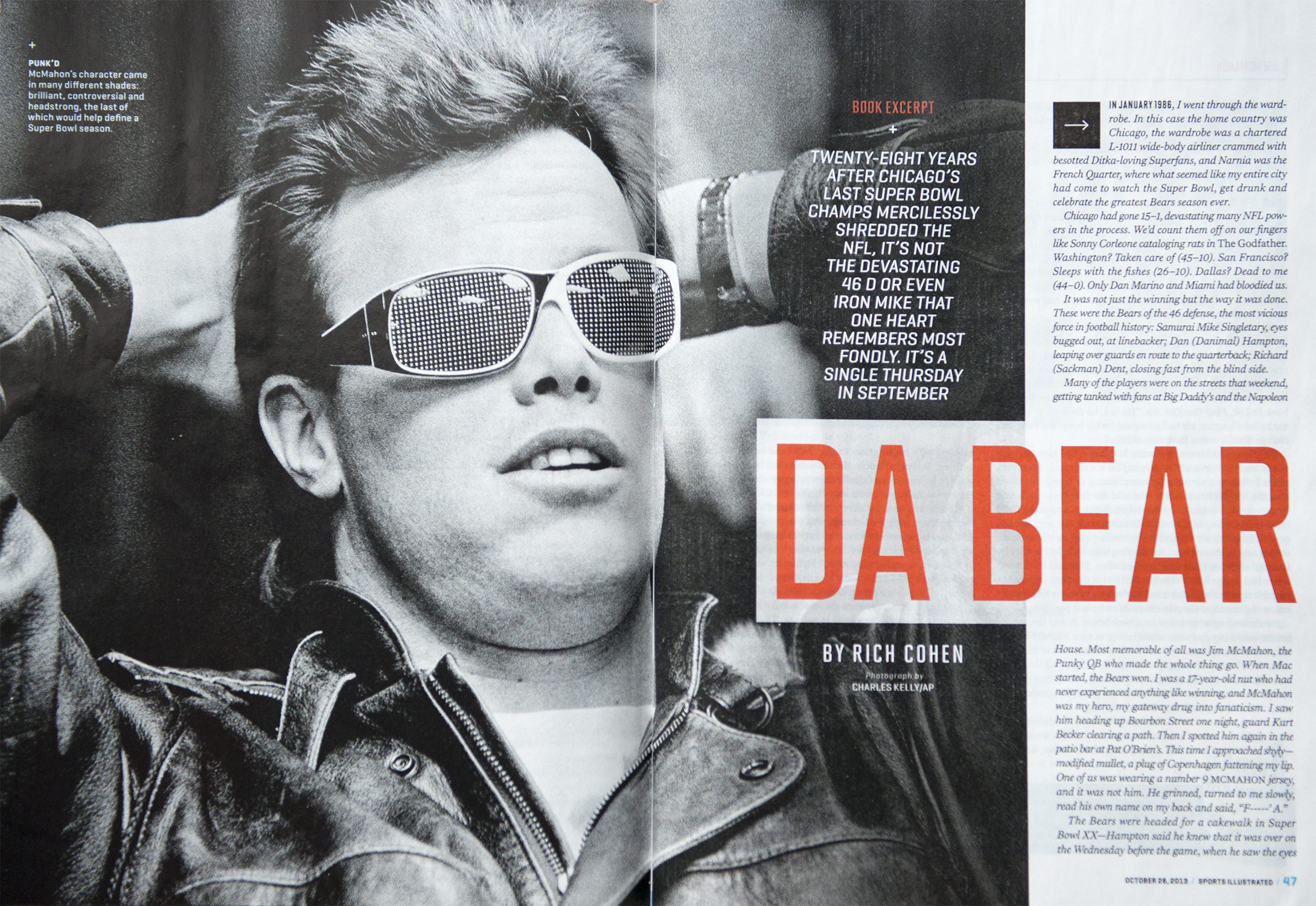
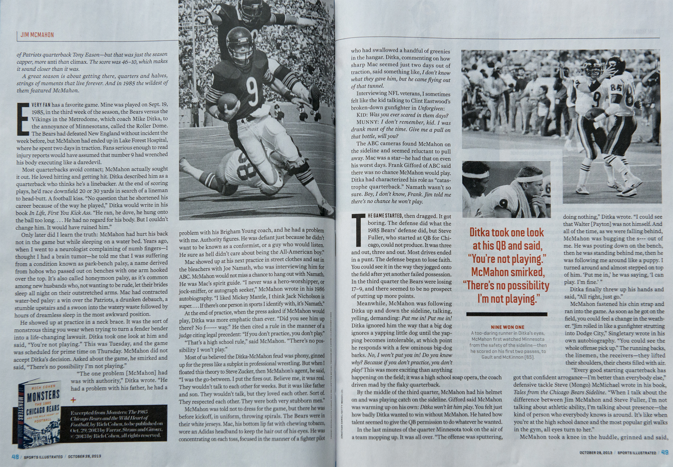
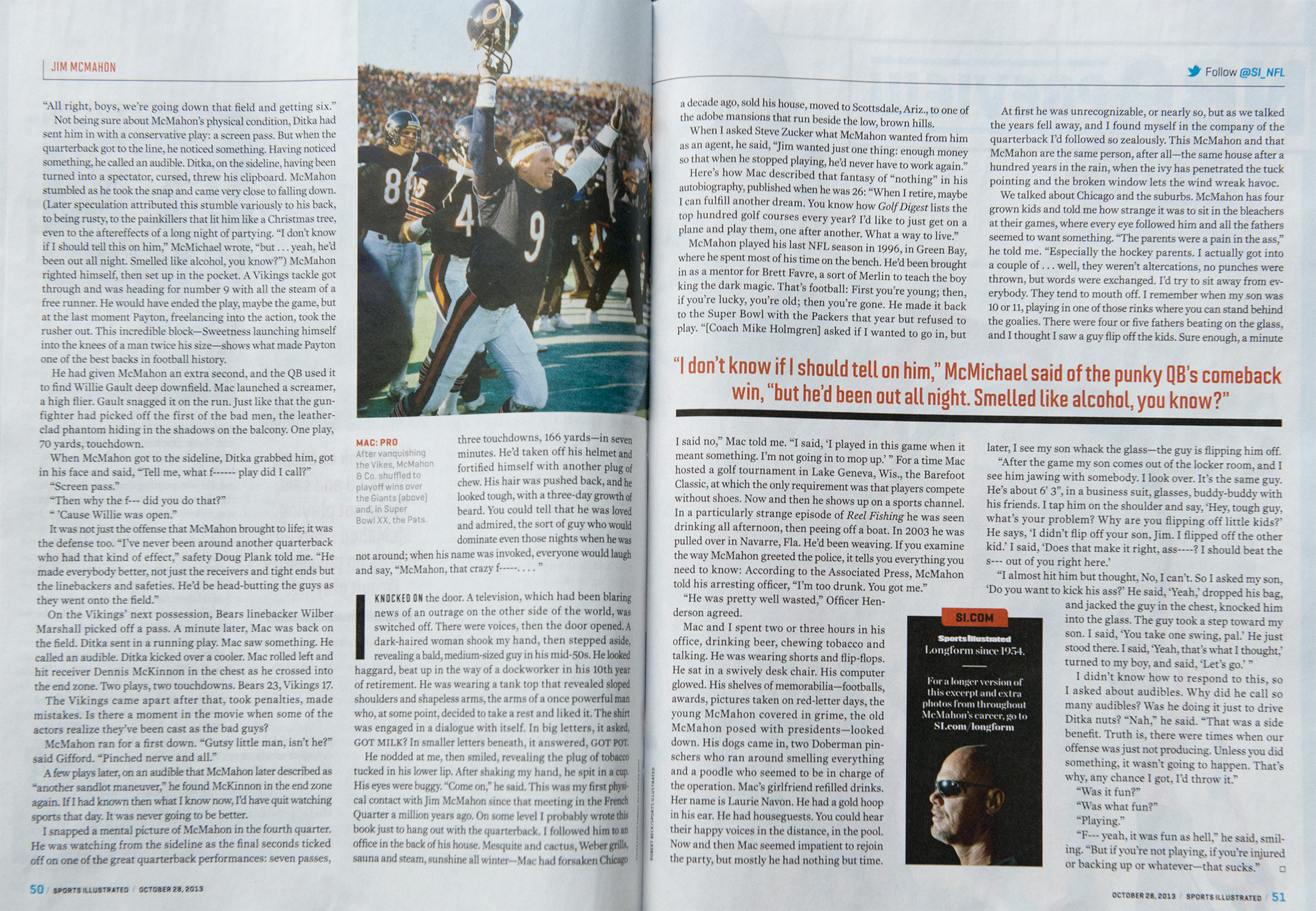
This layout is a personality feature on former Chicago Bear’s QB Jim McMahon. Even though it’s text heavy, the photos they do use focus on the individual and help drive the story. I also like the use of pulled quotes throughout the article.
Website Dominique Pineiro
Dominique Pineiro Logo
![]()
I was going for a clean, and easy to read look. I want people to get the impression that I’m a creative energetic self-starter. I didn’t want to put my initials side-by-side, so I decided to make an implied shape inside the “D.” I chose red not only because it’s an eye-catching color, but because the red, white, and black all create an appealing design.
Photo in web design
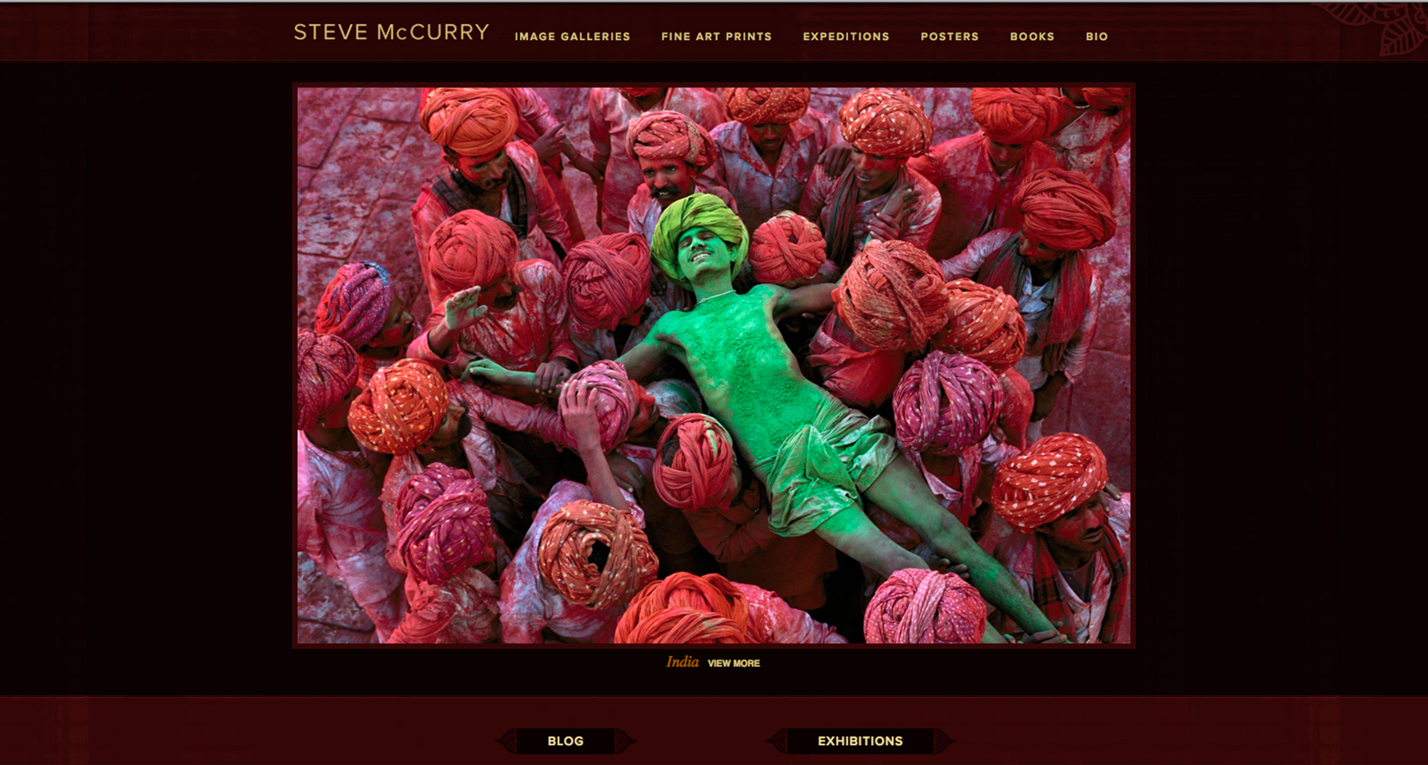
Steve McCurry’s website is an instant draw. All of the photos he uses in his slideshow have excellent use of spot color and have great composition. The elements are all very eye-catching.
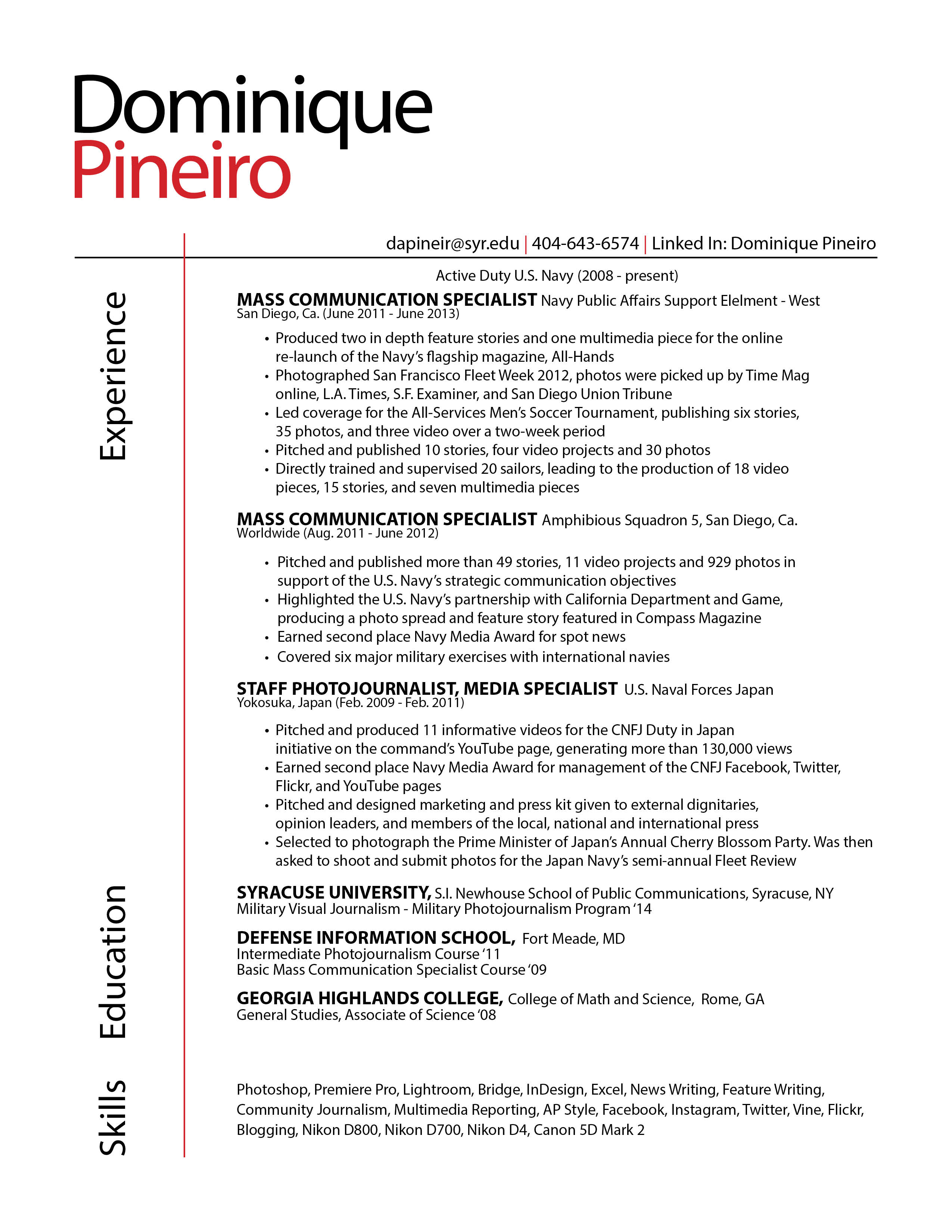
Resume Redo
Rule of Three
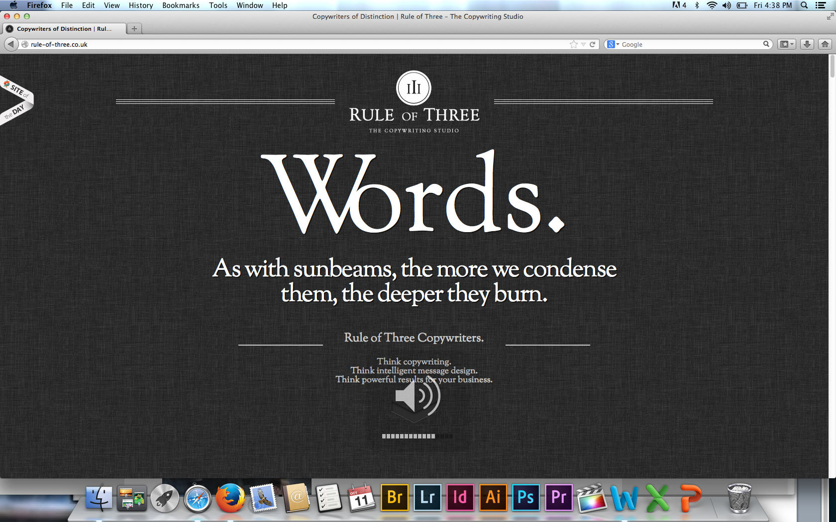
The Rule of Three website applies many gestalt principles. Most notably, visual hierarchy, figure and ground, and proximity and alignment.
The dark background and white letters allows the viewer to easily navigate the website’s text. The layout’s is very simple, and the word “Words,” is the most prominent figure on the screen, It’s also what the website sells. The website is very organized. Even though there’s only one type of font used, it’s used very effectively with grouping. All the areas with like information are equally separated, and the use of different sized fonts helps readability.