
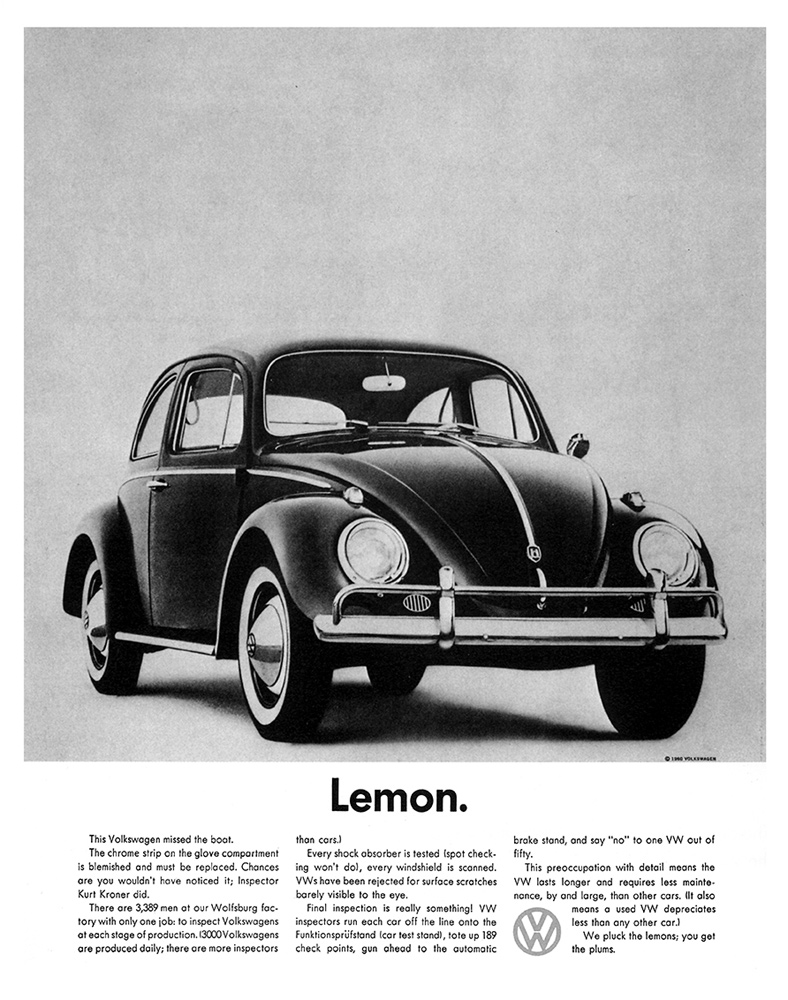
This famous 1960’s poster “Lemon” was apart of DDB’s “Think Small” campaign for Volkswagen. Not only was this poster revolutionary in many ways, but also it is visually and stylistically attractive. Before this, posters used to example the poster, sometimes having the text cover most of the poster. This has small print, but just one word stands out– “Lemon.” Additionally lemon, before this poster, used to mean a bad car; a mistake, a screw-up. When a consumer looked at this poster, you had to stop and think. Why would they call their own car bad? What does it mean? Besides the choice of text, the style is beautiful. White and black with a lot of white space. Just the beautiful car sitting there. So simple, yet elegant; exactly what DDB wanted to portray. At first it looks small and strange-looking, like a lemon, or a screw-up, but the simplicity is elegant and advantageous for an owner. It uses white space and color (or lack thereof) impeccably. It is one of the most important posters of all-time, it even was referred to on “Mad Men”, and it is personally an advertisement that I will always admire. About 75 years later and this still wants to make me want to buy that Volkswagen.
This entire ad campaign was excellent. The simplicity and style hold the viewer’s eye while the overall feel speaks to those who feel they are ‘different’. I even like the tiny detail of putting a period after the word lemon. Although it in no way qualifies as a single word sentence, the period underlines the fact that there is no more to be said about the car even though there is a fairly dense block of text below it. The negative connotation of the label: “Lemon.” makes the viewer want to find out more.
I can really appreciate the add campaign as well the ascetics of the poster alone. What’s attractive to me is the simplicity to it. I like the function of the text hierarchy. The large bold fold really grabs my attention and when I see lemon I think bad car. I also noticed that the elements of the poster are off center vertically. That element draws my eyes to the bottom.