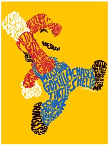
I love this poster! It brings back memories and of my childhood and how this character has evolved over the years into the icon he is today. I believe that there is no one in the world who doesn’t know who he is.
GRA 217 Section 5 Group 2
The official blog for GRA 217 with Sherri Taylor


Yes, just looking at the picture I head, “It’s me, Mario.” Though the one thing that I really like about this poster is the use of negative space. I was looking at a black and white scribble sketch of two cowboys and it perfectly represented their lives. Well I guess that made me think of this post where where even without the face completed, you eye immediately draws the picture for you in your mind. Shape association I guess.
Shape association with lettering is probably one of my favorite creative designs. The one word that I saw that I appreciated, especially it’s height and color contrast with the background, was the “turtle shells,” because who doesn’t hate those little life-ruiners when you’re in first place and everyone hates life but you. The color choices of the words and how they are the Mario character is the only way that this poster would have worked effectively, which was the point. And here is yet another famous pose from a character that the world knows and loves.