
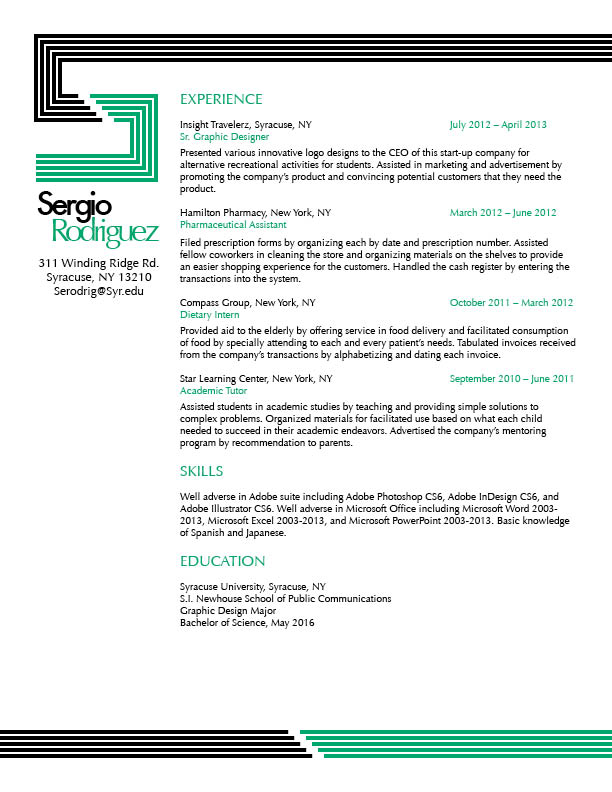
I honestly don’t even know where to begin with I learned in this class. To begin, I was able to host up my resume from being just a simple and boring Resume to one that looks so awesome and stands out from a normal one. I’ve learned what typefaces work well depending on the project. I also learned that black backgrounds for everything really isn’t such a good choice. Alignment and Hierarchy is key in every design.
Author Archives: Sergio Rodriguez
Ipad Cover
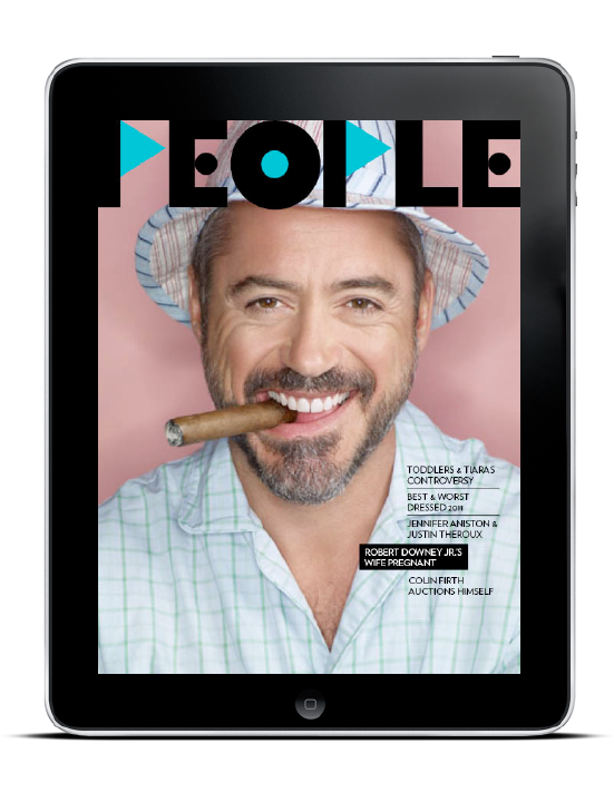
I Love how simple the design is on this people’s magazine cover. the typeface looks al=mazing and it suits the person on the cover. the color is also something I’ve never seen in an exact combination like that before. it looks simply awesome.
Sergio Rodriguez Logo
![]()
This is my personal logo drawn out. the R was supposed to be a reflection of the S but as i was drawing it i saw the R and decided to keep it like that. i really like how simple the design is and how it flows. hope you all like it too!
using photos in web design
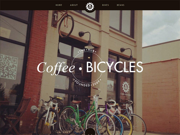
I love how the bikes in the photo compliment the idea of this coffee shop, as well as the type and design used in this website. it works really well all together along with the colors.
Gestalt Principles in Web Design
Gestalt is a German term describing a design’s wholeness. When we look at a design and say, “This design works!” what we are describing is the overall Gestalt quality. How this is so is defined by this Gestalt term: A design’s unity is more than the simple addition of its parts. Very simply it means that each part of a design is affected by what surrounds it, and that we can affect the cumulative perception by manipulating the interaction of the individual parts.
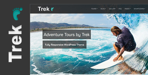
I think this web design looks really neat. i love the color scheme and the big picture and how simple the layout is. i hope everyone enjoys it
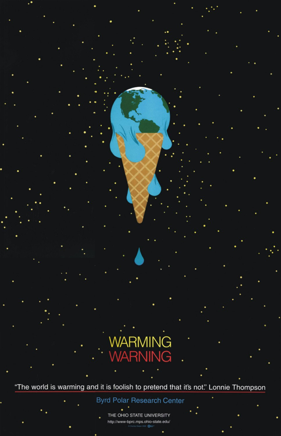
I think the adobe tools used in this poster design would be the pen tool. a lot of the design can easily be manipulated by the free transform tool that allows the person to change the curves of each like and size, etc. i love the effect of the earth melting as if it were ice cream.
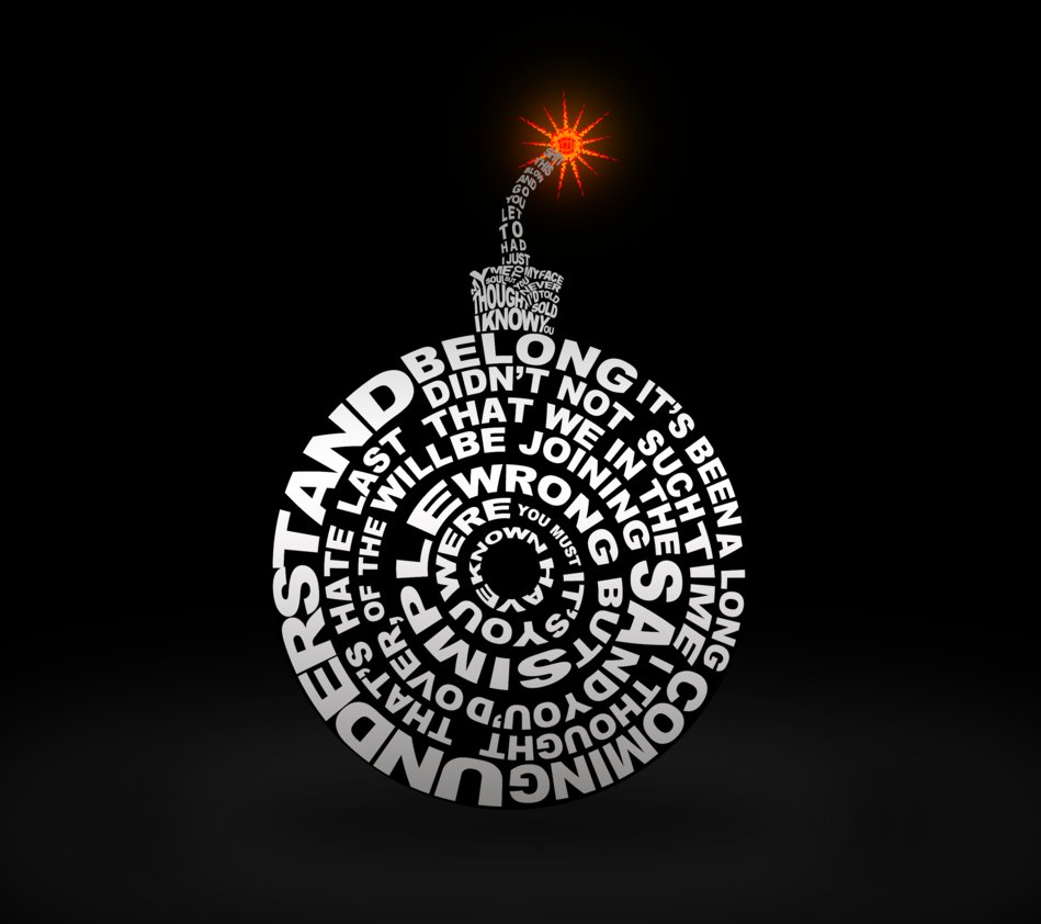
typographic bomb
Mario poster
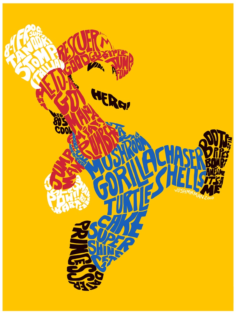
I love this poster! It brings back memories and of my childhood and how this character has evolved over the years into the icon he is today. I believe that there is no one in the world who doesn’t know who he is.