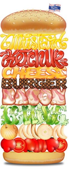
This hamburger design primarily relies on its typography. The sorts of typographic elements that make it stand out are the different typefaces that spell out the different components of the hamburger. The typeface of the each ingredient is the correct color, texture, and look of the actual ingredient itself. This allows the word to accurately resemble the ingredient that it’s representing. I think that this design is very effective.

