
This semester, I have learned a lot from this class. Overall, I have gained a greater awareness of graphic design and principles. This is something that I will be able to take with me in almost everything PR-related that I do. Additionally, I learned how to use Adobe Photoshop, Illustrator and InDesign. Knowing how to use these programs is something that will give me an edge, and allow me to perform graphic design tasks in my future career. Thank you for a great semester!
Author Archives: Dena Skeadas
Website (Redo)
From this assignment, I became very familiar and comfortable with the way Photoshop works. Understanding the way the pages can be replicated and altered with the eye icon is a very helpful thing to know in the design world!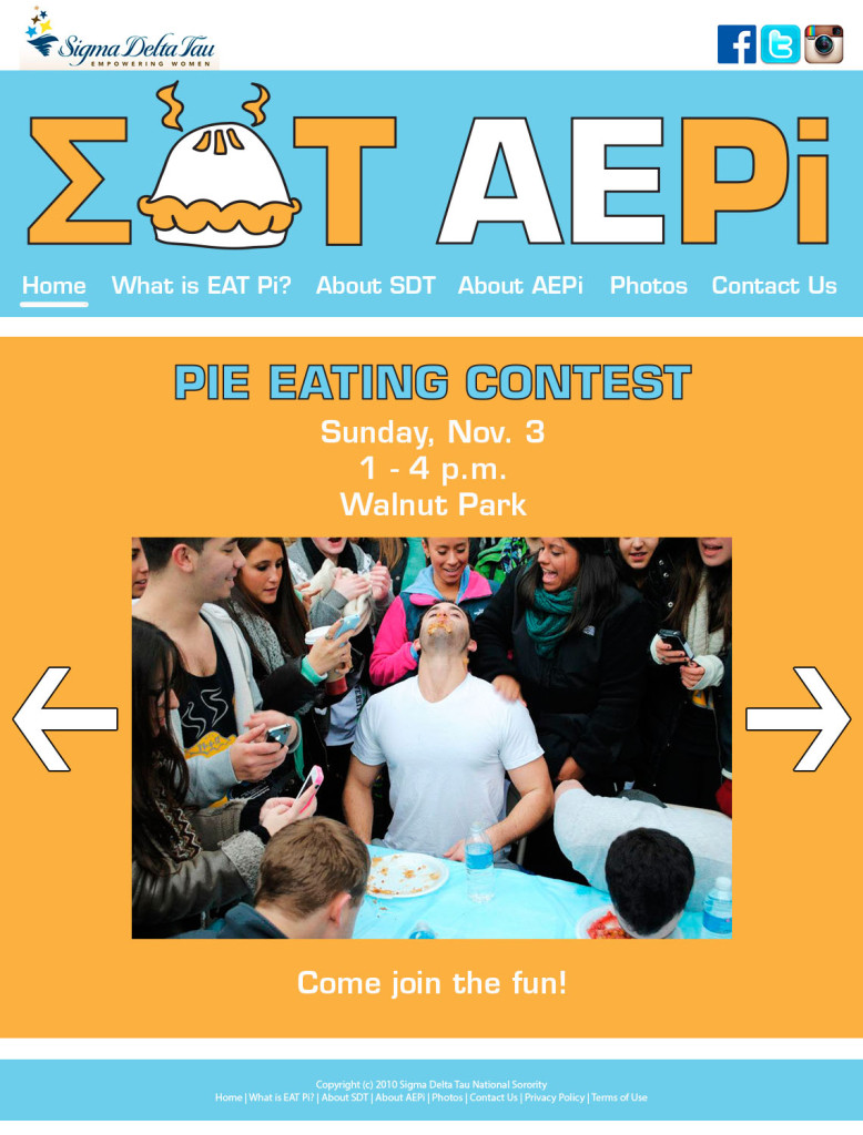
Dena Skeadas, Taylor Baucom, Chantel Carter, Sergio Rodriguez, Ethan Kleinberg
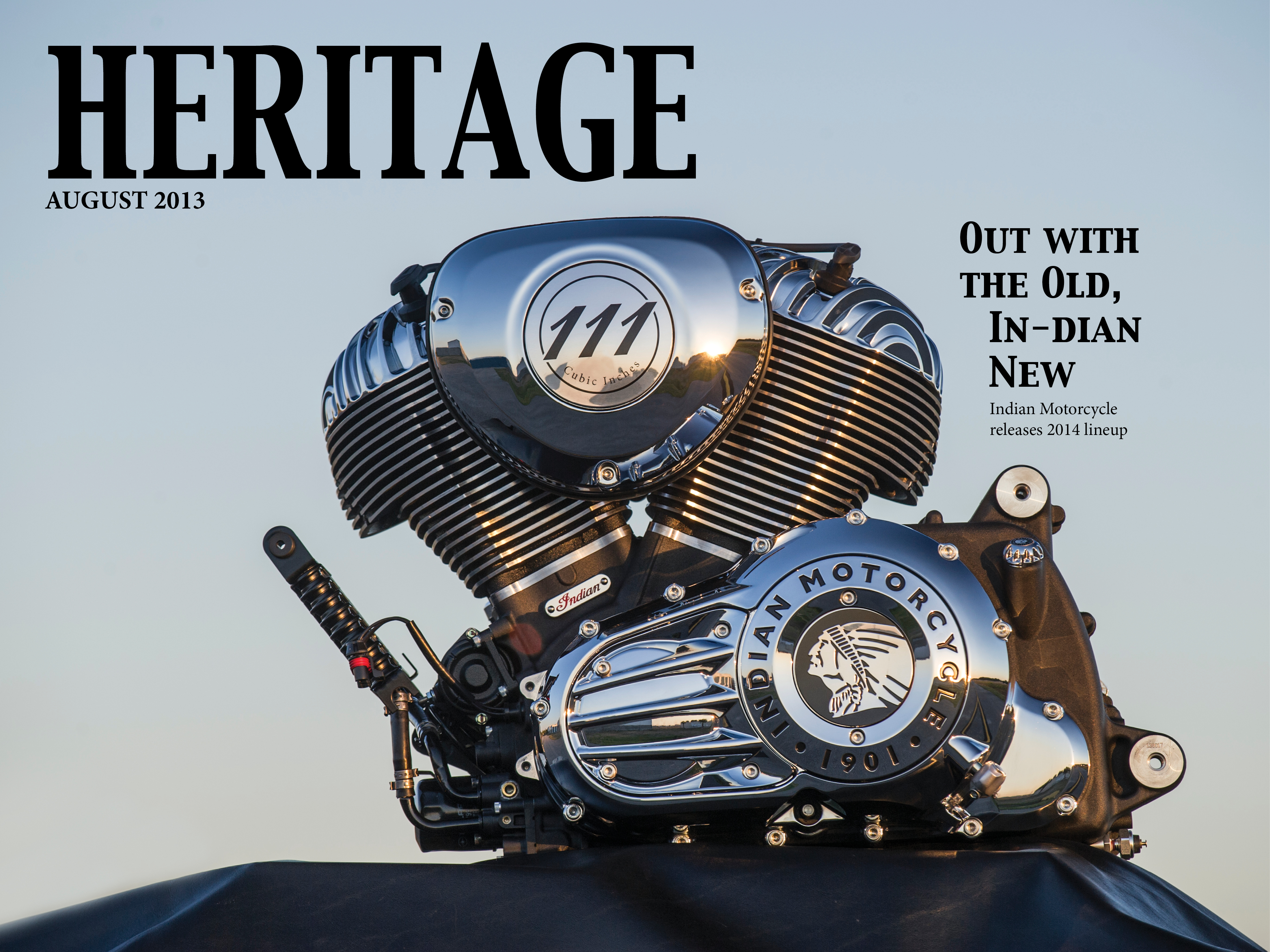
Indian Motorcycle iPad Design
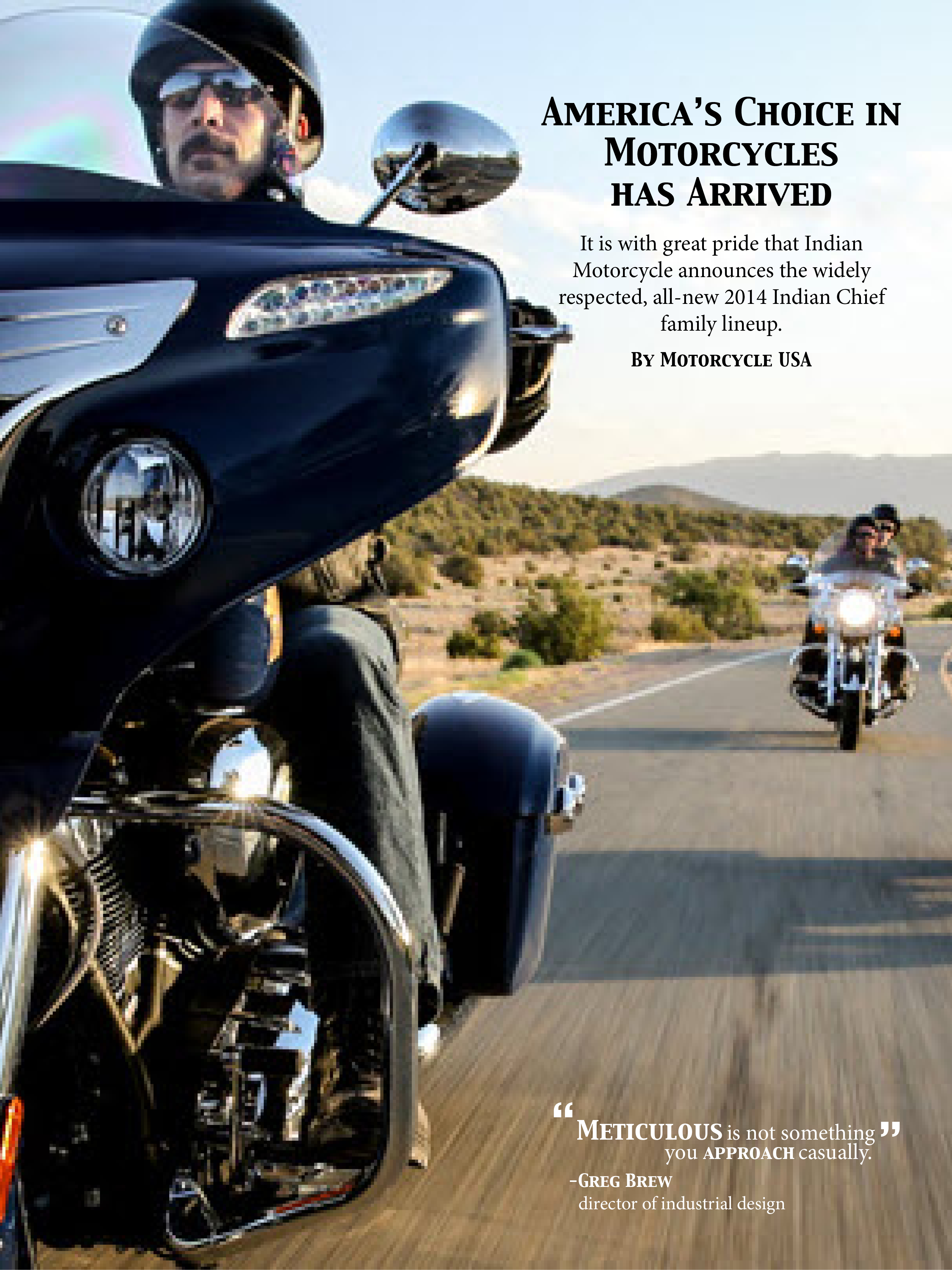
This was definitely my favorite project of the semester. I learned a lot, but one thing in particular that I learned from this project was how to do pull-tabs. It is very useful to know, and it is very cool to see how it is done in real life.
Slugger iPad Magazine Cover
iPad Magazine Cover: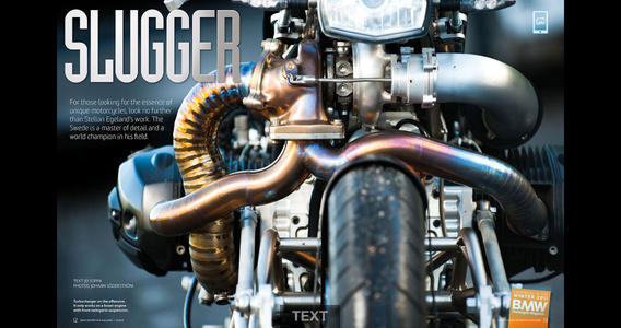
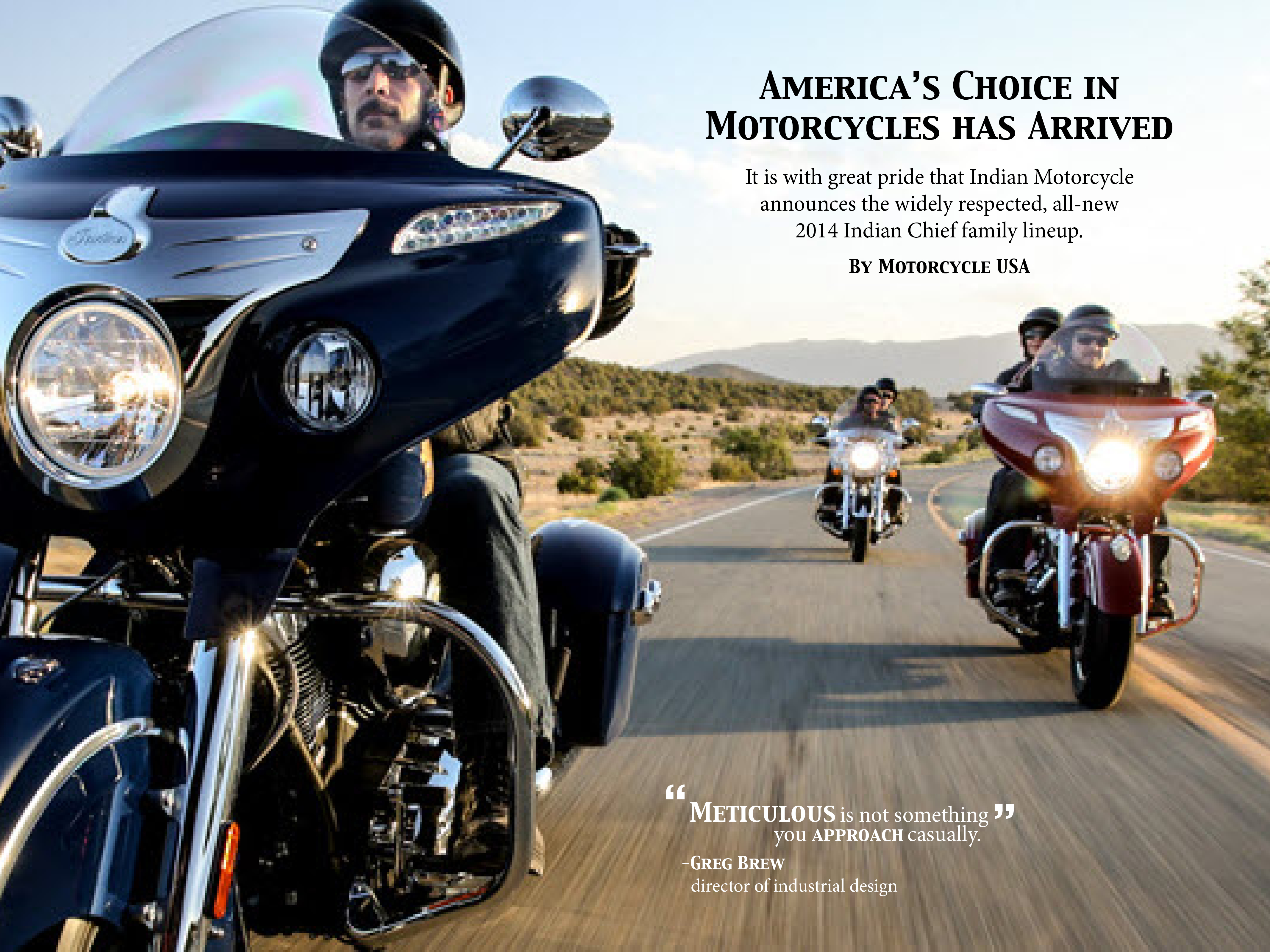
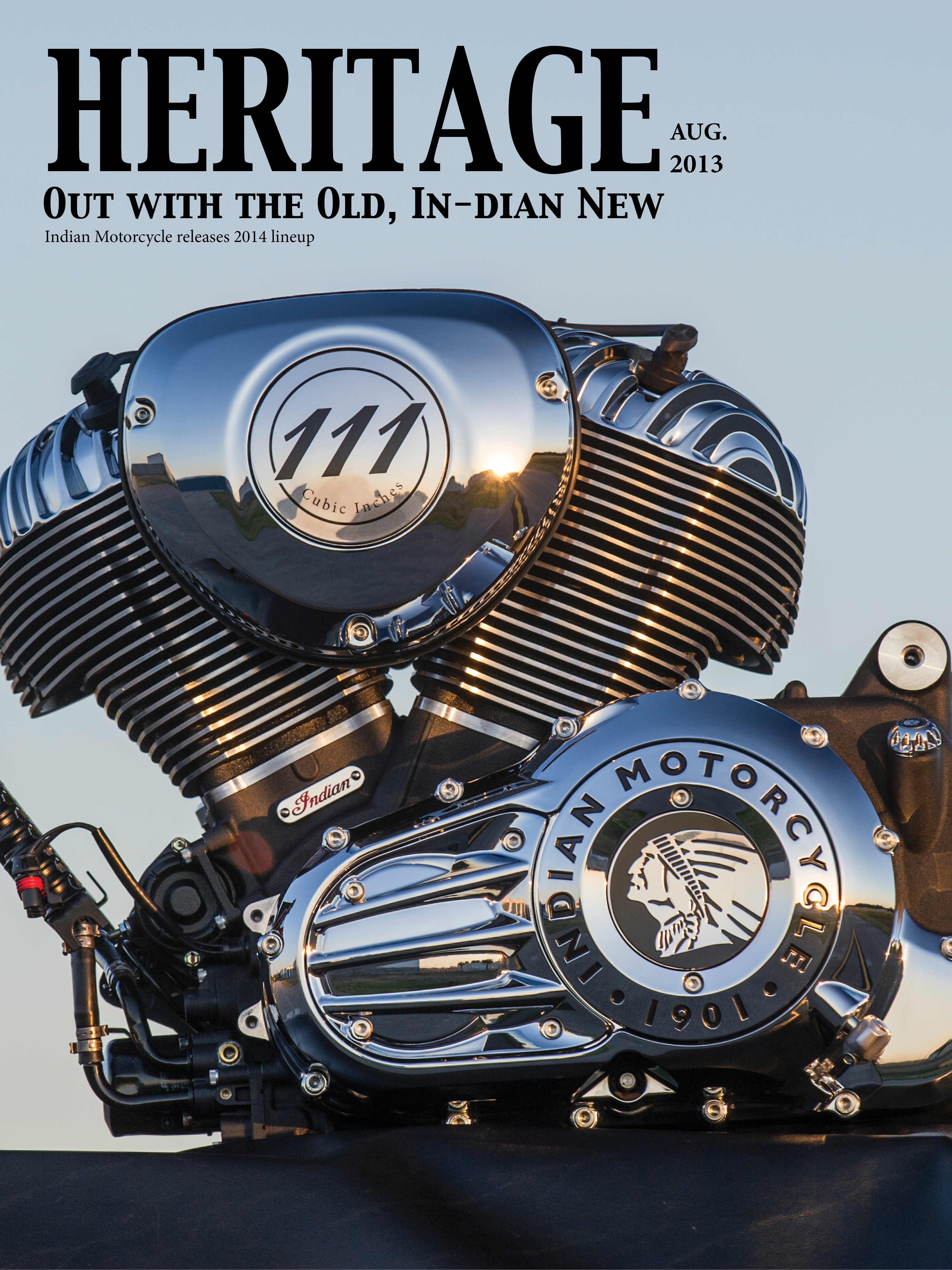
Print Magazine Cover: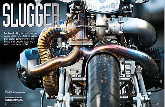
Unfortunately, this magazine cover only had a horizontal layout. I like it a lot though, especially because it resembles what I want my iPad designs to look like. The way the motorcycle bleeds off the top and bottom of the design really gives way to the engine and the pipes. The typography is well-chosen as well because it is sleek and silver; similar to the pipes of the motorcycle. The biggest difference between the digital cover and the print cover is that the type in the digital cover is larger. In addition, the image in the print cover appears to larger than the image in the digital cover.
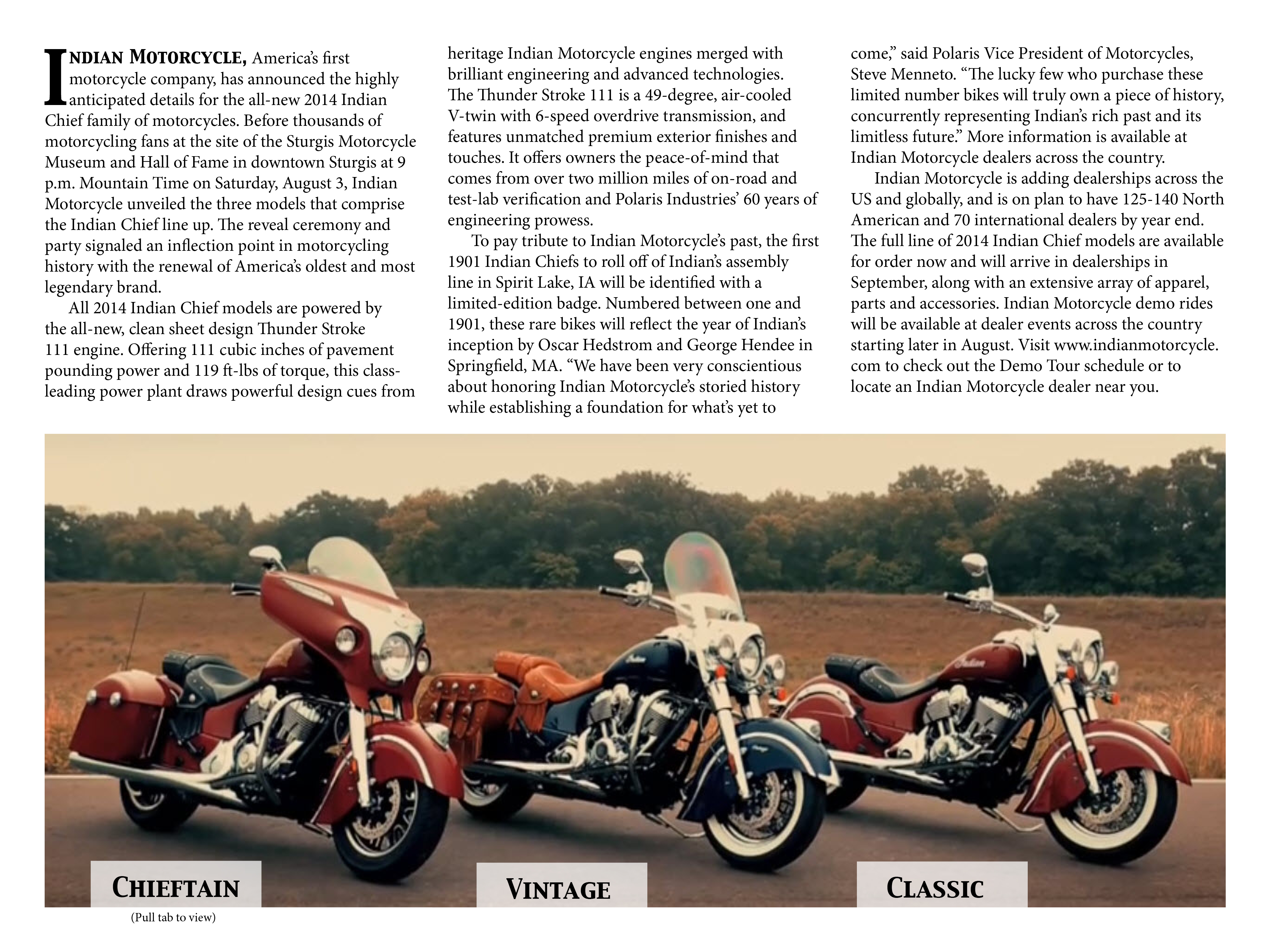
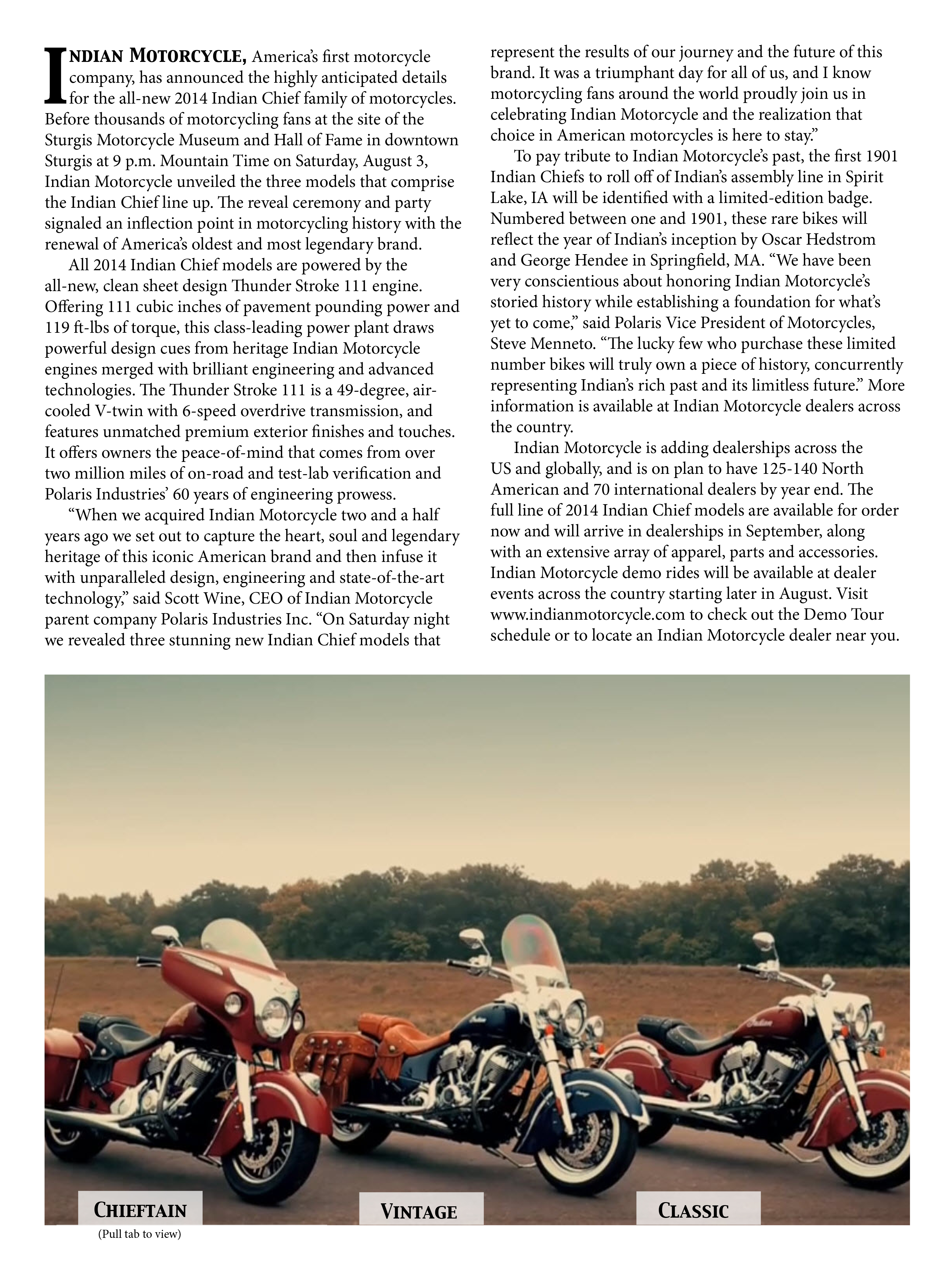
Indian Motorcycle Headline & Deck
HEADLINE: Out with the Old, In-dian New
DECK: Indian Motorcycle reveals its new 2014 lineup. Harley Davidson better watch out.
http://www.motorcycledaily.com/2013/08/indian-motorcycle-company-reveals-all-new-2014-indian-chief-motorcycles/
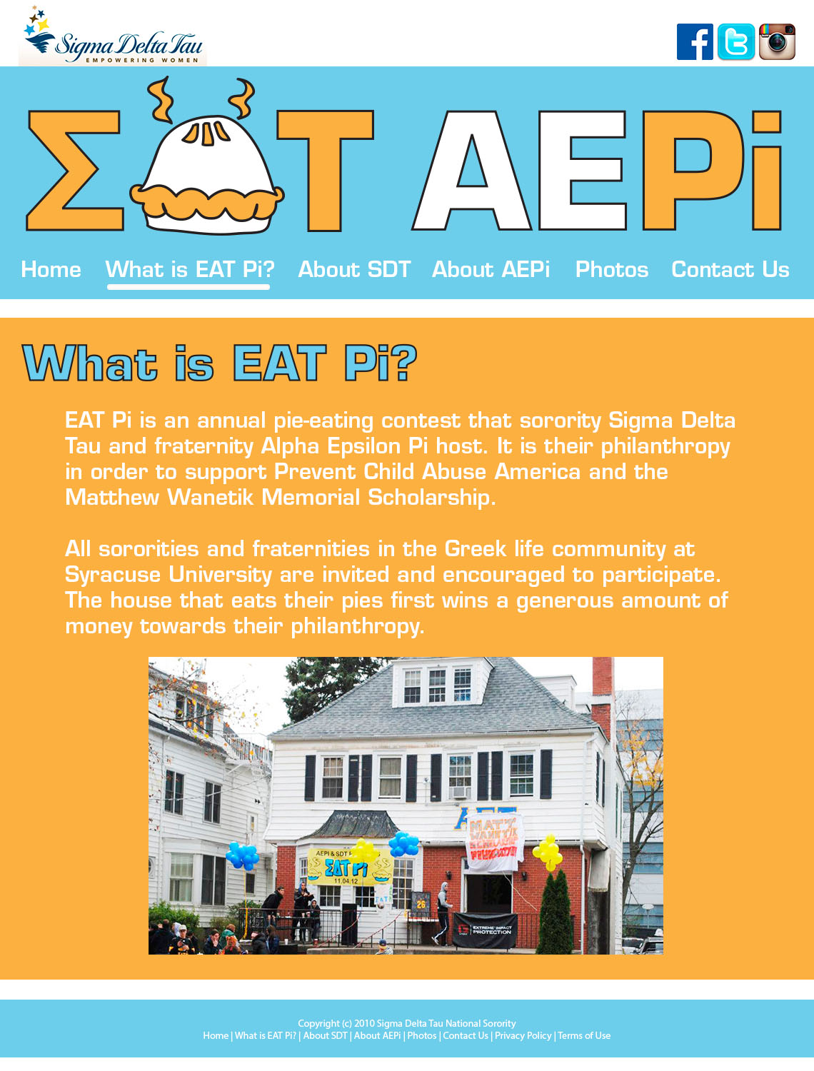
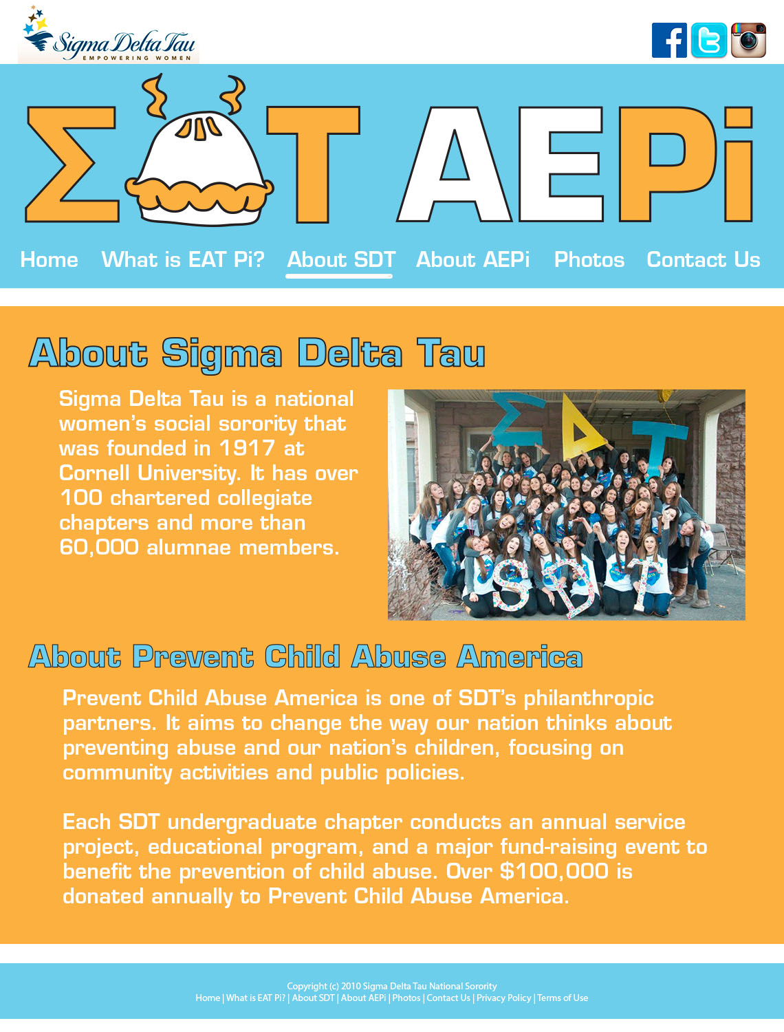
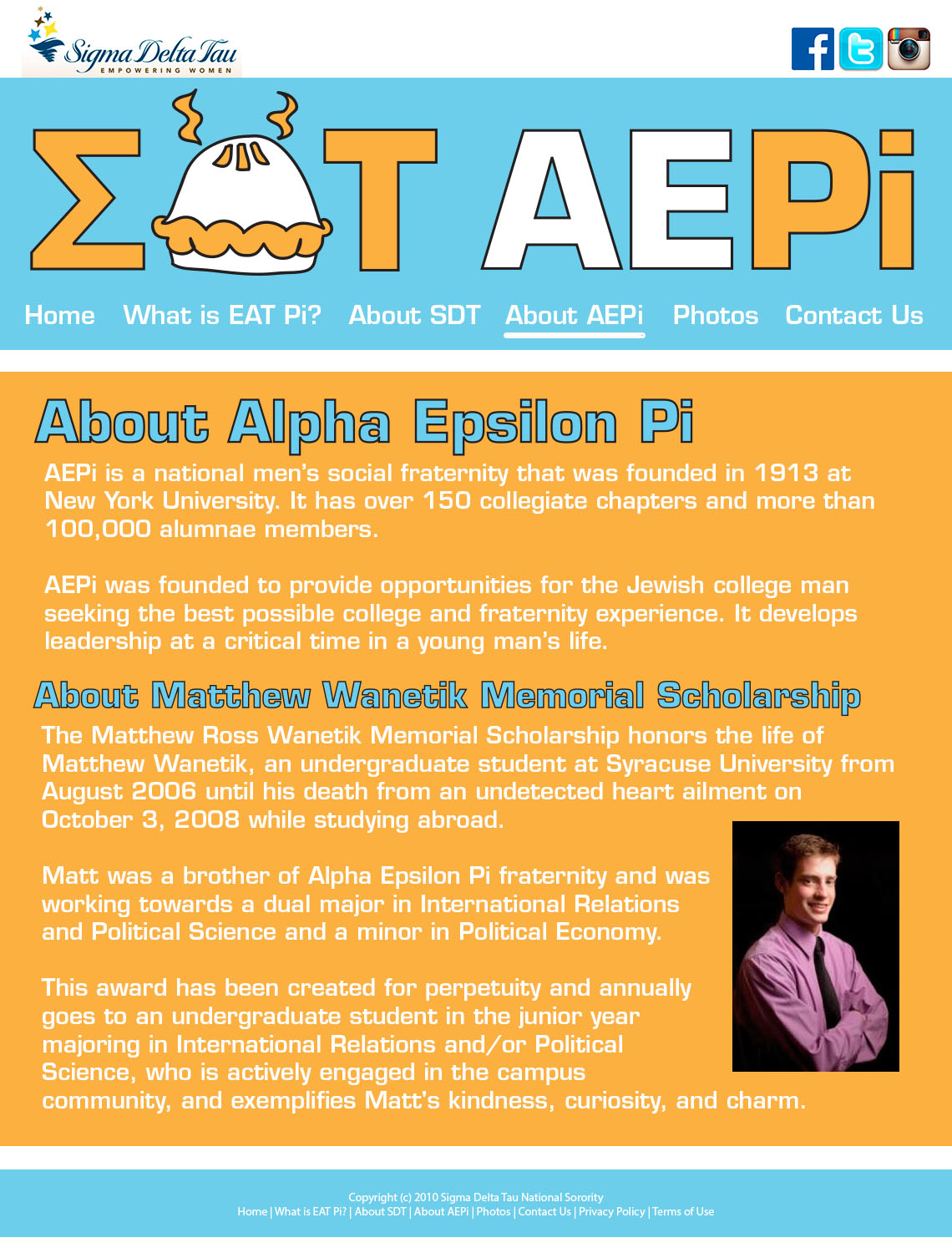
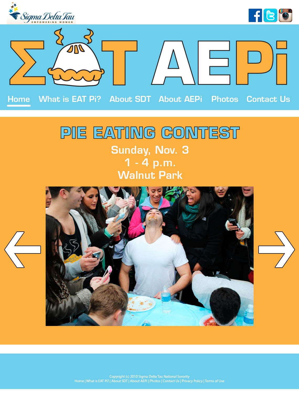
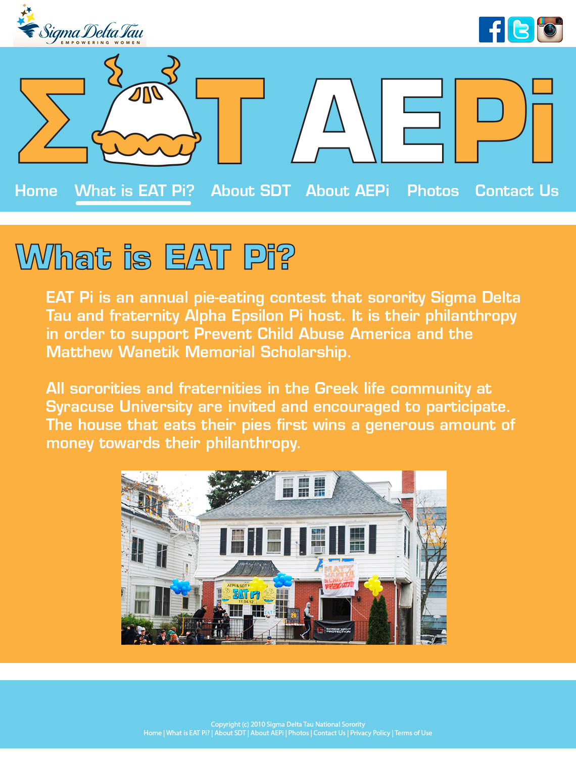
EAT Pi Website Design
Queen of Zef Magazine Spread
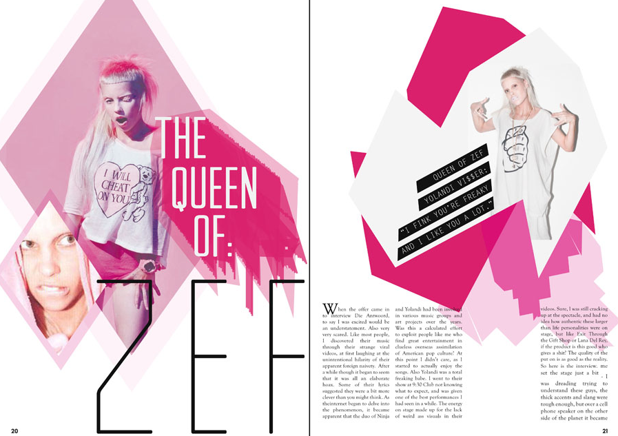 This magazine layout screamed out to me when I first saw it. It totally stands out and pulls the reader into it. It defines the essence of Gestalt theory that the whole is greater than the sum of its parts. This is because there are so many obscure pieces that make this piece what it is; it has the hot pink color, the wild facial expressions on the woman, and the retro typeface.
dhs logo sketch
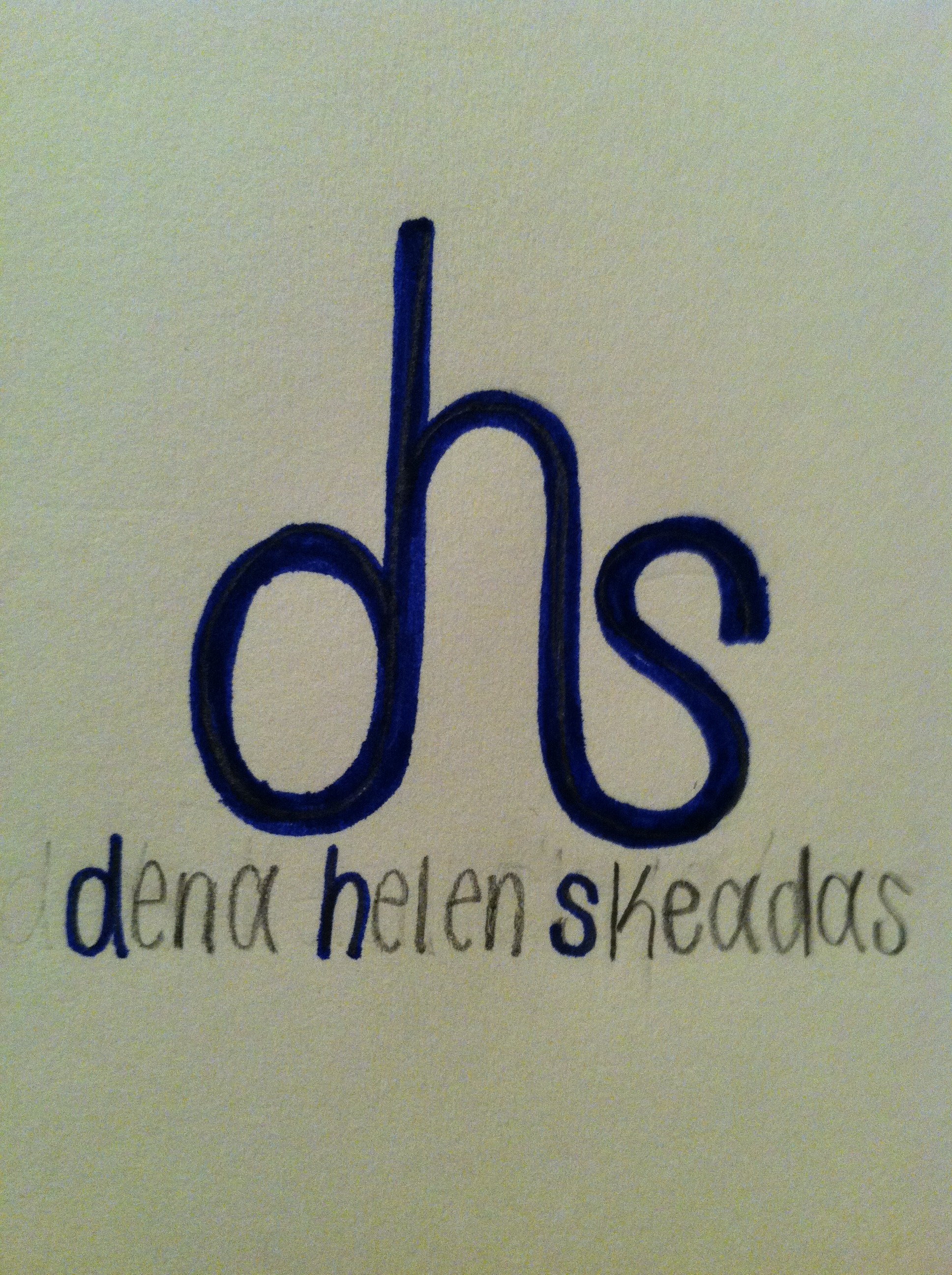 Above is my personal logo sketch. Behind this design, my thinking process is as follows: I wanted to use all three initials in my name because I think my name is unique and stands out. With this in mind, I wanted to incorporate the “d”, “h”, and “s” together, so this sketch is the way I thought it looked the best. I chose to use lowercase letters because it is the only way I could incorporate the letters together next to one another without flipping them around. I like how the “d” and the “s” are the same size, but how the “h” is slightly bigger. I also like the type is curved; it adds a touch of gentleness. If I were to implement this sketch, I would make the “dhs” a little bolder. I would keep the “d”, “h”, and “s” in the full name the same blue color as the initials above it. Then I would make the remainders of my first, middle and last name white. Blue and white are Greek colors, and if you couldn’t tell from my name, my name is Greek.
Photography in Web Design
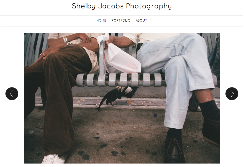
The large photo here was used as a visual element to effectively communicate with its viewers. Since this is a portfolio of Shelby Jacobs’ photography, the target audience of this is anyone who is interested in photography. She choose this particular image because it was simple, but could be interpreted in multiple ways. She also addressed a relationship between two people. According to Professor Taylor, showing relationships between people in photos is very important because it helps the viewers relate to the image. Additionally, I really like how the photo is taking up most of the space on the page. According to Bruni’s article, big photos sell! I also like how she used dark text over a light background. It helps the text stand out to the viewer.