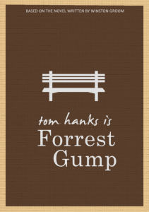
Another personal favorite (sorry guys for all of the movies). This is probably one of the simplest designs on Illustrator anyone will find. The park bench, where Forrest tells his story, is central to the movie itself, without being one of the scenes to capture his life story. The pen tool is obviously used to create the straight lines of the park bench, and none of the curves of the pen tool were used because it simply was not necessary. This poster is simple and straightforward and captures Forrest’s simple attitude towards life effortlessly. Go pen tool.
GRA 217 Section 5 Group 2
The official blog for GRA 217 with Sherri Taylor


I definitely agree with you on the simplicity of this poster. I think it’s very successful with its message. I like the (possibly) hand-drawn text “tom hanks is”, it adds to the design. Pen tool is amazing, though.
My favorite aspect about this poster is that even though it is simple, it is also has a three-dimentional aspect. The way the lines are drawn for the bench, it looks like the bench is popping out of the poster. It is a brilliant use of the pen tool.
I personally like this poster because the message is spoken well with a simple graphic that symbolizes the designer’s point. I also like the use of variety of typeface to give a different style (naturally, formal & bold)