
Category Archives: week5post
America’s Navy
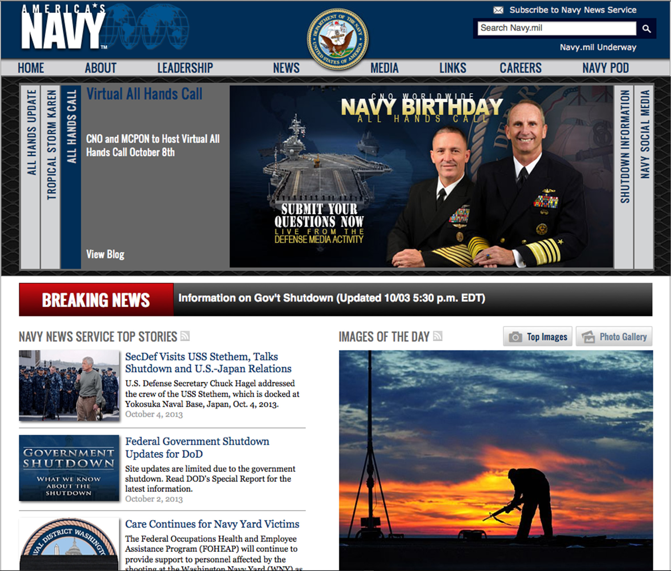
I like the visual hierarchy of this page. The arrangement of items leads you across the page from left to right, up and down in a very pleasing way. I also like the grouping of like items. It keeps everything on the page very neat and organized.
Interesting camera

This picture, which was designed by Illustrator, is interesting. The major tool for this picture should be pen tool, and texture effect. The first step may be to create the two hands and the camera. The shape of the hands and the camera are easy to be created by using pen, rectangle and ellipse tools. And then, we can use different colors to make the figures more detailed and clearer. The next step may be to add some wood grain texture to the camera, and another dots texture to the hands and the part of the camera. The last step should be to rotate the whole image.
Week 5 AI techniques
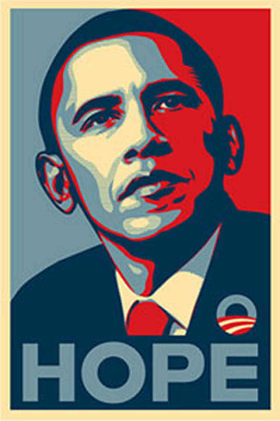
This is a poster of Obama’s 2008 presidential campaign. The poster is designed by Shepard Fairey. The artist used several layers to introduce a 3D effect. Tools the artist could’ve used include paint bucket, filters (to transform the texture from photo-alike to sketch-alike). The major steps for producing this poster would include setting multiple layers with each in different color, filtering, and using paint bucketing.
Marley’s World
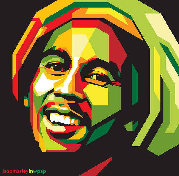
This illustration of Bob Marley is made with a black background then layers and layers of colored geometrical shapes placed on top of each other. The layers are necessary to get the overlap of shapes and to create the angles that emphasize the details of Marley’s face. The only circular area of this illustration are Marley’s eyes, but aside from this, this entire picture could have been created using both the pen and shape tools. By using white in the middle of Marley’s face, the artist has created the illusion of light shining from the aside which makes the entire piece look more three dimensional despite the hard angles and modern design. What I like most about this piece is the way the artist used all different shades of green, yellow, red and orange which is very indicative of Bob Marley and the way he has always been publicly portrayed. Even with the harsh sides and angles of the shapes emotion and personality still shines through Marley’s eyes and face in general which I think is well done considering the design of the illustration.
Week Four Post – Illustration
This illustration of John Lennon was made using a combination of the pen, brush and gradient tools. When making illustrations like this you have to use multiple layers and change the stroke on the lines to get the nice shapes and harder edges that make this illustration work. What I really like about this one is the expressionistic use of color the artists take on how the light hits the subject. This piece was probably a trace from a portrait of Lennon, but I could be wrong. Either way avery nice piece in my opinion. 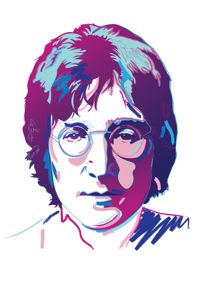
Atlanta Falcon

This fine piece of artwork was made with the pen tool. I’m also pretty sure the artist used multiple layers while making this. One separate layer for each color, and one for the shape of the white beak and eyes. It’s made with straight lines and bezier curves. It’s a straight forward layout, but it embodies the strength and power of the mighty Atlanta Falcon. If I were to recreate this, I wouldn’t. It’s already perfect.
Adobe Illustrator Rock Out

In order to create this artwork on Adobe Illustrator, the designer selected a horizontal document. Then, the designer took a photograph of the man singing, and inserted that photo onto the document. In order to create the shapes, the designer probably used one of two possible techniques. One, he or she used the symbols tool and dragged the loop symbols onto the document. The other option is that he or she used the arc tool to make the arcs of the loops. Next, the designer used the shape tool to make the circles. After the designer had all the symbols and shapes in the desired placement, he or she filled them in with different colors using the swatches library. Lastly, in order to create the shading in the some of the circles, the designer most likely went to ‘Recolor Artwork’ and added black or white tint.
Adobe Illustrator Artwork
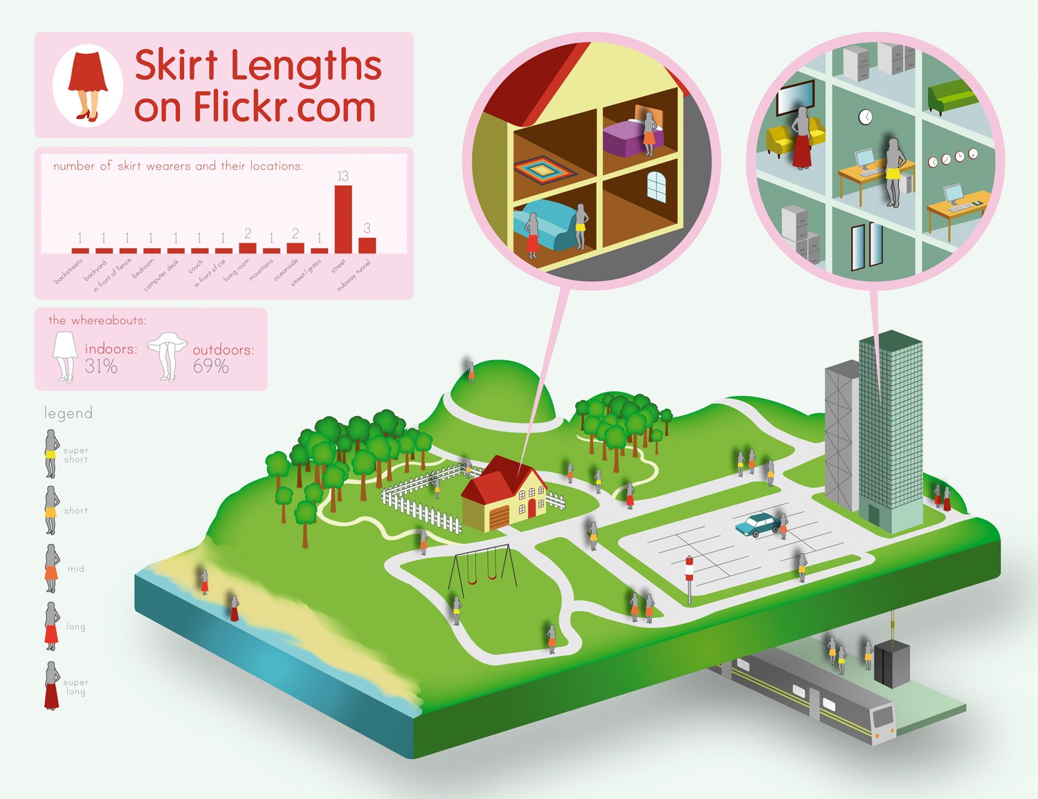
This is an infographic created using Adobe Illustrator. I found this infograph from a Adobe Illustrator tutorial website. This is definitely a very high-level difficulty work that requires lot of knowledge about the program to make it. However, if I were to guess what the designer have done to create this project, The first thing I can think of is setting up the three-dimension grid, based on the three dimensional rectangular platform. Also, one would have used the pen tool to create figures like houses, trees, train station, and the beach scene.
Illustrator Techniques: Save Water, Save Life Illustration
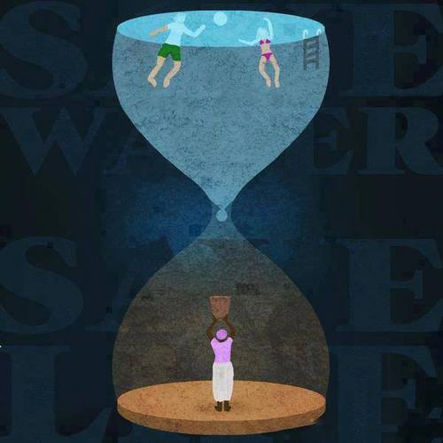 This illustration effectively identifies the disparity in water distribution throughout the world in one clever image. Yet how is it so effective?
In Adobe Illustrator and illustrating in general, perspective is key. Through applying multiple shades of color throughout the image and placing the words behind the illustration, there exists a sort of depth that wouldn’t exist otherwise. It is also important to note the figures within the hour glass and even the hour glass are simplified. There is very little detail in the shapes, but the shapes are recognizable. Most if not all of the shapes involved in the illustration can be created through utilizing the pen tool. There are other tools such as the gradient tool that can also provide shadow or a sense of light progression which can be seen in the faint aura behind the drop of water.
The most effective illustrations are not complicated yet discuss an intricate, complex idea. A simple hourglass is transformed into a potent metaphor of the water crisis that the world is facing.