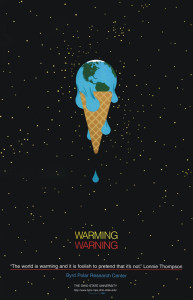
I think the adobe tools used in this poster design would be the pen tool. a lot of the design can easily be manipulated by the free transform tool that allows the person to change the curves of each like and size, etc. i love the effect of the earth melting as if it were ice cream.
GRA 217 Section 5 Group 2
The official blog for GRA 217 with Sherri Taylor


There could also possibly be the use of the pattern or logo tool in the ice cream cone. There are many means of achieving the globe, one of them being the trace tool. The illustrator could have found a photo of the map and traced around the land forms, placing the land forms in a circle created by the ellipse tool.
I think this is a really simple yet effective poster. Less is definitely more here. There is really effective use of color in the headline… “WARMING” in yellow (= warmth, sun, caution) and “WARNING” in red (= danger, hot etc.) In regards to the tools utilized, they could have used the line segment tool/arc tool to create the ice cream cone and the world. They could have used the paintbrush/pen tool for the stars in the sky.