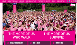
This is the Avon Cancer Walk website. The target audience of this website is anyone who wants to join the walk to raise money for a cancer cure. The image used on the homepage of the site is successful because it shows the emotions of the walkers and cancer survivors. It also shows depth with how deep the photo goes, making apparent all of the people who attend and support. The photo also supports the color scheme of the site (pink) and the words underneath the picture. The relationship here is meant to express “we survived cancer,” with hands in the air and happiness.
GRA 217 Section 5 Group 2
The official blog for GRA 217 with Sherri Taylor


The photo used here could be lame if taken out separately. But it works very well on this site! The crowd brings powers, which is what events like “Cancer Walk” would need to have. Also, the pink color in the photo matches perfect with the website. Without a big headline, the photo itself is a successful “call for action”. Great pick Sarah!