
Graphics 217 has taught me a wealth of information about the Adobe Suite that will take me very far in my career future in PR. I feel these tools are so important in the communication world today, because I may not be designing an advertisement in my field but I will be working with others who may and I now understand graphic terms and the ins-and-outs of the various software. I learned how to communicate in graphic terms (i.e. typography, colors, spacing and image) and this will be an invaluable tool for the future. I truly enjoyed every aspect of this course, my most favorite project being the iPad design because I loved the interactivity usage. Thanks for a great semester.
Author Archives: Sarah Richheimer
Ipad Project- Crave Magazine
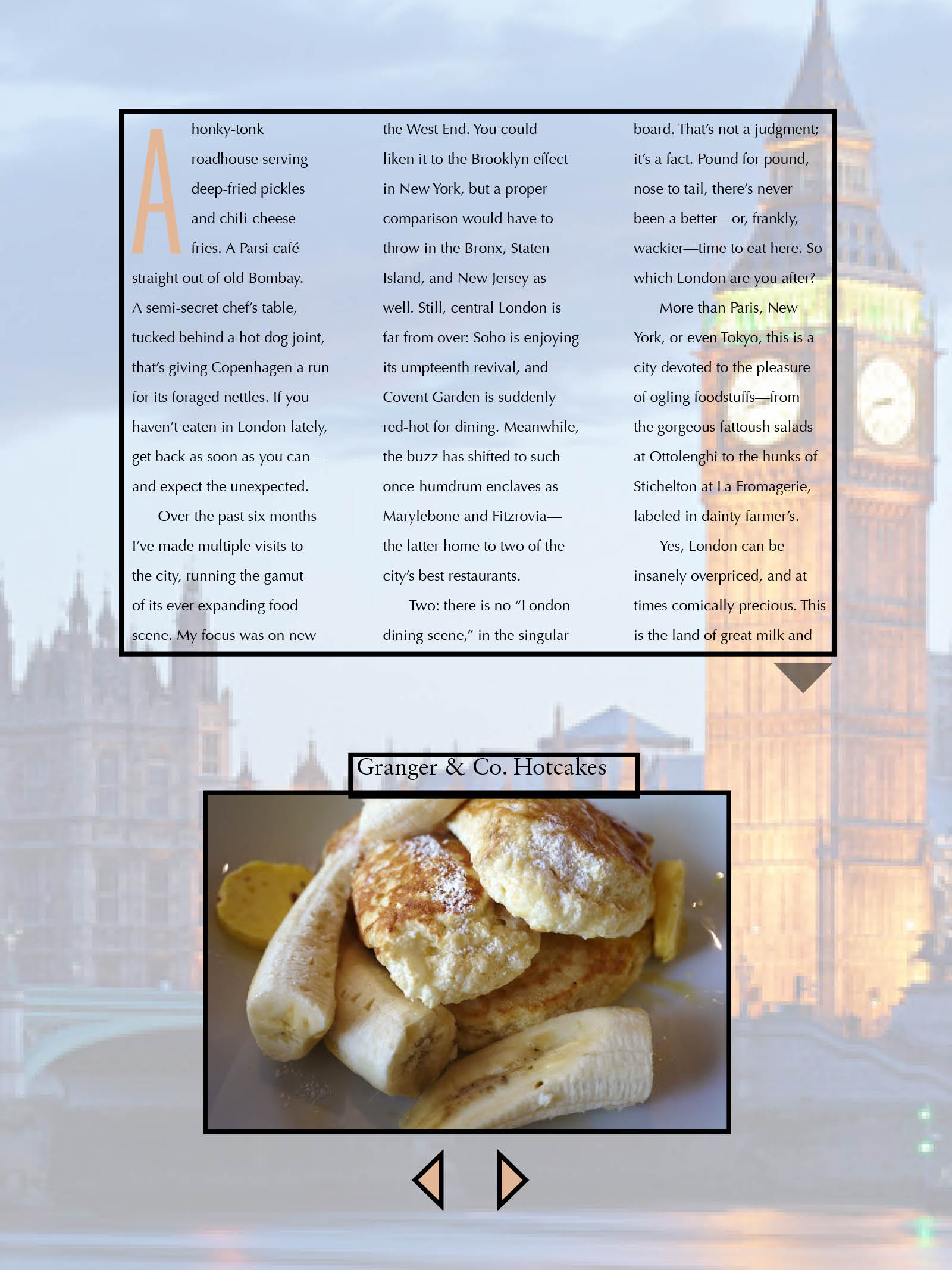
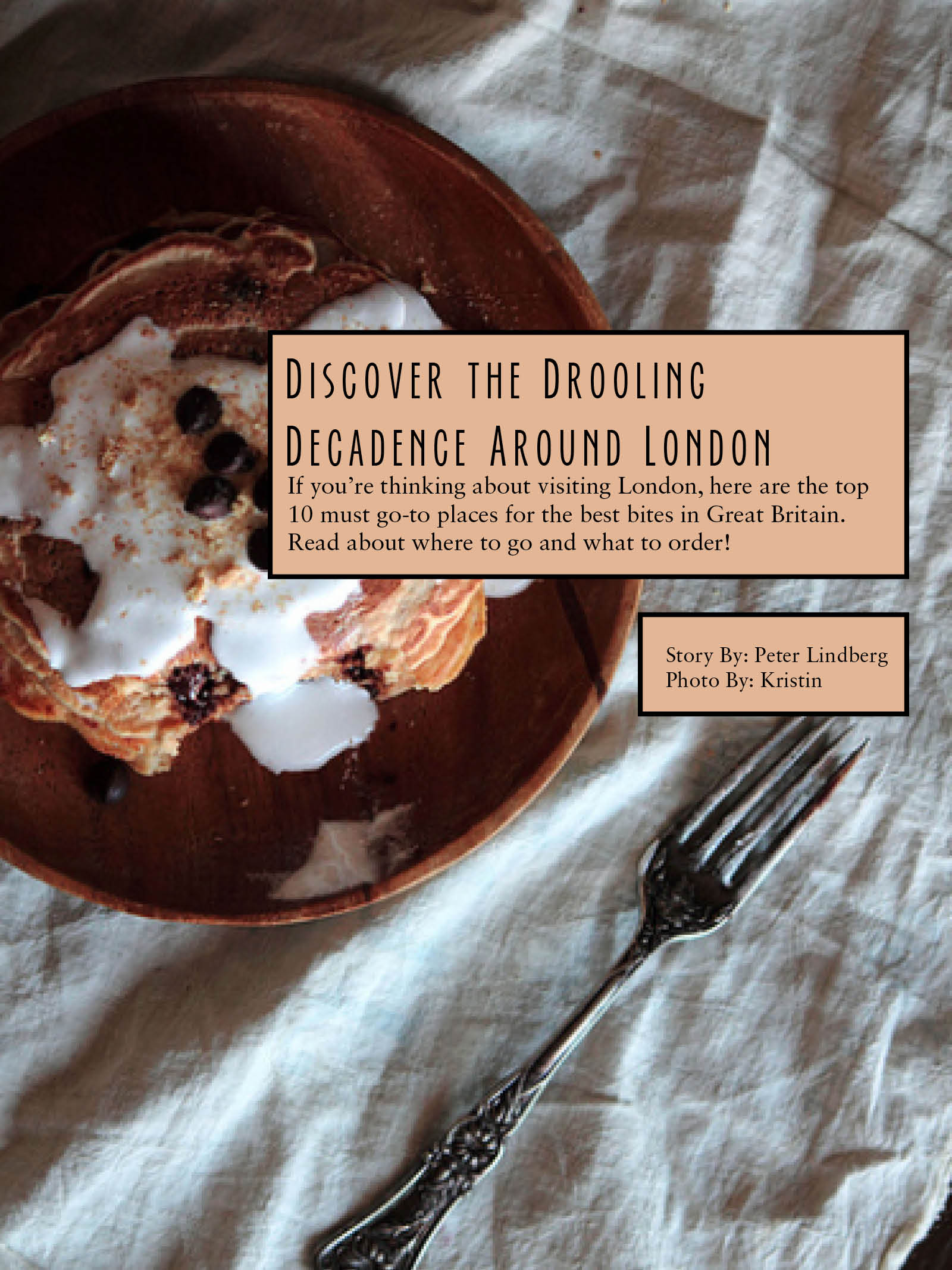
I absolutely loved completing this project. I learned how to use interactivity and after seeing real iPad magazines, it made me realize how useful these Indesign (and interactivity in specific) are so useful in real life. I now love to read iPad magazines.
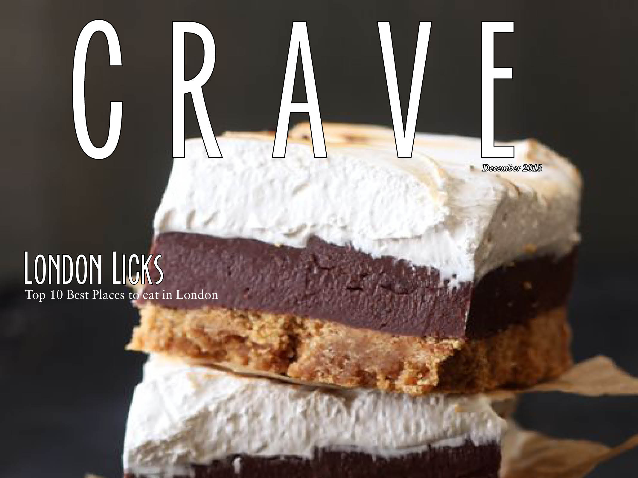
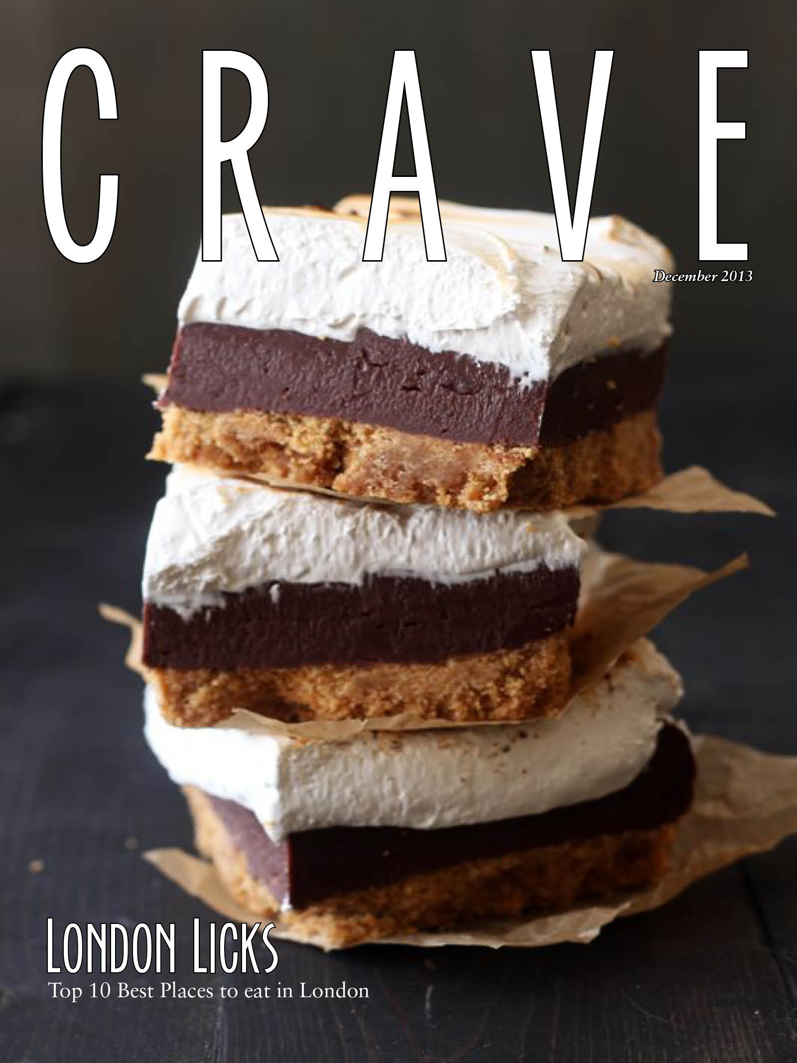
Ipad Magazine Cover
I could not find the horizontal image of this magazine on the iPad.
I like the iPad version better because the colors seem brighter. However, the layout of the images and words are identical in both versions. Even though the text seems clear and easier to read in the print version, I still prefer the iPad colors and overall appearance. The only thing I am not too fond of with this magazine is the multiple headlines all over the cover, I think they distract from the big image on the cover. And there are too many article titles to follow, overall just distracting the reader. Maybe for the iPad version the multiple headlines are safer because they hyperlink to the article but for the print magazine, I think they aren’t as valuable.
Headline and Deck Post
Headline: Beyond the Sling
Deck: A real-life guide to raising confident, loving children the attachment parenting way
http://www.pinterest.com/pin/39969515416497857/
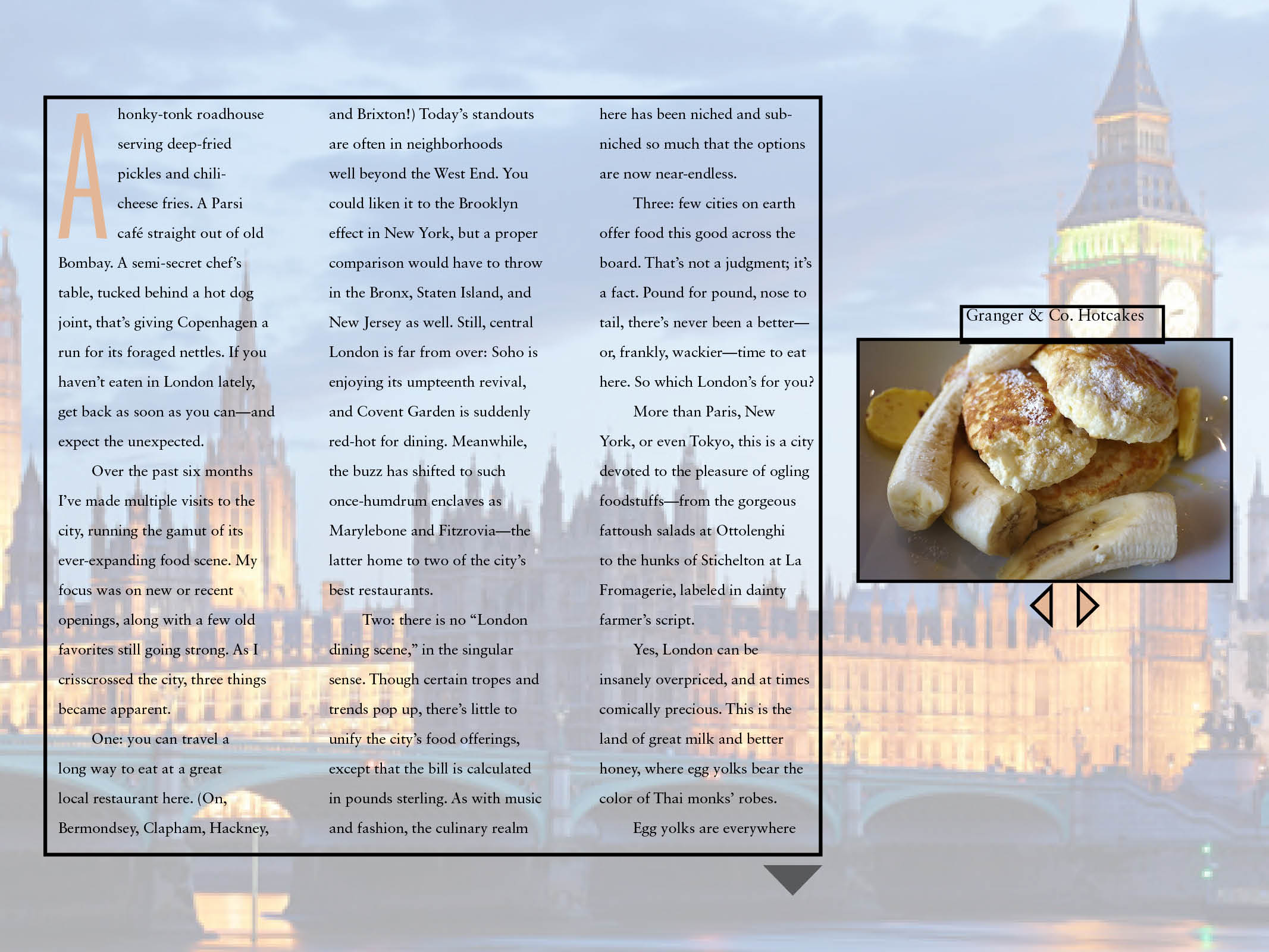
Magazine Spread
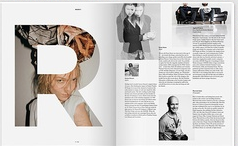
This magazine spread struck me because the “R” is so cool where the picture is coming through the letter. It makes the spread eye-catching. Also the black and white images on the right page organize the information and make it very readable, balancing the left image, in color behind the “R”. The top left image looks like it’s in motion and is also appealing. I just like the overall simplicity of this spread.
Website
Logo
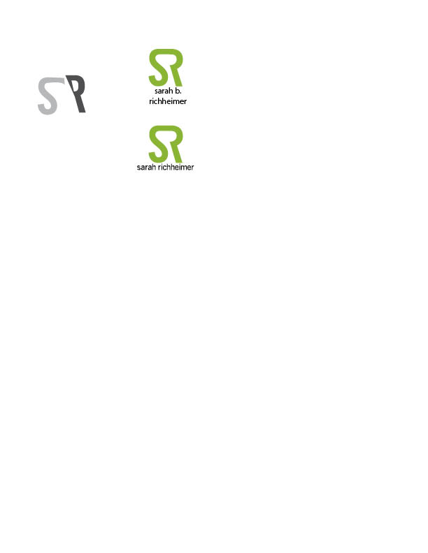
These are my two ideas for a logo for myself. I used the bottom one as my word mark/initial mark on the resume, too. I think it could work well on a business card too. I had trouble incorporating both letters in my name because I have awkward letters that don’t work together too well, but I figured it out! My favorite color is lime green, so that’s why I created my initials using it. Also, I think the middle, between the s and r, you almost forms a letter b, which is my middle initial.
Photography in Web Design
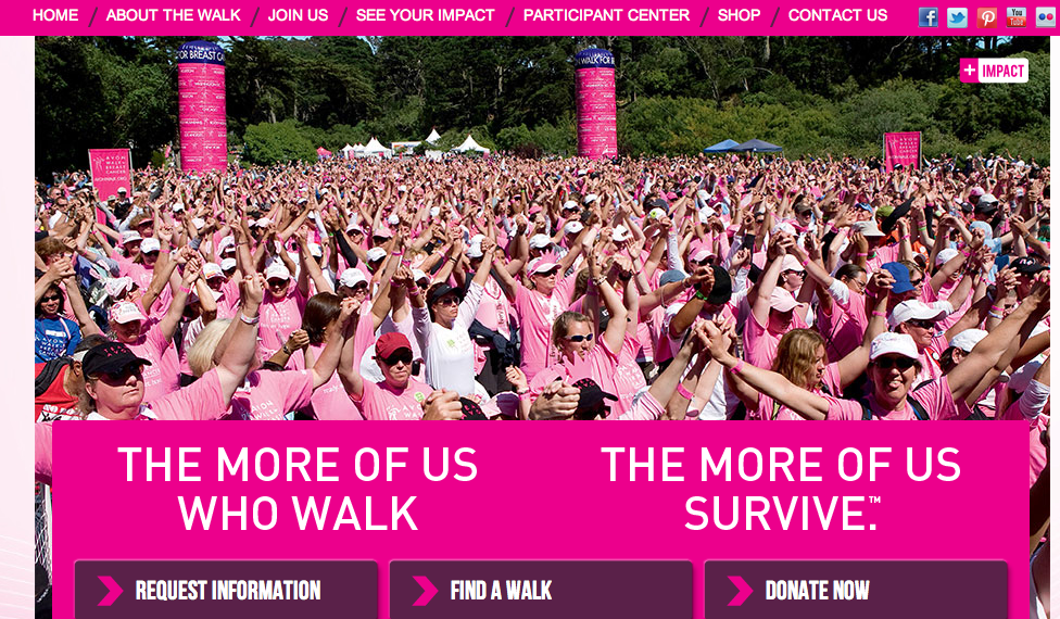
This is the Avon Cancer Walk website. The target audience of this website is anyone who wants to join the walk to raise money for a cancer cure. The image used on the homepage of the site is successful because it shows the emotions of the walkers and cancer survivors. It also shows depth with how deep the photo goes, making apparent all of the people who attend and support. The photo also supports the color scheme of the site (pink) and the words underneath the picture. The relationship here is meant to express “we survived cancer,” with hands in the air and happiness.
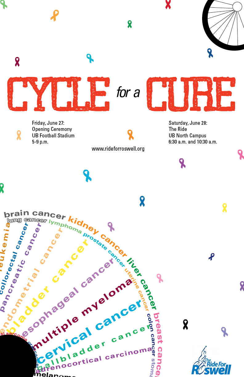
Richheimer Poster
Lululemon Webpage- Gestalt Principles
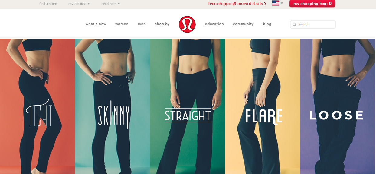
I think the Lululemon website is very successful with effectively incorporating the gestalt principles of design. First off, their logo shows an exaggerated letter “a”, which when clearly looked at and deciphered displays the continuation element. A viewers eye is drawn from the bottom corner curve, up to the top arch and back down, to the point where our brain can close the “a”. Also the figure ground principle is clear too; the red background allows the white symbol to pop out of the ground.
The website follow similar principles. We see proximity and alignment with the typography on the webpage because all of the drop down lists and bar at the top, are written in the same text and size and located close to each other. Also, the models are close to each other, leaving no white space, helping to draw the eyes up to the top of the webpage. However, the type on the pant styles are all unique, which I think help the different kinds stand out amongst each other. The models also contribute to visual hierarchy, leading the viewers eye up to the top of the webpage where the drop down lists are. The color of the background on the site is also white, allowing not only the logo to pop, but also the colors in each style pant to come off the page and be apparent.
I love this site…and their clothes.