
 I learned how vital it is for the visuals to match the written content. My opening page is probably the strongest of the three pages because of the connection. I also noticed how effective continuation throughout the pages in the form of text, colors, and content to pull the magazine into one cohesive unit.
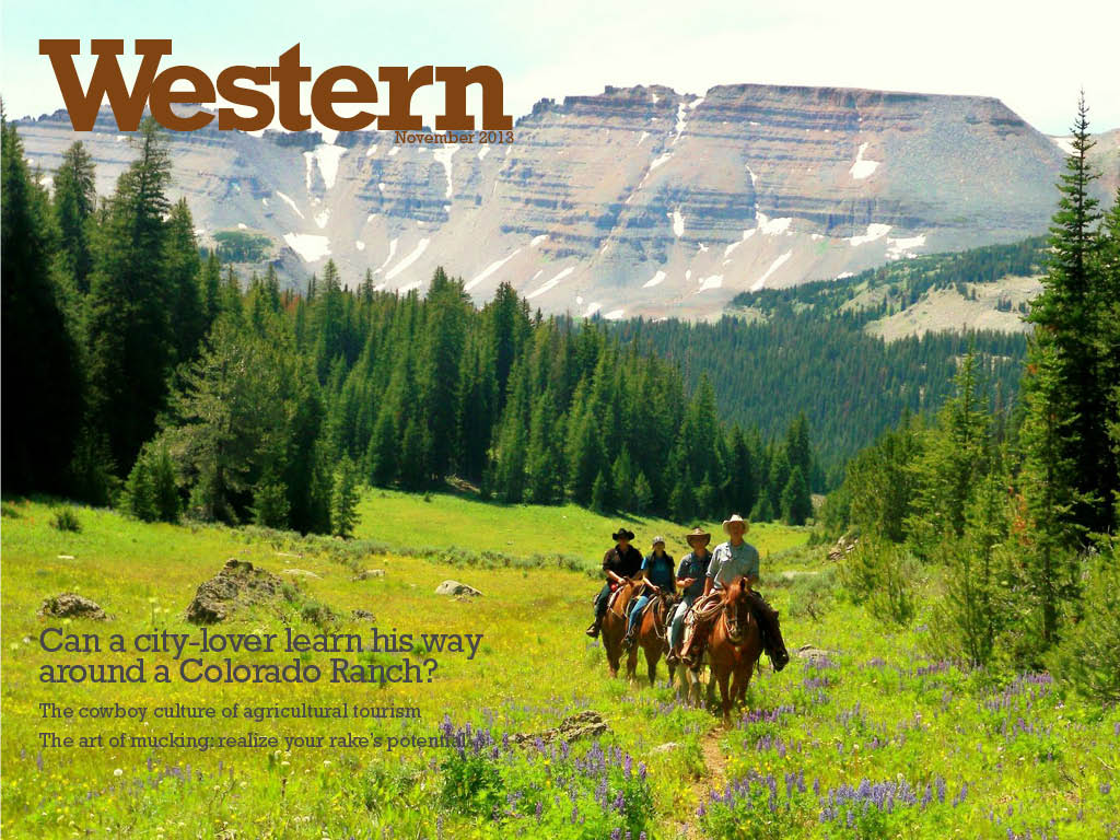
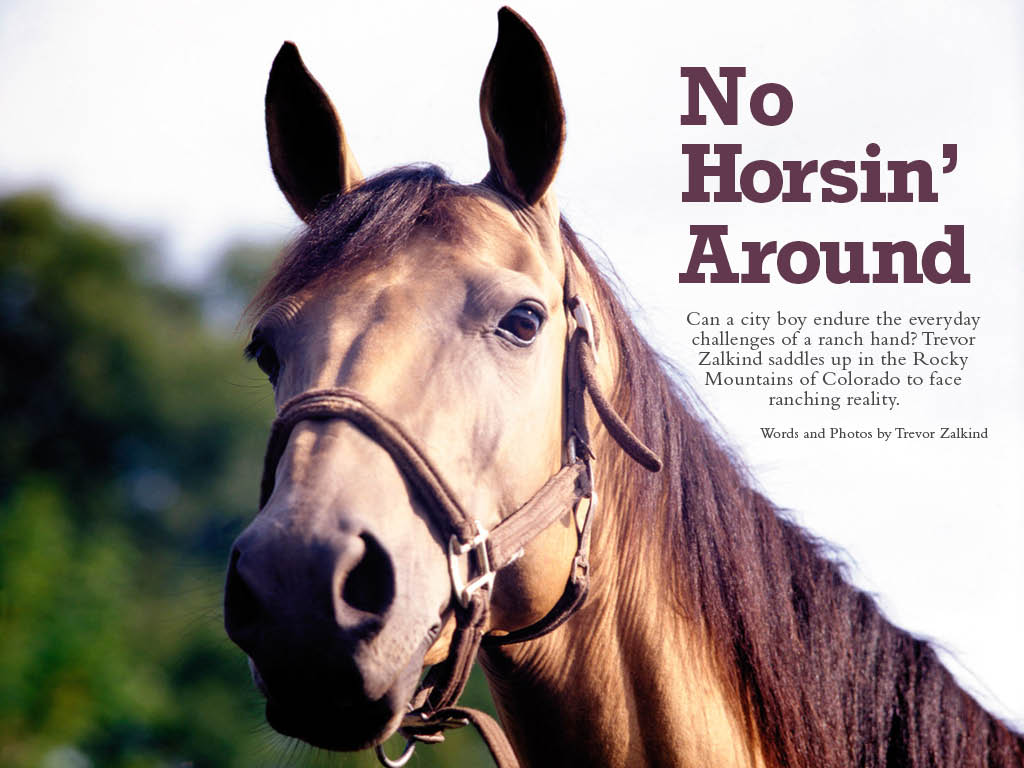
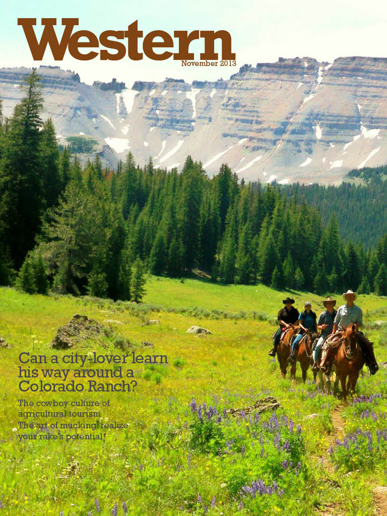
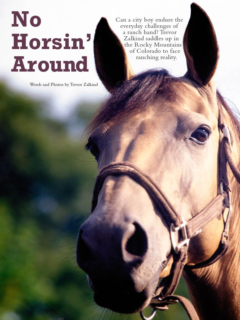
Trevor, I love your design. First of all, I love horses in general. Secondly, the photos you used are very well-chosen. I like the “No Horsin’ Around” pun; funny and easy to understand. I really like your cover page as well because it looks very Western, which is the look I’m sure you were going for. I’m not sure if you mean to do this, but the title “Western” almost matches the color of the horses. I love that!
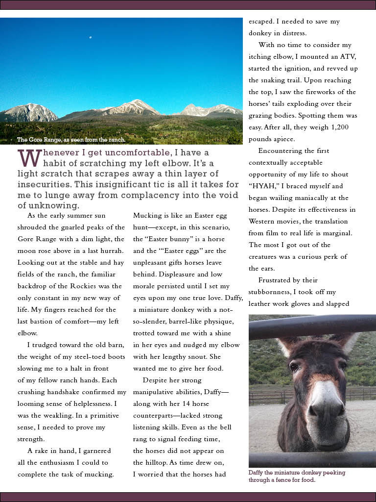
The use of color in this design is really appealing. The green is very vibrant and draws you in what proves to be a really cool story. I remember when you presented your design in class and thinking to myself how I would love to experience some time on a ranch. You do a good job of making your visuals and design work with your story in a potential influential and fun way.