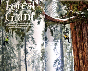
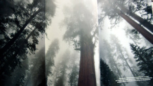
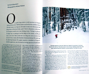
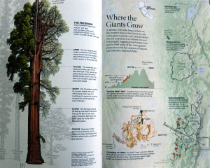
This is a spread from the December 2012 issue of National Geographic. It really utilizes photography in its design. I think it is really hard to convey how tall and magnificent these giant sequoia trees are in a photograph. However, I believe these photos do these trees justice. I like how they open with a full page photograph of the trees. The second page opens to an even larger photograph. The story begins on the third page. They utilize the drop cap and place the story within two columns on each page. The fourth page provides a visual layout of the anatomy of the trees and a map of Sequoia National Park providing facts. I think National Geographic does an excellent job combining the visual and the story in a clear and professional manner. It can be read and understood by anyone.
GRA 217 Section 5 Group 2
The official blog for GRA 217 with Sherri Taylor


