iPad Magazine (floating redo)

Williams_iPad_Magazine Williams_iPad_Magazine2 Williams_iPad_Magazine3 Williams_iPad_Magazine4 Williams_iPad_Magazine5 Williams_iPad_Magazine6 Williams_iPad_Magazine7 Williams_iPad_Magazine8

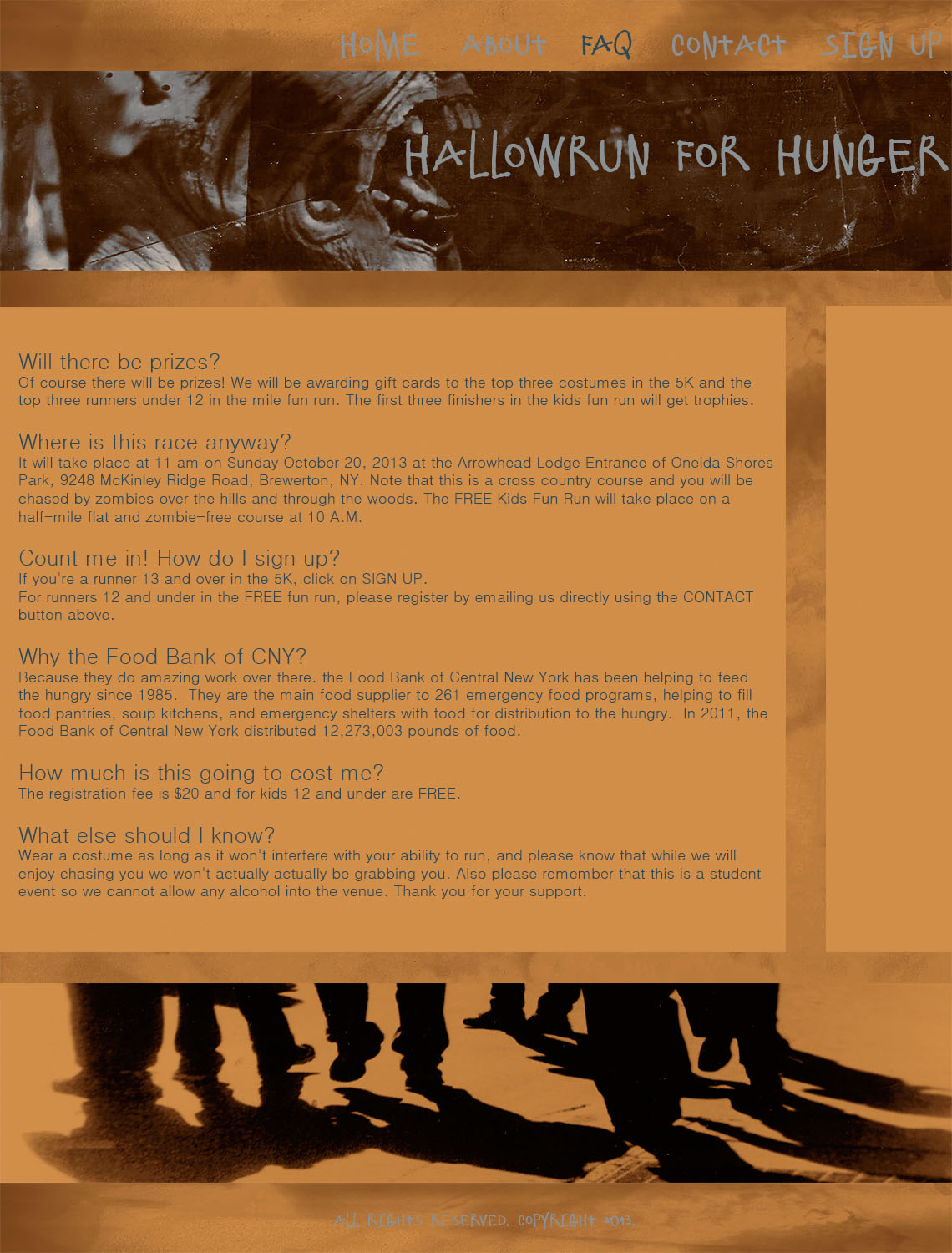
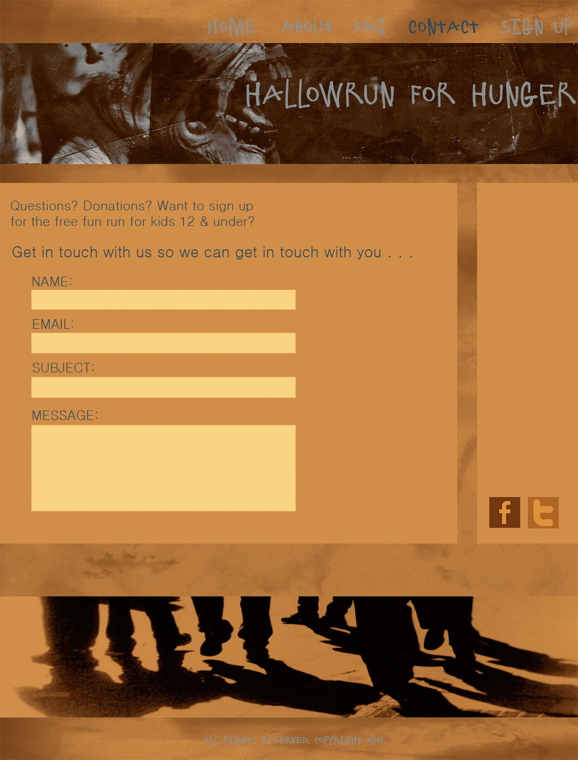
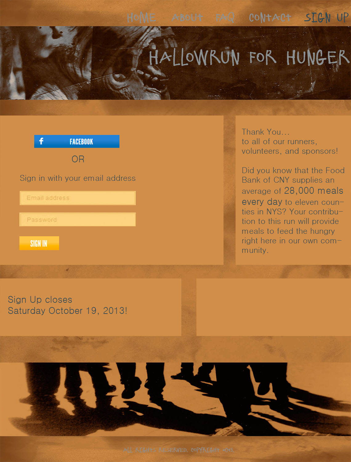
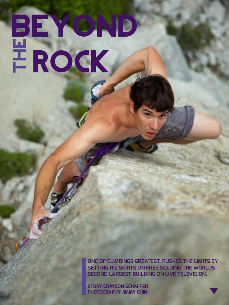
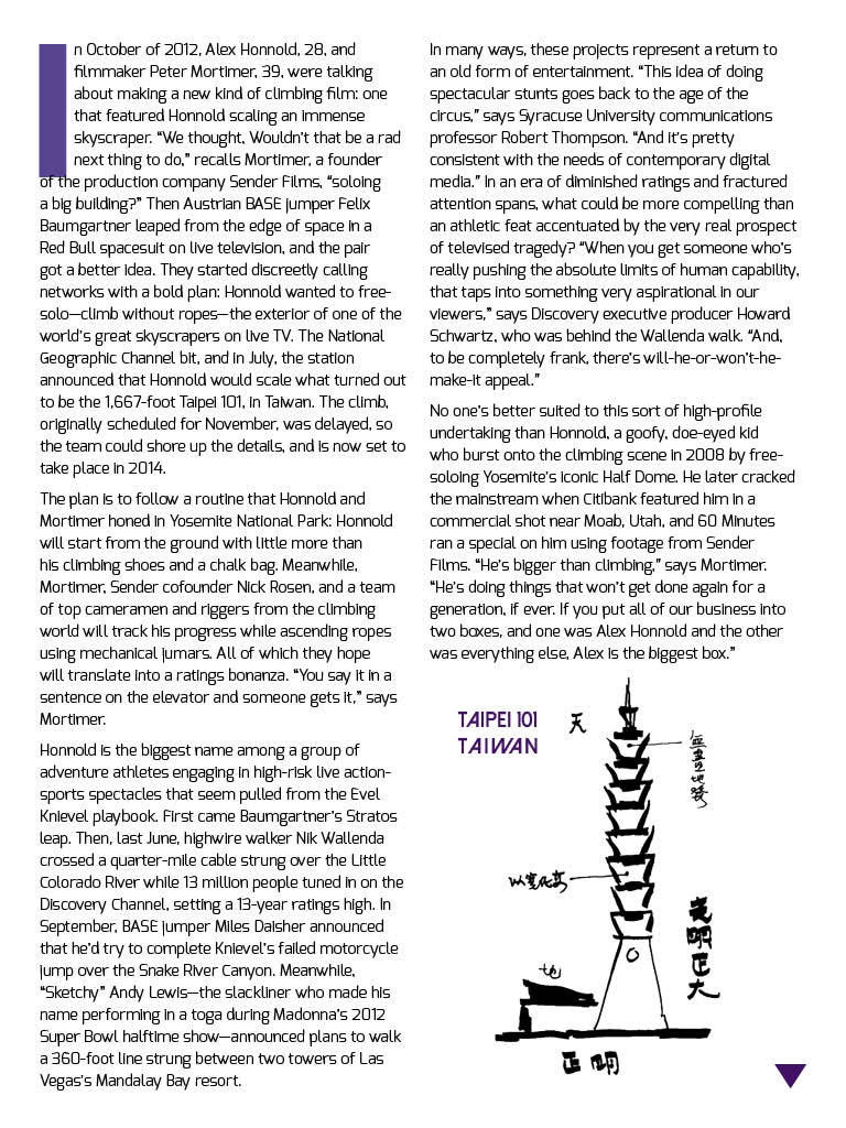
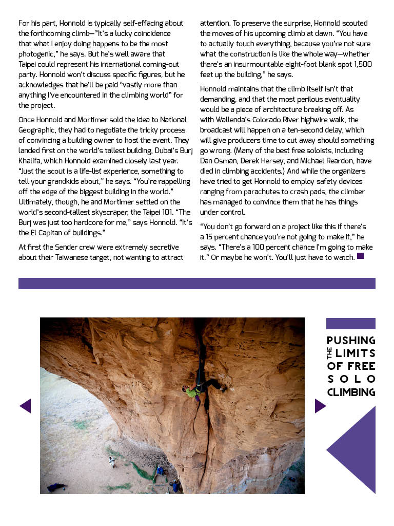
I learned a lot while creating this project, especially how to create interactivity. So cool! I now really appreciate all that magazines do to draw in an audience. There is a lot of work that must go into the story, the photography, and the design process… and then they must convert it to work in different formats. So much work!

iPad Cover

image Top_Gear_Magazine_2013-05_www.storemags.com

Top Gear is a magazine based on the BBC television show directed towards car enthusiasts. The title design/typography comes from the show. This issue highlights Britain, so they pulled the colors of the cars from the British flag. In the iPad format, there is mush less type and the photograph is significantly cropped. They also changed the color of “Top Gear” from black to white in the iPad version so it would not have an overwhelming presence.

headline and deck

Sugar Love: A Not So Sweet Tale
We were smitten 10,000 years ago on the island of New Guinea. Today the average American downs 22.7 teaspoons a day.

06-candy-670

This headline and deck are featured in National Geographic’s August 2013 issue. I think the headline is clever and does a good job of introducing the article. The deck provides historical and current day information. I believe both the headline and deck catch the readers attention… it did with me at least. The photographs of the sugary goodness are really cool too. http://ngm.nationalgeographic.com/2013/08/sugar/clark-photography


magazine layout.

_DSC2027 _DSC2028_DSC2029_DSC2030

This is a spread from the December 2012 issue of National Geographic. It really utilizes photography in its design. I think it is really hard to convey how tall and magnificent these giant sequoia trees are in a photograph. However, I believe these photos do these trees justice. I like how they open with a full page photograph of the trees. The second page opens to an even larger photograph. The story begins on the third page. They utilize the drop cap and place the story within two columns on each page. The fourth page provides a visual layout of the anatomy of the trees and a map of Sequoia National Park providing facts. I think National Geographic does an excellent job combining the visual and the story in a clear and professional manner. It can be read and understood by anyone.

personal logo.

bbw logo

My personal logo includes my initials, BBW, which stand for Bridget Bohannon Williams. I placed them in a triangle simply because that is my favorite shape. I flipped the middle “B” and made it bold just for stylistic purposes. I was really going for simplicity with clean, straight lines. It is black and white to again keep it simple. I created my logo on Photoshop. I have incorporated my logo into my website in the header and favicon. bridgewithat.com

photography in website

patagonia

Patagonia is such a great company… and their website reflects it. Their homepage features spectacular photographs that take up the majority of the page. The photograph depicts people wearing their clothing while out exploring. Their clothes are made to be worn outdoors while performing arduous activities. This specific photograph exemplifies that their clothing can stand up to harsh conditions the person puts it through. It also is perfect for this time of the year when people are preparing to buy apparel and gear for winter season sports. It is a beautiful quality photograph… it has a nice white background which allows for the bright pink jacket to stand out… it also uses the rule of thirds… and the ski pole leads our eye to the Patagonia jacket.

theclymb theclymb2

The Clymb is a discount outdoor clothing/gear website. Their business is all web based so it is very important they have an easy and accessible website design.

  • figure and ground: The Clymb uses a dark background which allows the viewer to see the products clearly.
  • proximity and alignment: The site uses two types of fonts, and the dark and light grey as well as the light blue colors throughout the website which creates unity.
  • continuation: The site is very linear and organized. They decided to create square blocks to place the information and products they are selling in.
  • visual hierarchy: Their layout is simple which is necessary for the site to place emphasis on the products they are selling. Most everything is uniform in size and color because each thing they are selling is equally important. The Clymb logo is large at the top of the page and the categories begin to decrease in size as you go to another sub category.