
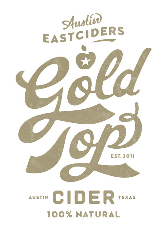
This week you are going to critique two wordmarks from a typographic perspective. What do you think of its typeface? What kinds of typography adjustments (color, reshaping letters, tracking, kerning, leading…) did the designers make to let the wordmark stand out? Does the type design align with the brand identity or development strategy? Does it create a memorable visual experience for the viewers? If you are choosing a redesigned wordmark, it would also be interesting to compare the old design with the new one.
Here are some great examples from the Creative Bloq.
It’s OK if you can’t find the exact typeface name of the wordmark, just describe its characteristics. But here is a great tool for typeface identification: WhatTheFont!.
Images of the wordmarks can be resources from the Internet or photos you take with your iPhone.
- Deadline for posts: Sep. 6, Friday. 11:59 PM
- Deadline for two comments: Sep. 8, Sunday. 11:59 PM
This assignment will provide some inspirations for your own resume workmark design. Have fun!