
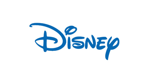
The fun typeface, Lettering Delights Walt, of this workmark coincides with the magical persona that Disney is renowned for. The color blue, being an inspiring color, also adds life to this wordmark. The designers made this wordmark stand out by making the shape of the typeface so distinct and unique to Disney, thus creating a memorable visual experience for the viewers.
As you said, the fun typeface really brings out the personality of Disney. The wordmark looks like a kid could have drawn it due to the width of the strokes and the combination of lowercase and uppercase letters. I think this really adds to the brand identity that Disney is mainly for the entertainment of children.
Another thing I like about Disney’s wordmark is that the script looks as though it was written with a paintbrush. To me, this really ties into the fact that they got their start in and continue to be known for animation.