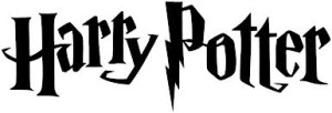
The Harry Potter wordmark uses the Harry P typeface, which was specifically designed to use for the series. The designers created the typeface with crooked letters and distinct serifs to illustrate the world of magic that Harry Potter portrays. The bolt image that extends from the P in this wordmark as a descinder brings the motif of Harry’s lightning bolt scar on his forward into the wordmark itself. Certain letters are larger than the others, and the H and the A, along with the P and the O are interlocking to place emphasis on the oddities and the other realm that the books and movies take the reader to.
The ESPN wordmark uses the ESP typeface. This is especially effective because of the type of magazine ESPN is, and the portrayal the editors want their audience to have of the magazine. The line going straight through the letters in a consecutive way illustrates a moving forward of sorts, or a type of action, as one’s eye moves directly across the image, from left to right, in a quick and fluid motion. The lack of negative space between the S and P elongates the word, keeping the word connected, as all of the sports and ideas within the magazine are connected as well, which is a great branding technique. The red is a warm color, keeping the wordmark in full view the entire time, making it stand out.


When I look at the Harry Potter wordmark, I think of eery, magical and adventurous because of the way the typeface used. I think it is successful because Harry Potter is exactly what the wordmark portrays. I love the “p” with the clever thunder bolt hanging down because we see that bolt on Harry in his scar. Also, the way the letters are written on an angle, versus on a straight line, emphasize the uneven, magical world of Harry Potter.
I really like the Harry Potter wordmark because it has a definite character. The crooked, zig-zagged, and irregular wordmark gives a mysterious, uncertain, magical, and exciting impression. It makes the viewers wonder what this “Harry Potter” might be about. Because it has such a definite character of its own, it separated itself from all other fantasy or sci-fi literature.
I really appreciate your assessment of the ESPN word mark. I’m a fan of both you posted. I always thought the Harry Potter wordmark was a little campy, but considering the initial audience it really does work nicely. The ESPN wordmark has been around for quite a while. I really can’t say more than you have about it, but I can agree with you. I always thought the stripe across the letters had something to do with sports. Almost all sports have lines for one thing or another. Ex. starting line, free throw line, 10 yard line ext. That’s what I also associated the line across to be, but none the less it serves the function you mentioned about walking the viewers eye across the word and making it seem longer. Really great work.