
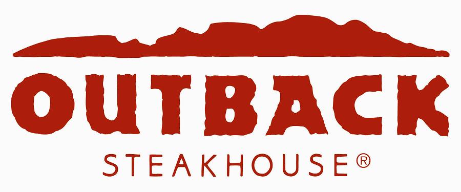
This wordmark of the famous Australian steakhouse Outback, that is now open worldwide, does a phenomenal job of portraying the brand image in the name. The crumpled and irregular typeface of “Outback” and its bold, red color gives an impression of wildness, amazon, and jungle. This is carried on through all of their branding strategies. For instance, their television commercials are usually composed of having jungle, Australia, kangaroo, and wildness as the main themes. Furthermore, the thickness of the typeface also portrays masculinity, which is well paralleled with the actual interior design of this steakhouse.
![]()
Disney’s wordmark is probably one of the most famous of all times. Disney’s target audiences are children, which means the associated values that they want their target to associate with are friendly, fun, exciting, and magical- all at the same time. It’s whimsical and curly typeface gives an impression of magical fantasy, which is exactly what they wanted to portray to the audience. . The roundedness of the typefacess gives an impression of friendliness and warmth. However, the use of the color blue allows Disney to have a balance of both masculine and feminine. If the wordmark of Disney was a feminine or warm color, they could have possibly lost their male audiences.
I love the Outback Steakhouse wordmark because it is so Australian. The letters correspond to the known voice of Jemaine Clement or Tristan Rogers as they do the Outback Steakhouse jingle. The outlines and width of the typeface that is used, and the irregular form that it takes, makes the wordmark look like land, or a continent, floating in the whiteness of the logo, like Australia does in the middle of the ocean. The red is more rustic than bright, adding to the idea of the grasslands and the clay looking land and mountains that cover the continent, which is a smart marketing strategy for the brand of the restaurant.
From growing up on every Disney movie available to man kind, this wordmark will forever be burnt into my mind. As I understand it, this wordmark is meant to be a stylized version of Walt Disney signature itself. Perhaps this is why it is so critically acclaimed and memorable because it stands to represent the company at such a fundamental level. While modern day Disney may have drifted a little from Walt Disney’s original vision, the wordmark that carries the name remains and it is as magical and inviting as ever. The letters are curly and thick and the blue is fun and dreamy. I find it interesting how there is no uniformity with upper and lower case letters. The ‘D’ is obviously uppercase and bigger than the rest, but while the ‘i’ appears to be lower case, the ‘N’ and ‘E’ revert back to capitals. Again this could have been because of Walt himself and the way he originally signed his name.