This gallery contains 20 photos.
20.19. 18. 17. 16. 15. 14. 13. 12. 11. 10. 9. 8. 7. 6. 5. 4. 3. 2. 1.

This gallery contains 20 photos.
20.19. 18. 17. 16. 15. 14. 13. 12. 11. 10. 9. 8. 7. 6. 5. 4. 3. 2. 1.


Through this project, I learned not only how to create layout of digital magazine, but also how to create interactivity, which was really cool and also challenging.
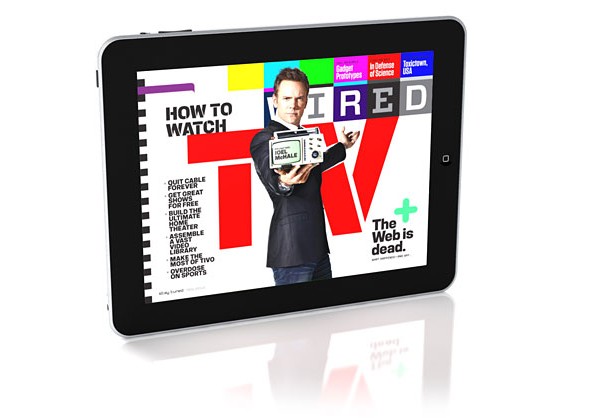
I chose WIRED magazine’s iPad cover. I could not find the vertical version of this photo. The reason I chose this layout is because of its cleverness of the horizontal iPad and layout. The theme of this feature is TV, and the immediate value of association that comes with it is horizontal, rectangular TV. I love how the headlines are unified into one typography that has style that reminds one of technology, IT, and innovation.
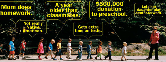
Head: Ethical Parenting
Deck: Is there such a thing? Just ask your children.
http://nymag.com/news/features/ethical-parenting-2013-10/
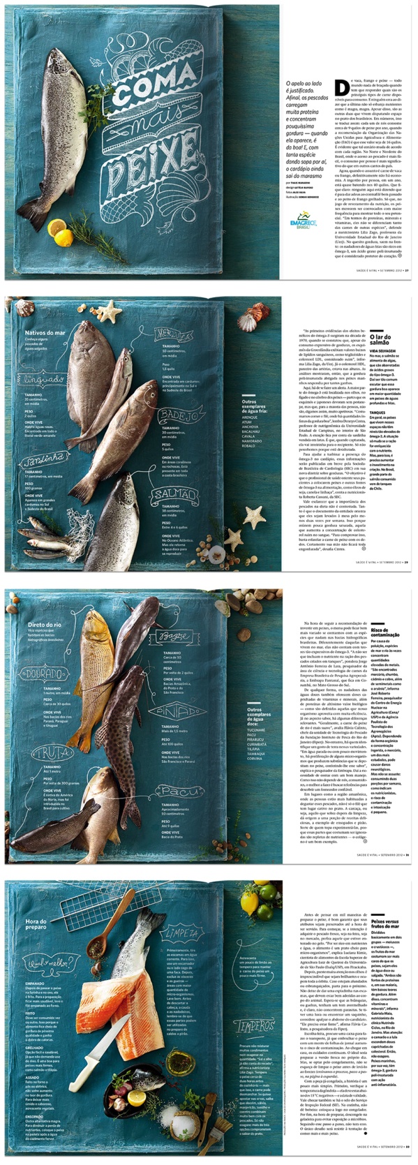
I like this layout especially because of its creativity and originality of using a fabric instead of regular table to display the fish. I also love their use of color, orange, blue (turquois), yellow, and green seems to be complementary and supplementary to each other.

I like to keep things simple. For me, simple = clever = intelligent = universal = effective = powerful. So I wanted to convey the impression that I am of these personalities. The reason why I used lighter color for the “KIM” is to emphasize me as a person “Eunice” more rather than what people may assume by just looking at the last name.
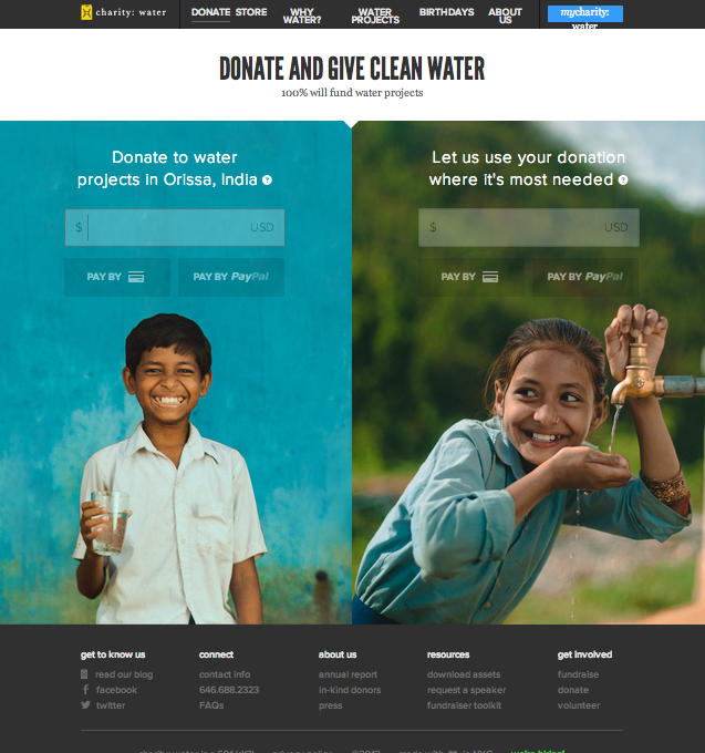
This is the “Donate” page for Charity : Water website. I specifically chose this page instead of the conventional “Home” page because I wanted to to see the organizations use of photography in a page that is the most essential for convincing or persuading audience to take action.
This is the view of the website after I zoomed out three times to get the whole layout of he page. In original setting, the two photos will be bigger than the window itself that I need to scroll down to finish the photo. I love their use of two images of very cute children who serves as the faces of the mission of this organization, and thus very relevant. The use of complementary colors attracts the viewers more to the page and the contents on the photo (donate). Also, the color used for typeface contrasts with the photo that it is very legible. The target audience could be seen as in the wide range of teenagers to seniors. The call-to-action is purposely on the photo so that the message will associate with the beautiful photos, evoking ethos to the audience.
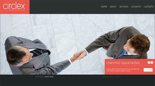
This website uses Gestalt’s Principle- Law of Symmetry. The main image of the web has a element of rotational symmetry because it has a central reference point (the hands) and rotates around the central point. Because of it, the web looks much more interesting, engaging, and attractive to the visitors.