
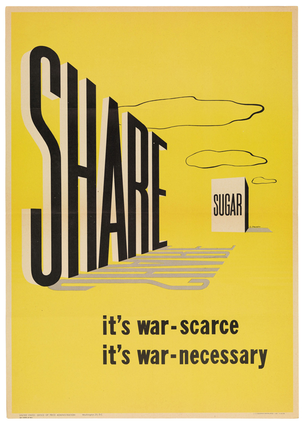
Ahh, World War II: An era of immense nationalistic sentiment. The American war machine needed its various sources of fuel, and the only way to obtain those resources was through the American people. But how do you get all of the mothers of the US to relinquish their sugar needed for scrumptious homemade apple pies? Through excellent use of the visual hierarchy in propaganda posters, of course.
The yellow background of the poster stands out, and brings the reader in from afar. Then, the eyes begin at the word “share” and follow the perspective towards sugar. Even the clouds help provide depth and guide the reader. The shear simplicity of the message and its portrayal in the poster is what makes it effective. It’s also important to note the distinct lack of “patriotic” colors and wording. The poster doesn’t ask for war resources out of patriotism, but rather the “common sense” of giving. There’s no distractions, and no bull. The government just wants some sugar. They’re just simply the neighbor next door.
I agree with Trevor’s insightful review and would only add that I think the bare-bones feel of this poster only helps to contribute to building a feeling of scarcity for the viewer.
I also like the way the supporting lines at the bottom of the poster lack capitalization or punctuation to add an unpretentious air to the tone.
The upper capital “share” draws people’s attention first when they look at this poster. Once people see the “share” may feel curious what kind of thing they are asked to share. Then their eyes will follow the direction and know that is “sugar”. A good design can give people many surprises.