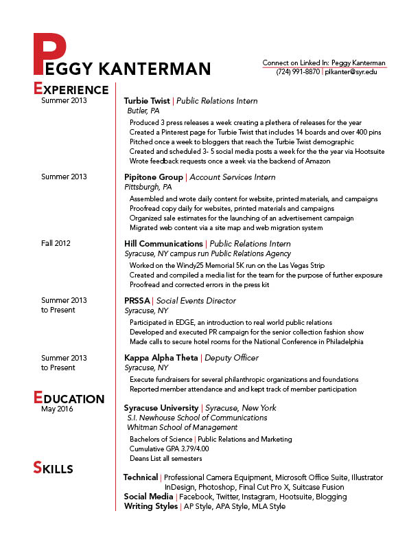
I really like the elegant approach you brought to this project. All the elements really work together nicely. The only thing I would suggest in the future is when using drop caps, or in this case emphasis on the first letters on the left, be careful they don’t spell anything unflattering. It happens to the best of us in the newspaper industry too sometimes. Also I don’t think you need the dates on the left either. You can explain that in the interview. Other than those minor observations I think your project looks great.
I found your resume to be very professional yet adding a bit of personality with the emphasis on the first letters of the headers and the choice of color. I suggest finding a way to space the skills section a little bit more. It seems like it’s squeezed in there. Although grouping it is nice, I don’t think there’s enough space to make it organized like that.