
I have learned so much in graphics class. Every time I look at a website, flyer, menu, etc., I notice the layout and design. I critically analyze the piece, and I take notice of the typefaces chosen and the gestalt principles applied. Before this class, I never considered how much work went into laying out the information we read. Now, not only do I have a new respect for every layout I see, I can also label the principles used and comment on the visual hierarchy. I also learned so much about the Adobe programs that we used. I worked with photoshop a little bit before, but InDesign and Illustrator were totally foreign to me. Now, I am able to work all three programs, and I believe it will give me an edge in the world of public relations. I truly appreciate all I have learned throughout graphics class this semester.
Author Archives: Peggy Kanterman
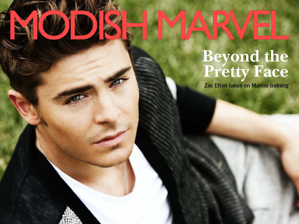
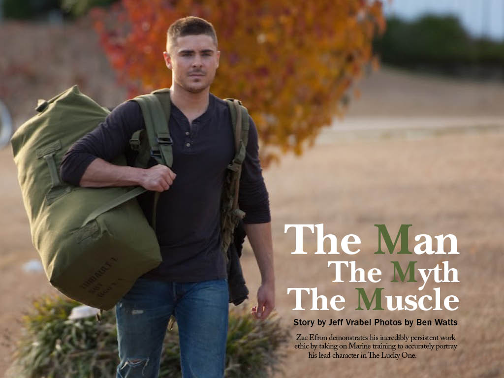
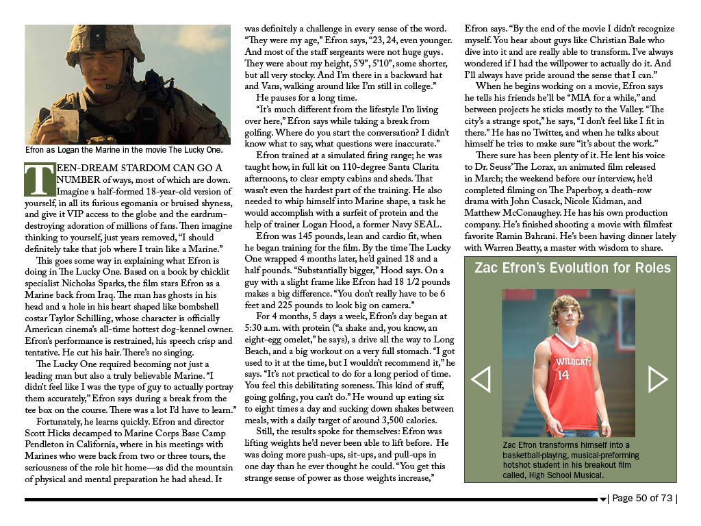
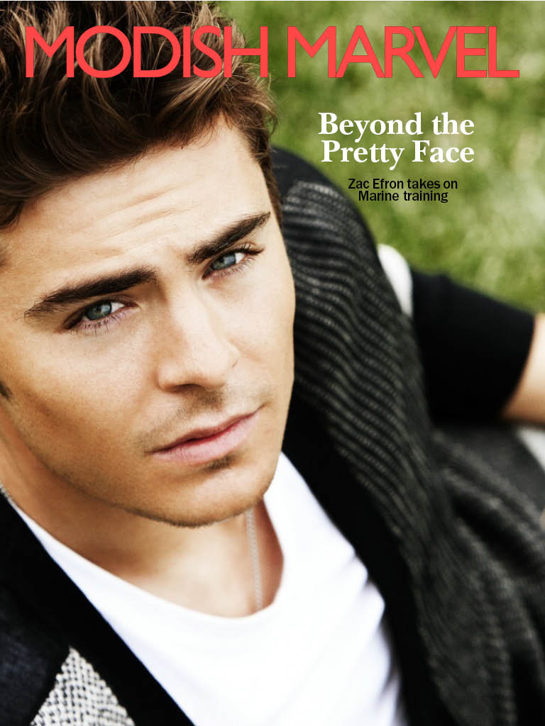
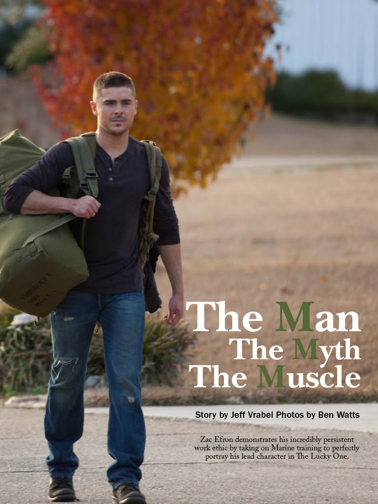
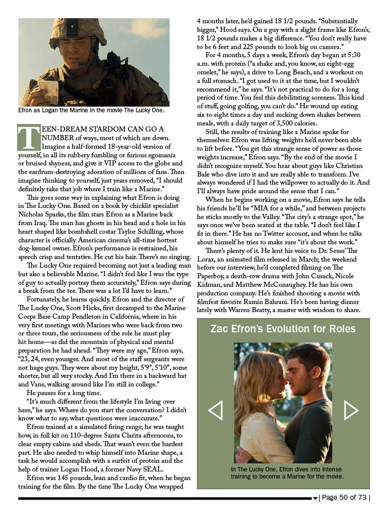
Zac Efron Tablet
In this project I learned how to create interactivity, which was really cool (when it worked).
Solar Storm iPad Cover
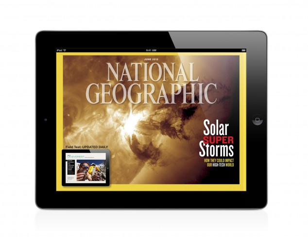
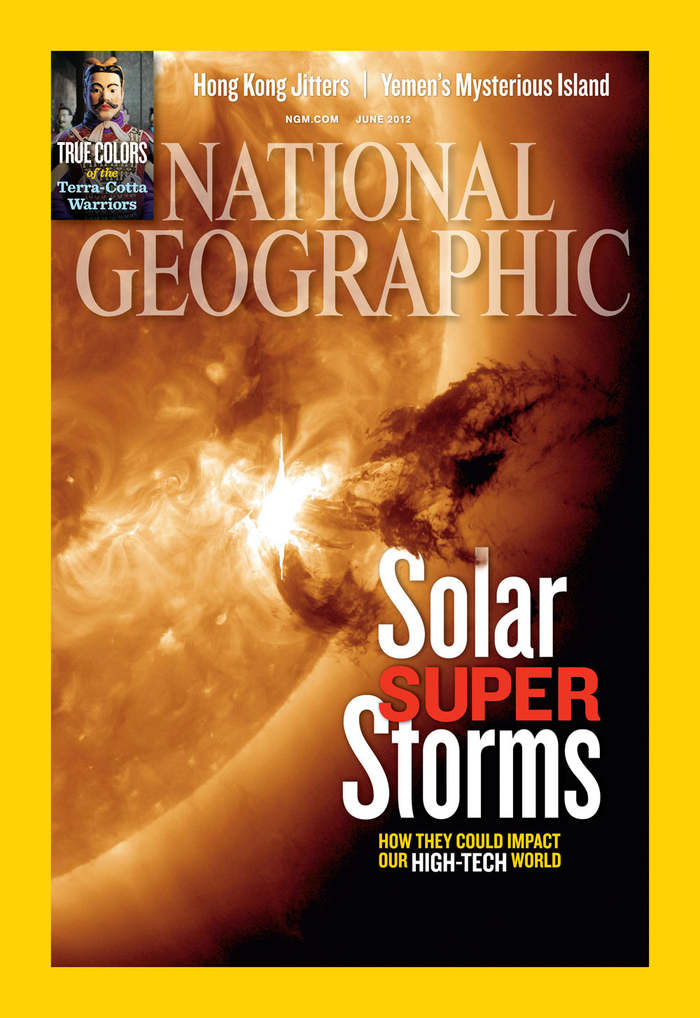
I couldn’t find the vertical version of the iPad design cover, but I did find the print version. I really like the design because the picture is extremely powerful, and the nameplate is cool because it’s opacity is not 100%. There are slight differences between the iPad design and the print. For example the size of the typeface is bigger in print, and the spacing and cropping of the picture is slightly different due to the vertical and horizontal spaces used. I really like how the burst of the solar storm leads to the headline of the article, and I like the leading done on the headline as well. Overall, I really like the cover design done on this National Geographic issue.
Headline and Deck You Can’t Beet
Headline: Don’t Miss a Beet
Deck: Tips for buying, storing, and cooking with beets, which are in season in November.
Retrieved from: http://www.bonappetit.com/columns/in-season-now/slideshow/buy-store-cook-beets/?slide=1
Feature Magazine Spread
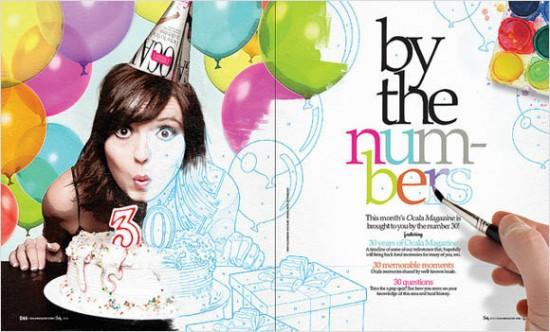
I love this feature spread about being 30. I think the way that the picture starts out in color but gradually turns into a sketch is very fun. I also like the way the hand is then painting in the colors on the headline. My eye is automatically drawn to the headline because the hand is pointing right to it. I also love how the picture overlaps from the left page to the right. It keeps my eyes interested and leads them straight to the text. Overall, this is a very fun magazine feature spread layout.
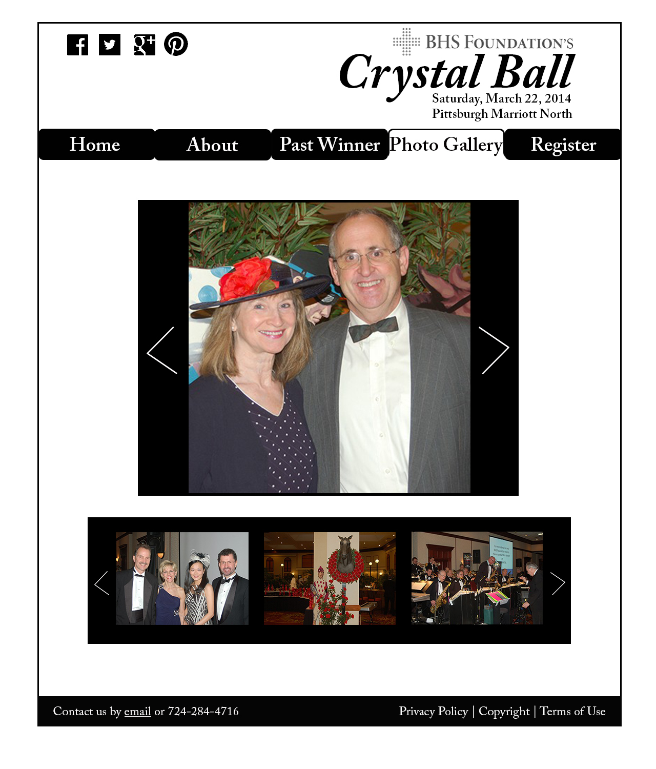
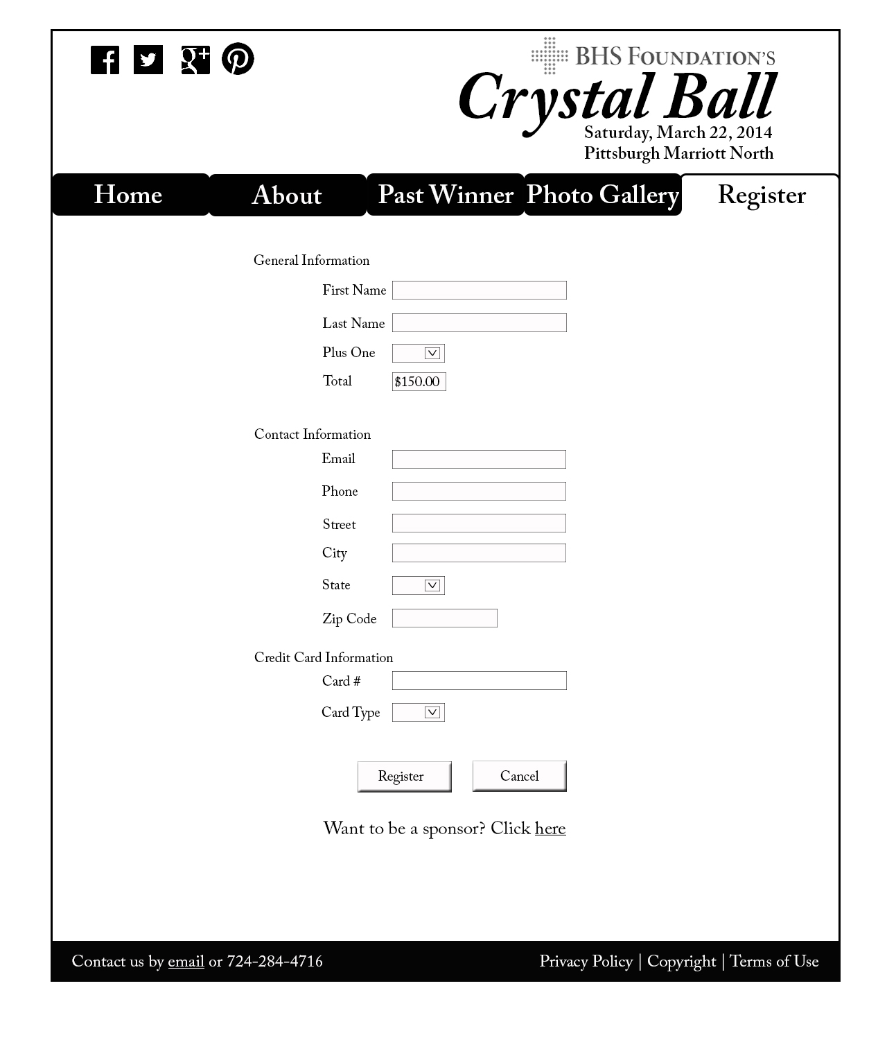
Crystal Ball Website Project
Logo Sketch
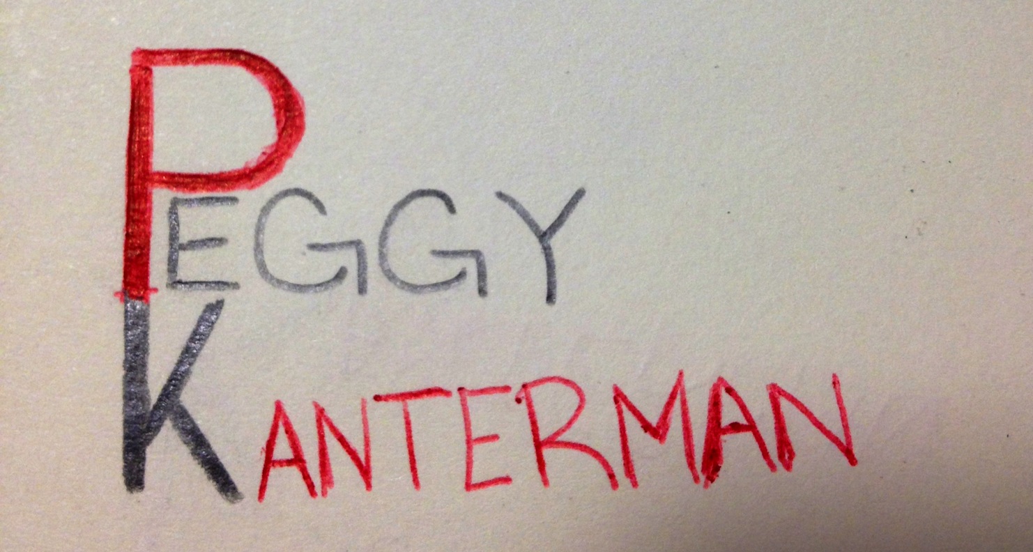
Now obviously this is just a sketch. If I were to put it into photoshop, the text would be straight and the image would be much cleaner. The thought process behind my logo stemmed from my word mark. I used red as my warm color in my word mark and in this sketch of my logo to draw attention to my name. I connected the P and K for stylistic reasons, but to ensure readability, I used black for the K. I also made the P and the K more bold than the rest of my name to draw attention to my initials. I wanted to keep my logo as simple as possible, and I felt this arrangement of my name was the best way to do so.
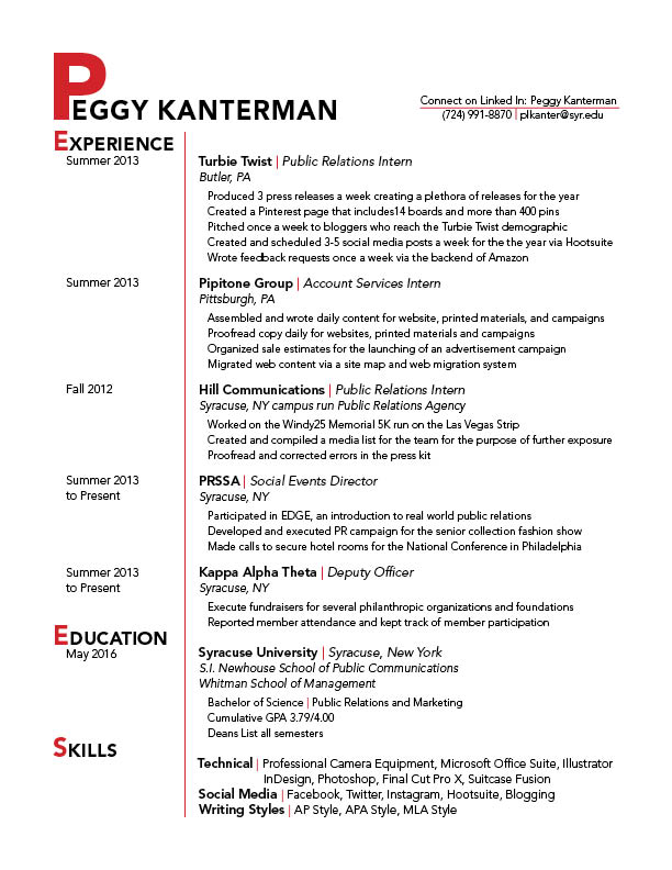
Redo Resume
Sweet Picture by Sweet Basil
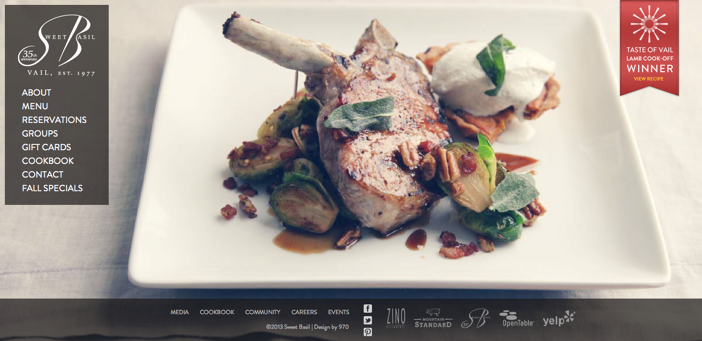
The photo on this website was used to give the viewer a sense of the restaurant. It is apparent by the appealing visual presentation, that the restaurant serves upscale food. The target audience is people who can afford and are willing to pay for an expensive/luxurious meal. The designer chose this image to entice the viewer to make a reservation and come to the restaurant. The visual works really well with the content on the page as well. The bone on the lamb points to the navigation and directs the viewer’s eye to the information about the restaurant. The footer is appropriately placed below the edge of the plate. This is an excellent use of a photo background; I know I found the food very enticing.
Kit-Kat Gestalt
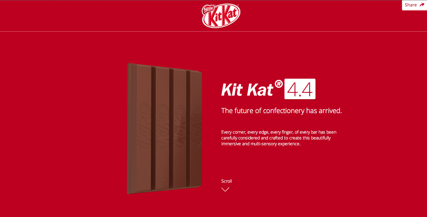
My love for Kit Kat aside, this website applies many gestalt principles. The Kit Kat bars stand out clearly from the background due to the color difference and three dimensionality aspect. The colors are very consistent on the page. They stick to the classic red and white colors that are associated with the Kit Kat brand. The font is aligned well and gives the look of an organized page. Lastly, the hierarchy is very apparent and visually appealing. The words at the top are the biggest, most bold, and italicized. The following line is much smaller and the following block of text is the smallest. Overall, this page is very appealing and applies the gestalt principles very well.