
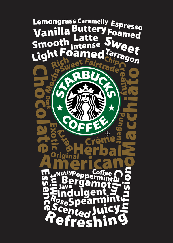
I really like this typography poster designed for Starbucks. It is a very smart design that the words are combined as a typical Starbucks’s coffee cup. The upper and lower words are white color, while the middle ones are brown color that implies the cup sleeve. The typeface of the words should be sans serif grotesque. Creatively, all the words are about coffee, like “Macchiato”, “Vanilla”, and “Foamed”. And the logo at the middle of the “cup” is bright and impressive, which gives people a clear idea that this is a Starbucks’s poster.
You know in looking at this, my eyes went straight to the thing that I would want. A vanilla latte. I like the effect of words where you mentally look for the thing you want the most.
I just like the simplicity of the typography usage here. One typeface, two colors and multiple sizes all com together to create a clean image.