Mexican Prints and the Taller De Grafica Popular

Although I am not very familiar with Mexican culture, the exhibition did give me an unforgettable experience. This exhibition shows the influential graphic work of the artists that shaped 20th century Mexican art. The works are all about revolutions and wars, some are realistic while some are satirical.

photo (1)

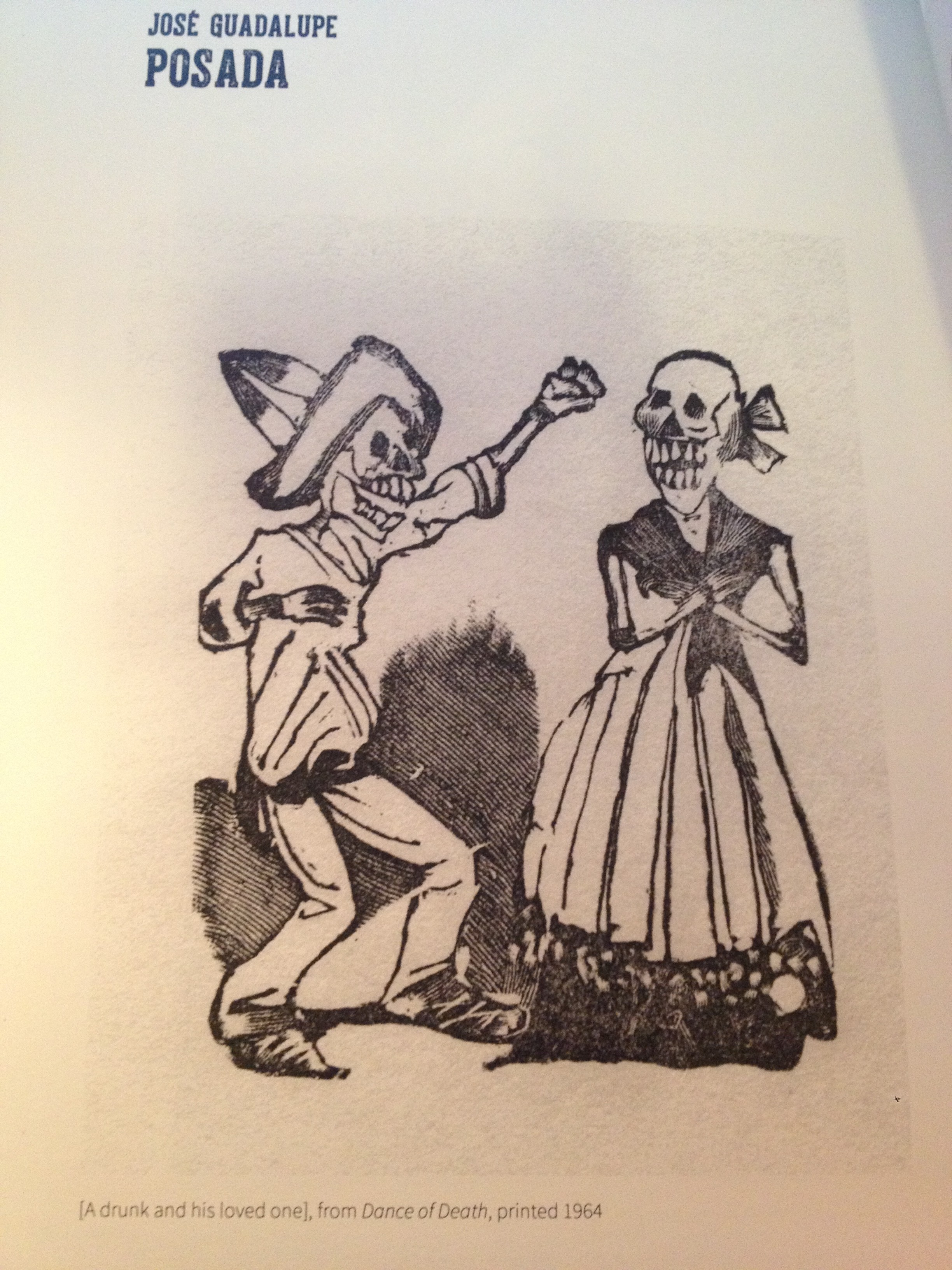
The works created by Jose Guadalupe Posada are one of the most impressive. The whole series of this image is consisted by several small cartoon illustrations. Because the images are small, when I first saw them I just thought those images were so cute. However, all “cute people” are skeleton, which shows satirical acuteness and political engagement. Posada was the cartoonist illustrator and artist whose work has influenced many Latin American artists and cartoonists.

What I have learned

The most useful things I have learned from this class are how to use InDesign, Illustrator and Photoshop. Although I am not very satisfied with all projects I have done, I really appreciate that I have my own profile right now as a communication people. I also can do many poster and image editing right now for my own interests and for my internship. In addition, this class gave me a great amount of knowledge about graphic designs and opened a new field for me. It is very interesting that I often think about typefaces, visual hierarchy, colors and etc when I see somethings on the street right now. Overall, this class is one of the most interesting and useful classes I have taken in SU!

Time of Steve Jobs

time-jobs-cover jobs_time

On the left side, it is an iPad cover of Time magazine with Steve Jobs. Steve Jobs’s eyes are look at us, strongly dragging our attentions. “Time” is on the top, covering half of Jobs’s forehead. The visual–his bright face works well with the black background.The feature story’s cover line is at the left bottom, white and bold. Two lines of deck are lower with smaller fonts. This design works well because of strong visual hierarchy.

Compared to the iPad cover, the print cover is a little bit different. It includes four other cover lines on the top, and a barcode. I like the iPad cover more because it looks more succinct


Head and Deck

cover-story-sandra-bullock-03_08550473291.jpg_article_singleimage

Head: Sandra Bullock Becomes Weightless Burden in Fame

Deck: Sandra Bullock increased her fame in Hollywood, after her highest grossing film Gravity

Link: http://www.vogue.com/magazine/article/lift-off-sandra-bullock-gravity/#1

Magazine

ba1301b5994931c1582e3d3064e11785


I think this design is perfect. The color of the title and the girl’s dress are consistent, which works very well. This color scheme–yellow, grey and black–is bright and comfortable. Also, the visuals on the left page are triangles shape, while the dress of the girl is designed as the similar shape as those visuals. On the right, the words and the visual combine together creatively. The girl’s eyes lead readers to the beginning of the paragraph. Overall, this design is smartly, using similarity skill.

Logo

Screen Shot 2013-10-26 at 9.52.24 PM


I designed the logo in InDesign. The words are my wordmark in the resume. I like the different pt dots lines because they shows inspiring, creative and energetic characteristics. Pink is my favorite color, so I used it for my last name and dots line.I was inspired by the logo of Sparkpr Firm.

Photo in Web Design

Screen Shot 2013-10-18 at 11.15.33 PM Screen Shot 2013-10-18 at 11.15.44 PM


This webpage is about corporate entertaining. The Whitney Museum of American Art encourages corporations rent their places to hold events. Those photos work very well. The target audience are corporations which are going to hold various events and finding places. All of the photos show gorgeous rooms with luxuriant decorations. All of them are very attractive. The biggest one shows the scene of cocktail party from a high angle. It is unique and gives people a sense that they are monitoring the party as a planner.