
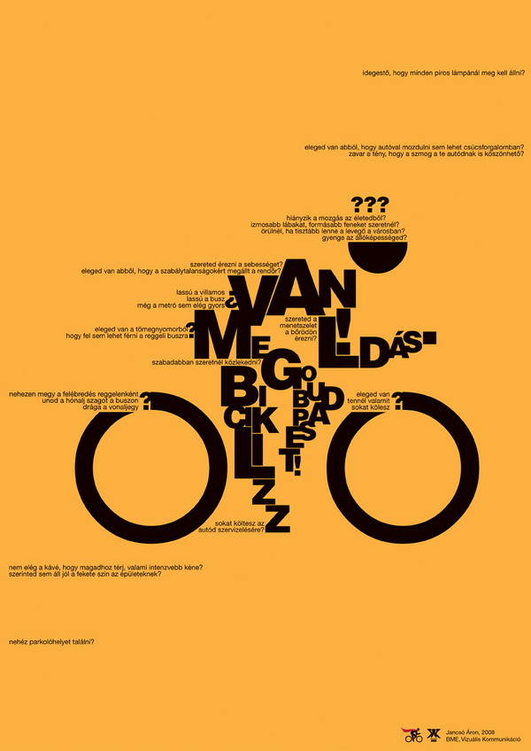
This poster cleverly uses typography to give the essence of motion. I like how it is a recognizable figure yet still abstract. It effectively uses the type’s size to create form, especially the very small type to invoke speed. The design is simple and has nice contrast against the yellow background.The giant “O’s” as wheels draw the viewers eyes in but do not distract from the whole image over all.
I love the blurring effect of the bike, and how each word gives you a mental reminder of what you are looking at. The challenge of biking.