
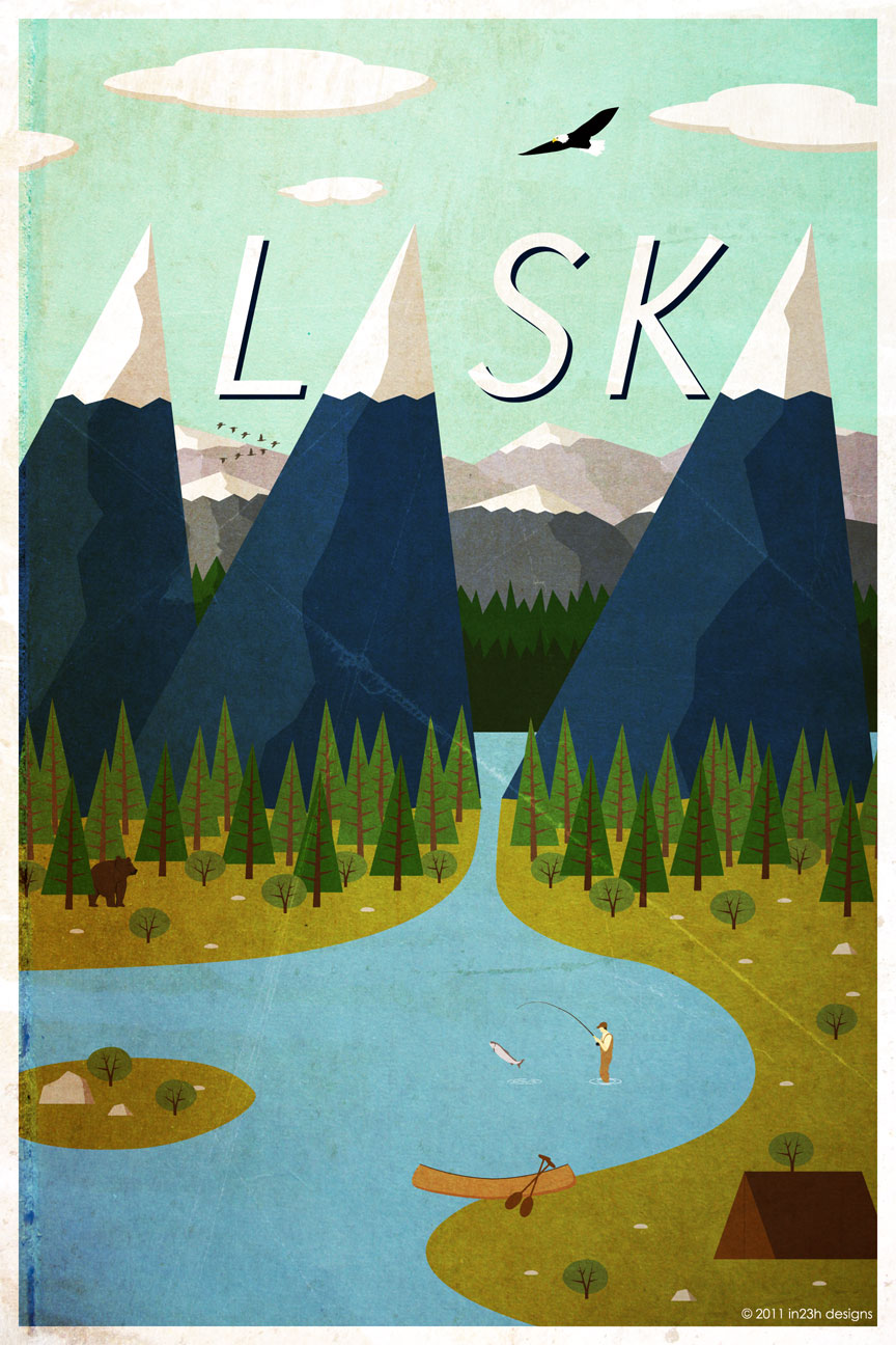
This is a Alaska travel poster made with Adobe Illustrator. It is a very linear design, so I assume the designer used the line segment tool to create the mountains, trees, tent etc. They probably used the arc tool to create the lake, the island, and any other rounded objects. I am sure the designer created only one mountain and one tree and duplicated them and changed the colors. They added dimension to the mountains by adding highlights and shadowing just by making one side of the mountain a darker shade of blue. They also made the mountains and trees in the background smaller and with less detail to create depth. They cleverly positioned the mountain peaks to be the “A”s in Alaska. The other letters were created with the type tool and given dimension with the dark shading behind them.
Smart design! It definitely sells as I’m very eager to visit Alaska after seeing this poster. The designer has used pen tool to outline the river. The designer also duplicates the trees and mountains and place them at different places. One more notice, trees closer to viewers are in deeper color, which introduces dimension.
I’ve always loved this form of cell-shading. That was really inventive with the use of the mountains to illustrate As. That and the fact that image is layered where you could get lost in all of the information on the page.