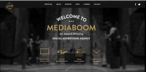
I really love this website design. The darkness of the background contrasts excellently with the white and gold colors used for the type. I also really like the way the overhead lights in the background frame the type on the page. It looks as though the lighting comes from the tabs at the top and then as it shines down and widens its scope of light, the type on the rest of the page fills up that lightened space. I also approve of the way the picture is blurred in the background; it allows the viewers eye to be focused on the clear type of the page.
I find the visual hierarchy on this website design to be very effective. My eye naturally focuses first on the largest size type of the most important word, “mediaboom.”The san-serif typeface is easily readable, and layout of the type is playful and interesting. The links with the visuals at the bottom of the page do a great job of capturing my attention. The visuals allude to the information that will be described on the different pages, and they are neatly organized at the bottom of the page. Overall, I feel this website design is organized and visually appealing.


I like this web design. The only colors used are white, black and gold; yet the website doesn’t appear plain or boring. The arch “Welcome to” adds some movement to this site. I also like the placement of light, which makes the setting look very real and vivid. The website, in general, looks very classic. Like Peggy mentioned, the website also has a clear visual hierarchy, achieved by the use of texts in different sizes.
I really like the color scheme in this website. The simple colors, as you mentioned, are eye-popping yet lead the viewer to the main idea of the website. The arch “welcome to” helps frame the other main words and adds to the visual hierarchy, along with the different type sizes. I also like how the background is blurred, keeping the text visible and easily readable, yet making it interesting. All the information you need is found on the front page, too. Good choice.