

Category Archives: week6post
The Whitney’s Website and Gestalt Principles
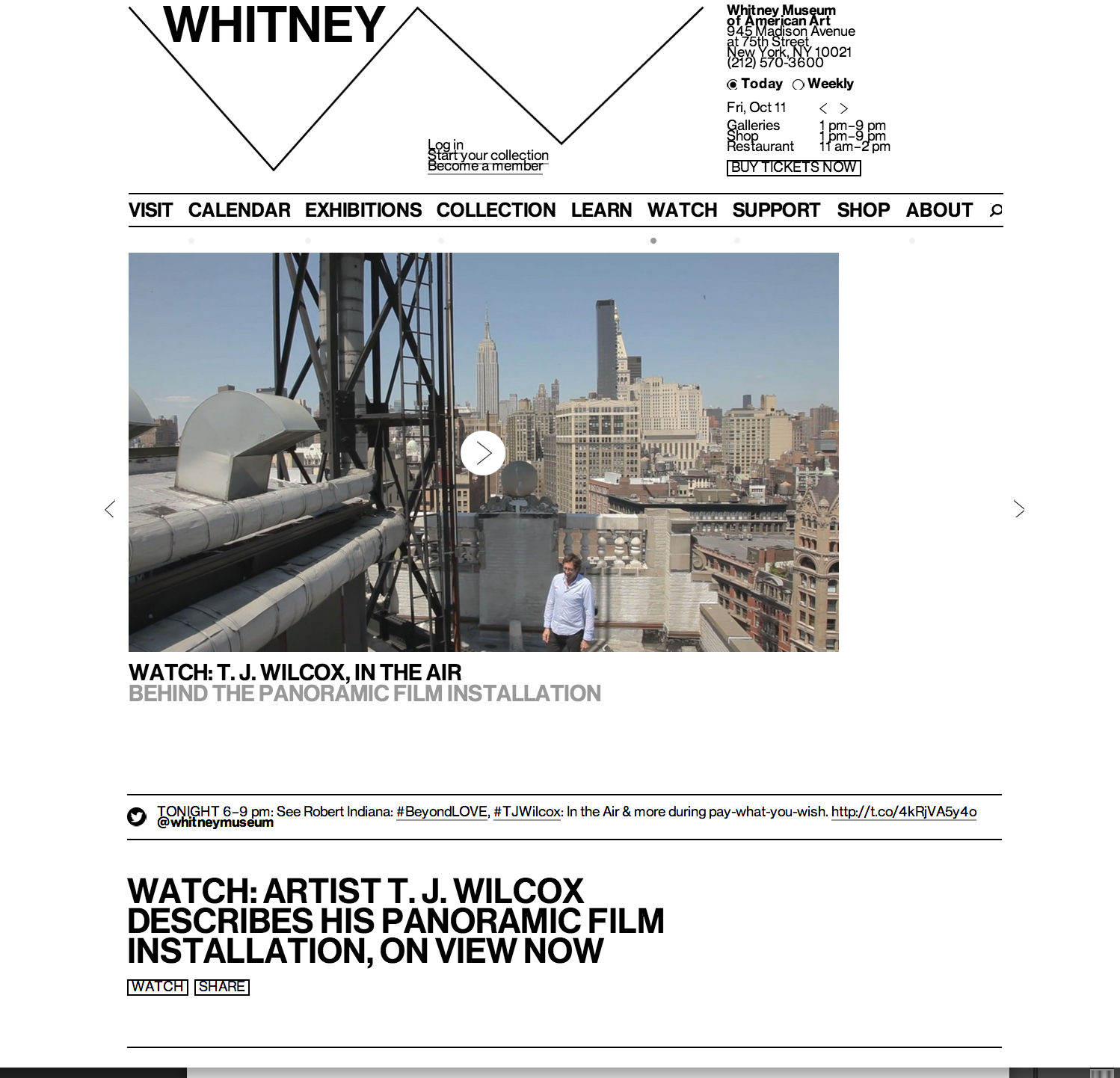
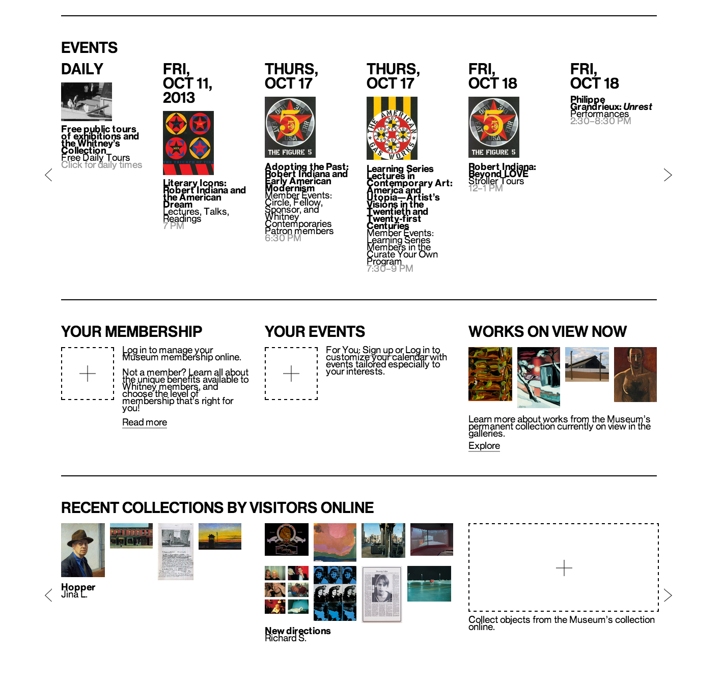
This website was newly published by the Whitney Museum of American Arts. I think it serves as a good example for other museums how to make pages readable and clear. It uses white color as a background and black color for most words, and the visuals are very colorful. Hence, it is such a great contrast that objects can easily stand out. We can see that it groups information well under the “EVENTS” column. Top is dates, middle is visuals and bottom is the name and other information. White space is between each event. Each group of information can be clearly consider as a unity and separate with each other. Regarding visual hierarchy, the website uses the same font but different colors, different sizes, bold or regular, and upper or lower cases. For example, it uses black color, bigger size and upper case for the dates in EVENT column, while uses smaller size and lower case for the events’ names. And it uses grey colors, for the least important information—the time.
SRCOM – Website Design
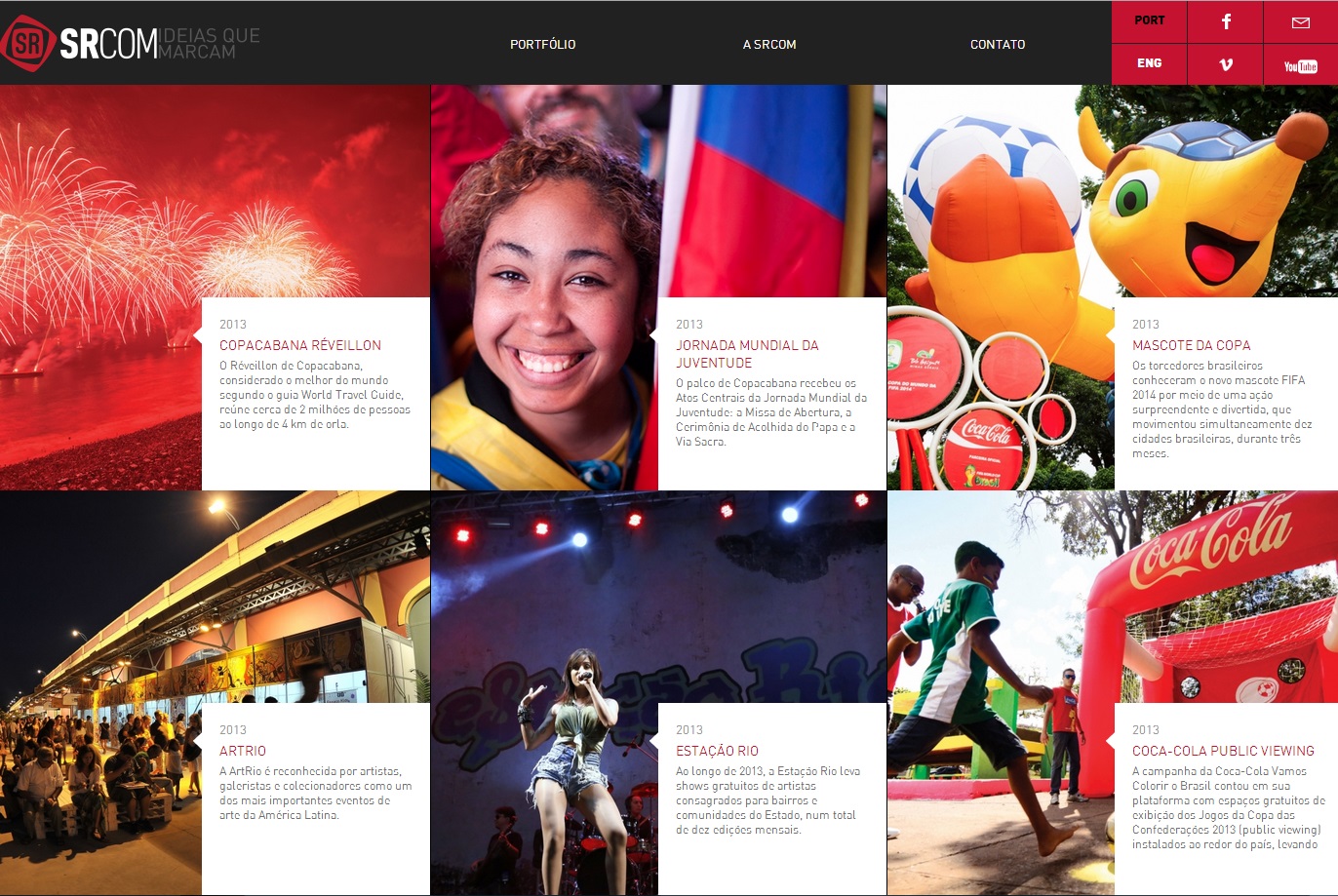
This website proves that web design is a universal language for communication. Despite being in Portuguese, even an English speaker can understand the importance of layout. Boxes may seem initially unappealing in regards to web design, but they can also be the most effective. In separating the text and emphasizing the important parts of the pictures, the web design has a successful visual hierarchy. The eye prefers visuals over text, and managing the layout greatly improves the viewer’s willingness to read the text.
100 McDonald’s Moments
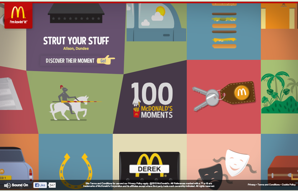
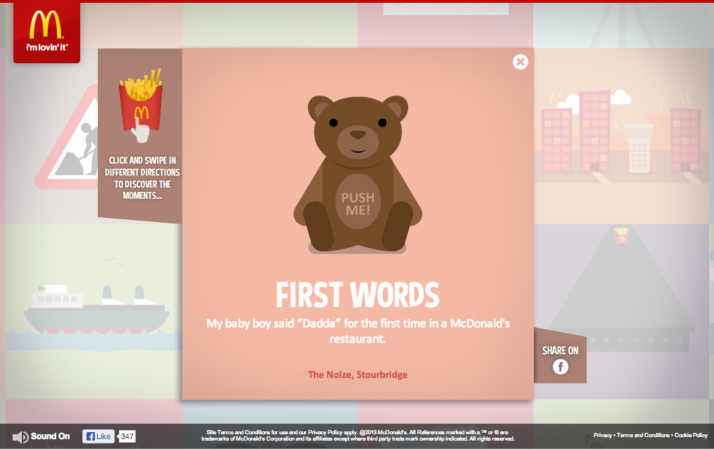
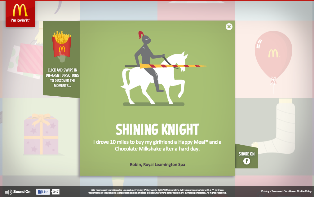 I chose 100 McDonald’s Moments as my favorite website because of its effectiveness in engaging the audience, showing brand personality, and and also enhancing brand image.
McDonald’s did a fantastic job of creating a web site that is purely created by engagements of its consumers. With the valuable anecdotes that consumers have sent, it raises the credibility and authenticity of their message to a whole new level.
Their use of color, gif motion, grid format, and typography are all fun, colorful, and original and it conveys the personality of McDonald’s excellently.
A Booming Web Design
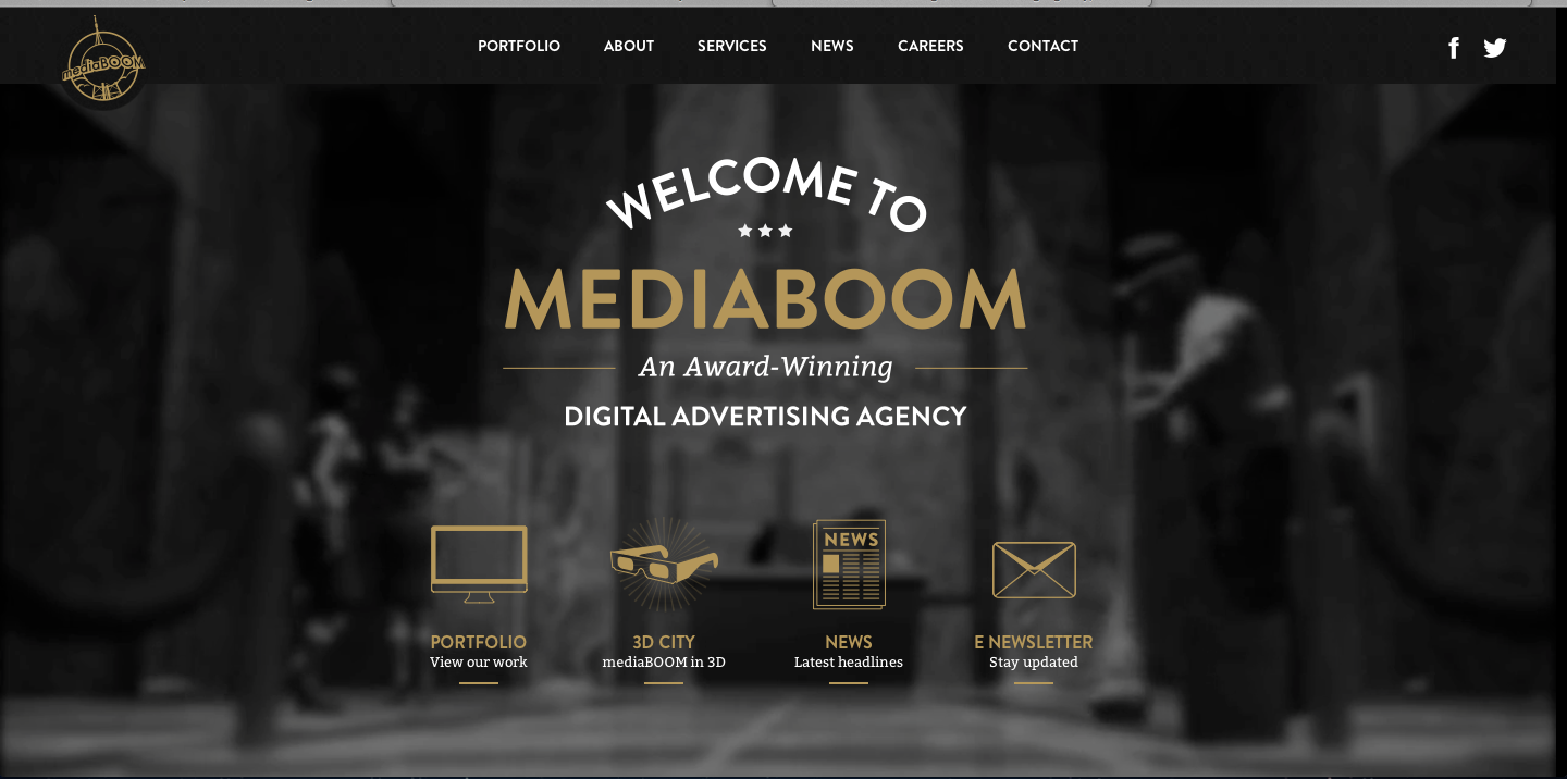
I really love this website design. The darkness of the background contrasts excellently with the white and gold colors used for the type. I also really like the way the overhead lights in the background frame the type on the page. It looks as though the lighting comes from the tabs at the top and then as it shines down and widens its scope of light, the type on the rest of the page fills up that lightened space. I also approve of the way the picture is blurred in the background; it allows the viewers eye to be focused on the clear type of the page.
I find the visual hierarchy on this website design to be very effective. My eye naturally focuses first on the largest size type of the most important word, “mediaboom.”The san-serif typeface is easily readable, and layout of the type is playful and interesting. The links with the visuals at the bottom of the page do a great job of capturing my attention. The visuals allude to the information that will be described on the different pages, and they are neatly organized at the bottom of the page. Overall, I feel this website design is organized and visually appealing.
Niko’s Greek Taverna Website Design
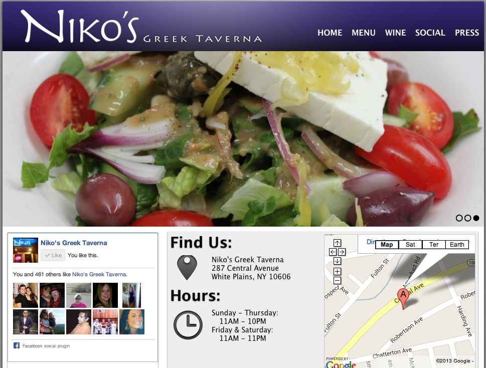
I absolutely love this website design. It’s clean, appetizing and easy to navigate. The name of the restaurant, Niko’s Greek Taverna, is right there in the top corner. Then, on the navigation bar, there lists home, menu, wine, social and press. These are all links that customers want to have access to before dining at the restaurant. Next, there is a picture flow; the screenshot is stuck on the salad photo, but there are other photos of a fish dish and people happily dining. In addition, on the home page there is a Facebook section, which allows people to “Like” the page right there and even see how many other people “Liked” the page as well. Furthermore, there is the restaurant address and hours of operation, which is super important because it is a common reason why people go to website pages in the first place. Lastly, it does not show on the screenshot here, but there are links to Niko’s Greek Taverna’s Facebook, Twitter and RSS pages.
http://www.nikostaverna.com/
High Performance. Delivered.
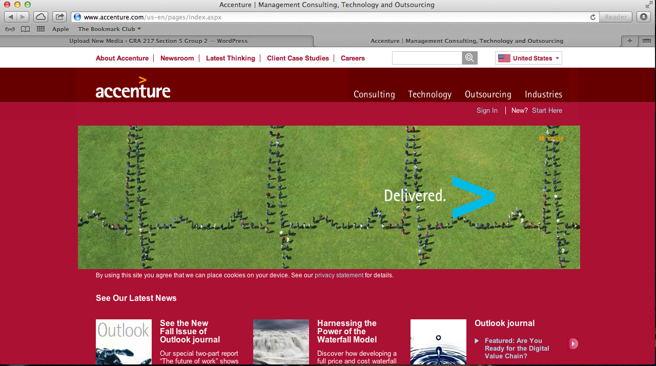
I am very biased in this post, as my parents work here, but whatever. I like Accenture’s website design primarily because of the scrolling visuals that are always present on their homepage – with the clients that they represent and their logo, the accent mark (ahem, hence ACCENTure), moving forward, etc. The links to different aspects of the website are clearly defined, and contrast with the colors of the backgrounds they are on. Red is a warm color, thus standing out to whoever is viewing the page. Also, at the bottom of the screen, there are short snippets of information as the “latest news” section of the homepage. Not included is the very bottom of the website, which includes social media such as Facebook, LinkedIn, Twitter, YouTube, Google+, an RSS feed, podcasts, blogs, and much more. It’s a very clean design, emphasizing the modern and advanced nature of the services one could get by working with Accenture.