
I personally like this web design very much. I think it is a good example of how Gestalt principle (similarity, continuation, proximity, closure and figure/ground) is applied.
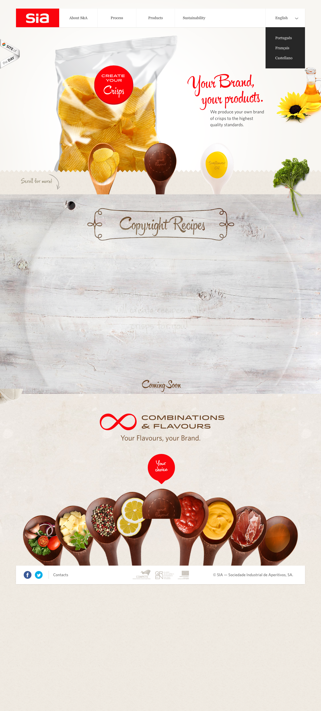
For example, through the use of “containers” all in spoon shapes throughout the website, the designer nicely introduces similarities that make the website look very organized. The background color is clean, which makes objects in the foreground stand out. The website also uses very effective visual elements, especially the image of chips whose reflections add huge dimension to it and make it pop out.
I also like the typeface the designer has chosen, which looks really neat, clean and relaxing.
I like the visuals on this web design. The bottom spoons are interesting, and they also point to the text. As I glance at the page my eye is naturally drawn to the text in the lower middle, thanks to the visual. I also really like how the color red is carried throughout the page. It starts at the top left and can be spotted throughout the page down to the bottom middle. The color adds consistency to the page while also making certain points standout.
Jingai, I don’t feel the same way. I feel as if this website is too clustered and thus, ineffective. There is too much going on on the page. This being said, there seems to be no level of hierarchy. It’s hard to make out what the images on the bottom of the page actually are; Are they spoons with food in them? It is unclear. The one thing that I do like about the website design though is the color of the page. It’s off-white, subtle, and leaves the rest of the attention for what is placed on top of it.
I really like this web design especially because it makes what is normally seen as “deceiving” and “unhealthy” seem transparent, true, healthy, and clean. It is definitely a new approach for snack products.