
This has been not just a fun class but very rewarding in terms of what I’ve learnt. The most important thing I learnt is to think critically. Before taking the class and doing the projects, I hardly paid much attention to visuals — I saw them everyday but never thought of them CRITICALLY. The class has helped me foster such notion. Also, I enjoyed designing with Photoshop, Illustrator and InDesign. The process has made me a better observer, thinker and design practitioner.
Author Archives: Jingai Xu
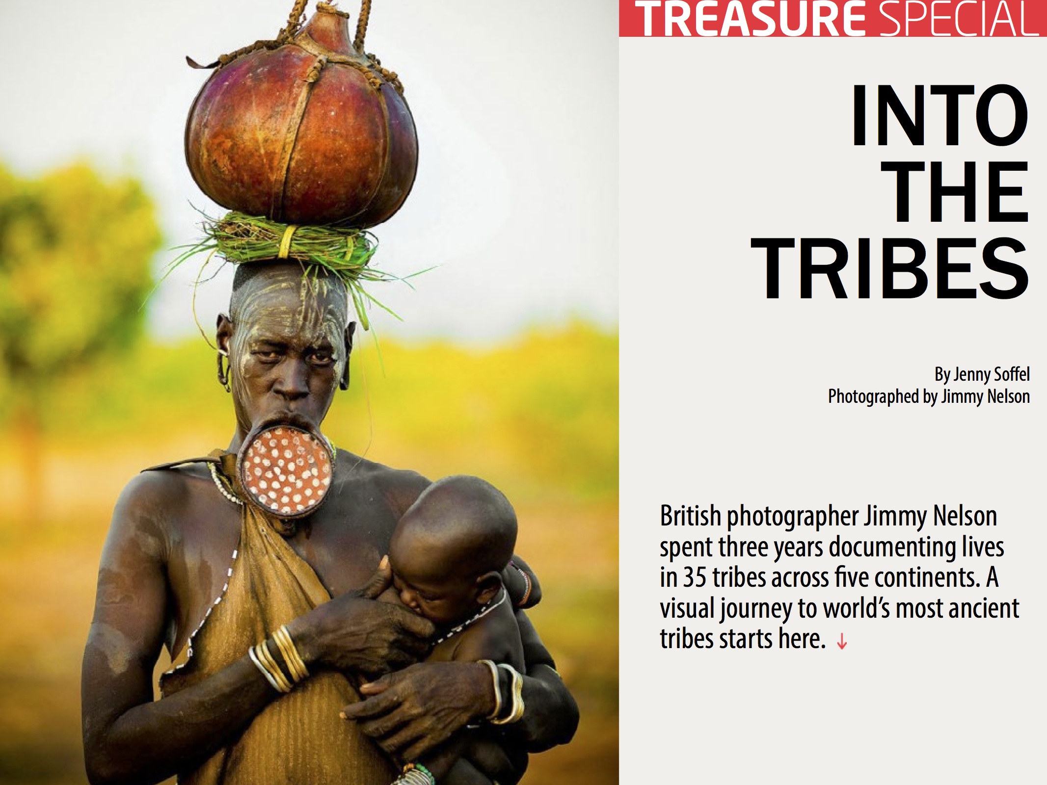
iPad project
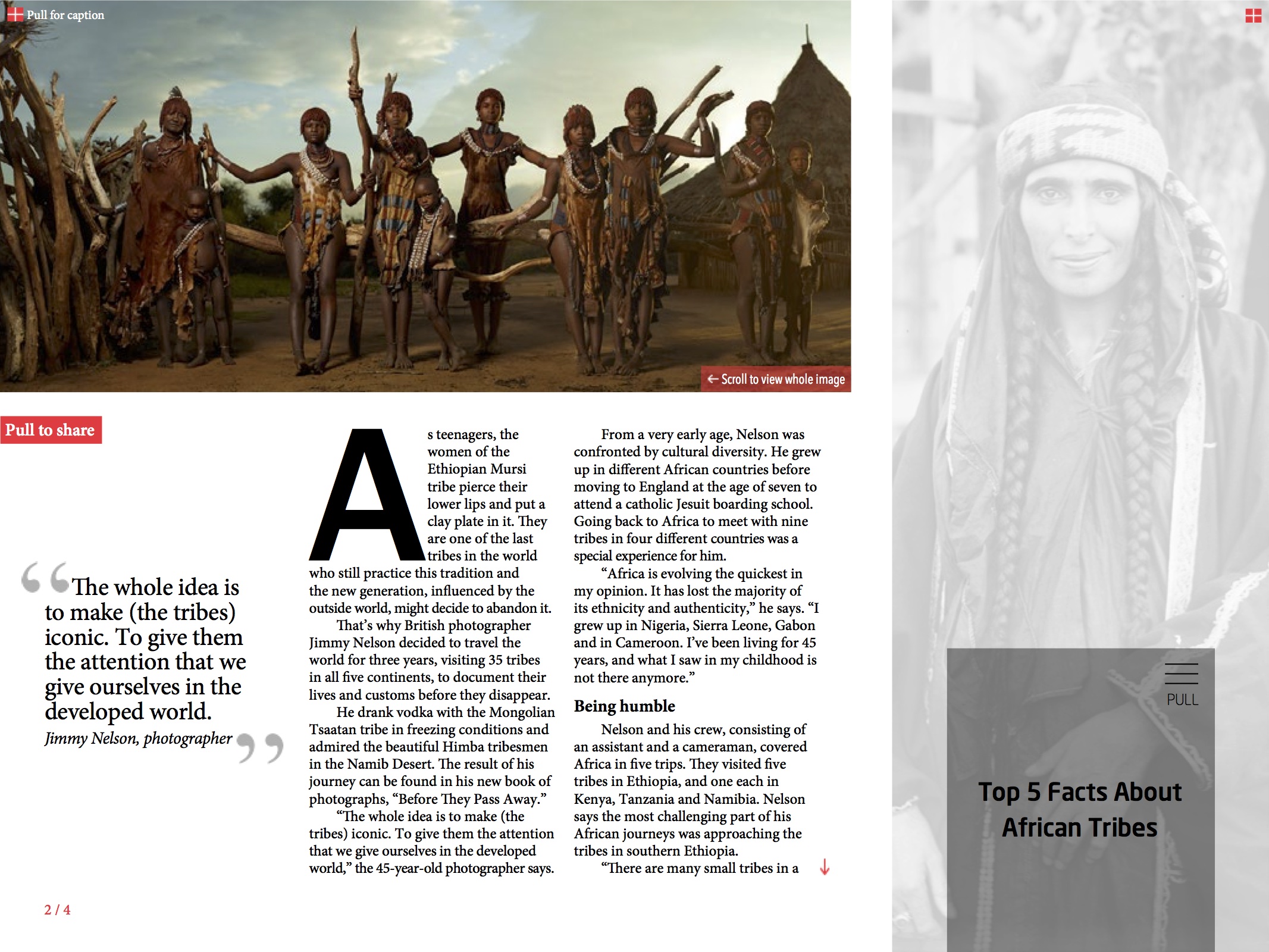
It’s great to have learnt creating interactivity using folio overlay in InDesign.
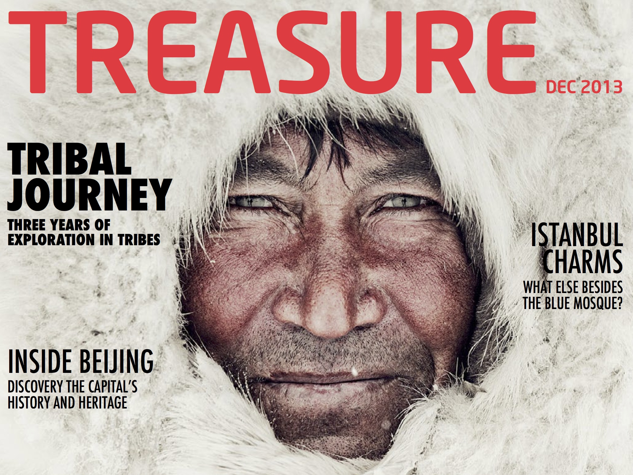
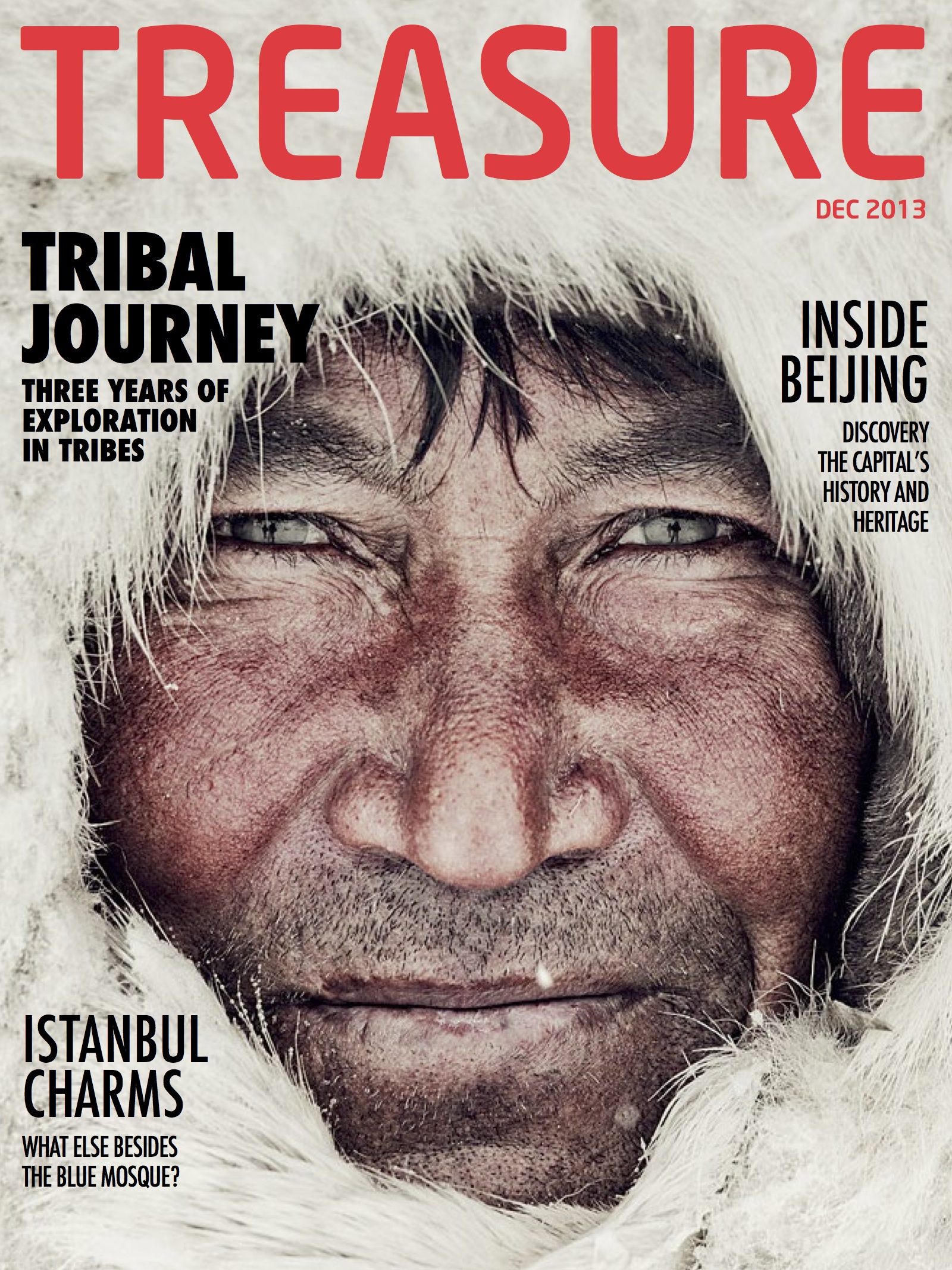
Ipad Magazine Cover
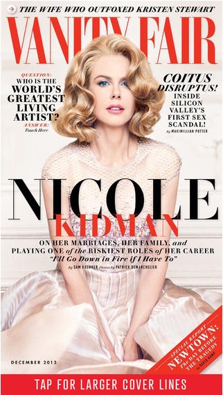
This is the cover of Vanity Fair Ipad version. The photo is smartly shot and chosen, where Nicole Kidman looks directly into readers’ eyes and connects with readers perfectly. Symmetry doesn’t always work well but in this design, it looks great — with the photo at the center dominating the cover, any asymmetry would break the balance; however, symmetry like we see in this design avoid such imbalance. The colors are kind of simple but the combination of red and black, for most of the time, if not always, is very effective and eye-catching. Also, with Nicole Kidman slightly leaning over, the line “Nicole” is made even more prominent — very smart design.
Hed and Dek
Headline: Dancing with Lobster in the Forest
Deck: Immersive, magical and spiritual — French chef brings surprising dining experience to Shanghai foodies.
http://tmagazine.blogs.nytimes.com/2013/08/23/shanghai-surprise/
Website Design Project
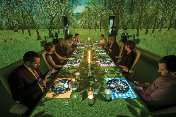
Magazine spread
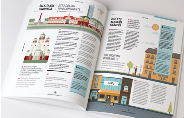
This magazine spread looks fantastic. It looks fun, casual yet very organized. Visuals definitely stand out and catch eyes. I like how the designer positions the visuals, which is really very well balanced. Also, colors in the visual work effectively as well. Red and green dominate the left side page while yellow and blue dominating the right half. Such color combination is smart — it sets the two pages apart automatically, which corresponds to the texts. The red dots throughout the page looks fun as well and introduces “similarity” that appeals to eyes.
![]()
[This is just a sketch.]
Black and white is my favorite color combination, which suggests simpleness, classics and a bit seriousness, as my major journalism requests.
Coming from China, I’m always looking for a way to showcase my bilingual writing skill, which I found could be perfectly revealed in this logo — I put both my English name (Anita Xu) and my Chinese first name (bottom left) here. Also, black and white indicates the Chinese philosophy of “yin and yang,” something that powerfully controls the balance of nature. Literally, “yin” could represent female and anything that’s slow and soft, while “yang” representing the opposite. With three quarters in black (“yin” being overwhelming in this case), this logo also corresponds to my gender.
I’m keeping looking for typefaces that will work well with the information I wanna transmit — probably something genuine, classic and a bit ancient.
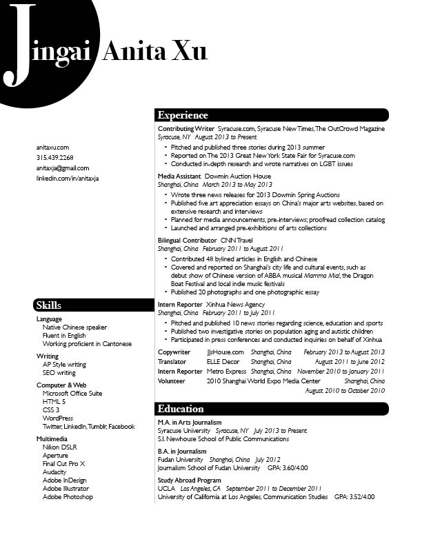
New Resume
Photos in web design
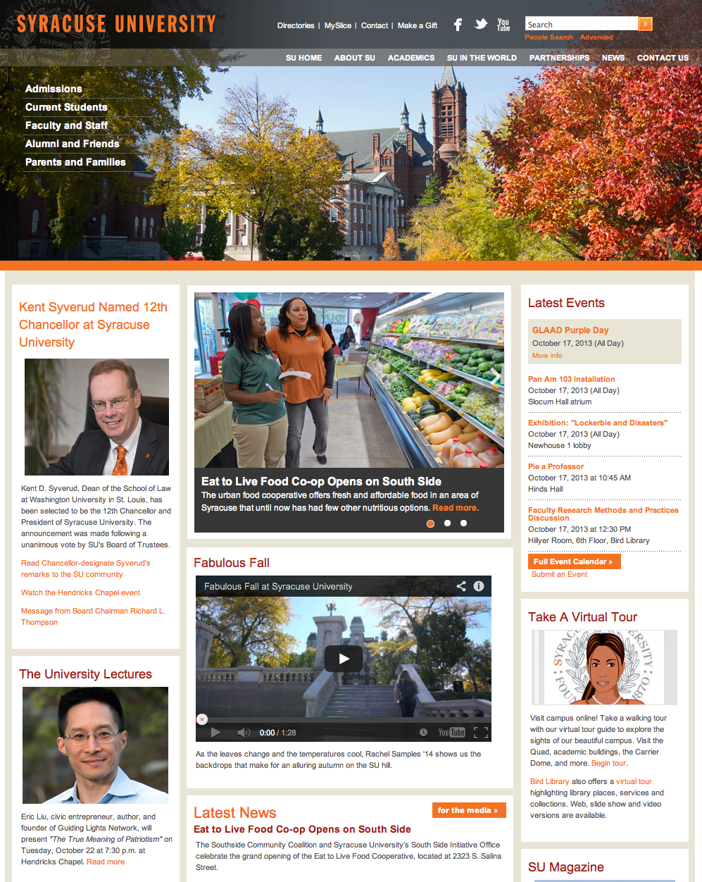
This is the homepage of Syracuse University’s official website. Photos are used very effectively on this page. The big picture in the header shows the current season in Syracuse, giving readers a sense of what the place SU sits looks like. Also, the picture blends greatly into the navigation bar. Pictures on the left side are also very effectively used, considered the text information it provides. Headshots in those pictures are clear — the background is blurred, making the subjects popping out. Also, picture in the main section also looks great — the photo is sharp; it has rich colors in it, which makes the photo look fun and interesting. It also relates closely to the story it is covering.
Gestalt Principle — The New Yorker
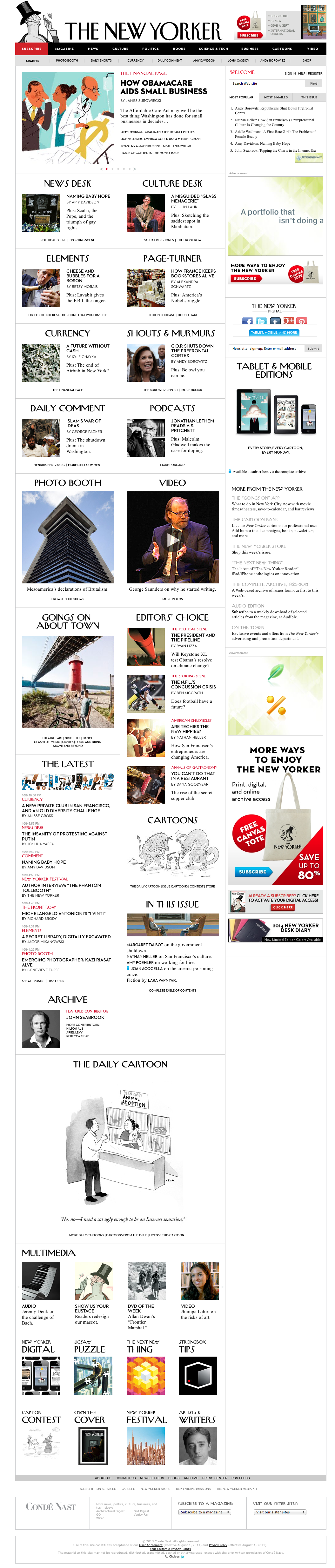
The New Yorker website is definitely among those well-designed news websites. The Gestalt Principle is applied throughout the site.
- proximity and alignment: achieved through dividing content into two/three columns and align them neatly.
- similarity: through placing images in square shapes of the same size within each section; same typeface among each section; unified format in each “story box”, following the rule of headline-author-brief summary-section name.
- visual hierarchy: achieved through smaller intro texts following bigger headlines; also achieved through use of difference sizes of images.