

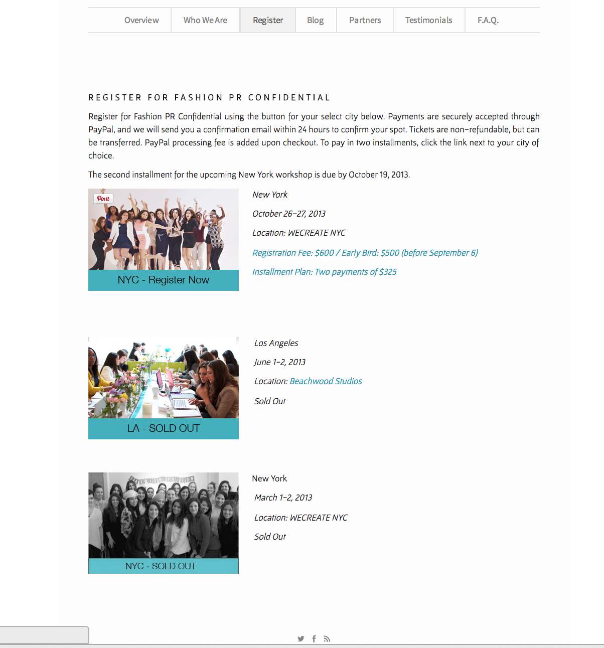

This is a website for promoting a 2-day crash course in Fashion PR in NYC. This is a event website that is similar to our projects, so it is valuable for us to study. I really like this website, because it look bright, simple and stylish. And it is very easy to navigate. Its logo, which is on the top of the home page, is very impressive and can catch people’s attention once they open this website. I think one of the reasons make this website so attractive is that it makes a good use of white color, which occupies most of the space. Also, the color of the logo and the theme color are almost the same. All in all, this website can be a very good example for promoting an event.
I definitely agree with the idea of an event website being valuable. This is a professionally made site with ideas that we should take note of. I love the blue, because it stands out nicely as the main focus of the page. The front page uses a large picture as its focus as well, which draws in the viewer’s attention, as if they’d want to be apart of the event. The registration page is clean and organized, and the visuals aid the effort to get people to come to the event as well. There isn’t too much information, so the viewer doesn’t get overwhelmed.
I find the website’s use of text interesting. Much of the headers are in upper case, while the body and less important texts are in lower case. The sans-serif makes the site ‘cleaner’ while the visuals also accentuate the chic-ness of the program and the fashion industry. The site also uses whitespace effectively, spacing the information that is there in a readable manner.