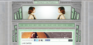
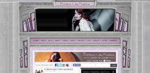
Florence + the Machine has a very aesthetically pleasing website. I like the 20’s/art deco style of the web design. It correlates with Florence’s actual fashion style. The website includes very dramatic and quality photographs of her. The colors of the windows and the photos at the header change while you are viewing the page. It is very clear and easy to navigate. I believe that many artists and bands have really nice and quality websites and Florence + the Machine is no exception. http://www.florenceandthemachine.net/index


It’s a little busy but I like it. It has really elegant theme to it I like how there’s a kind of clash between the color in the headings and what I think are windows against the more chiseled marble looking background.The thing that caught my eye the most is how there’s a picture separating the banner from the menu and another picture separating the menu from the content. It’s really different from most designs that I’ve seen. It breaks up the text which is nice, but the picture keeps my eye on the page for a few seconds longer.
i love the colors on it. i dont think ive seen a color scheme like this in any other website ive ever visited. i like how it looks rather elegant.