It is interesting that although we love Apple’s website very much, “it was commented as being “too marketing focused” and does bad in the areas of media relations, general contact information, and investor relations according to our PR textbook. I think it kind of makes sense because Apple puts the “Apple info”, “Media info”, and “Contact us” at the lower right corner of the website where people can hardly notice.
I believe Apple is not alone in being “too marketed focused.” Other sites such as microsoft.com and adobe.com both have their products as the main focus with their “about,” “info,” and “contact us” at the bottom of the page.
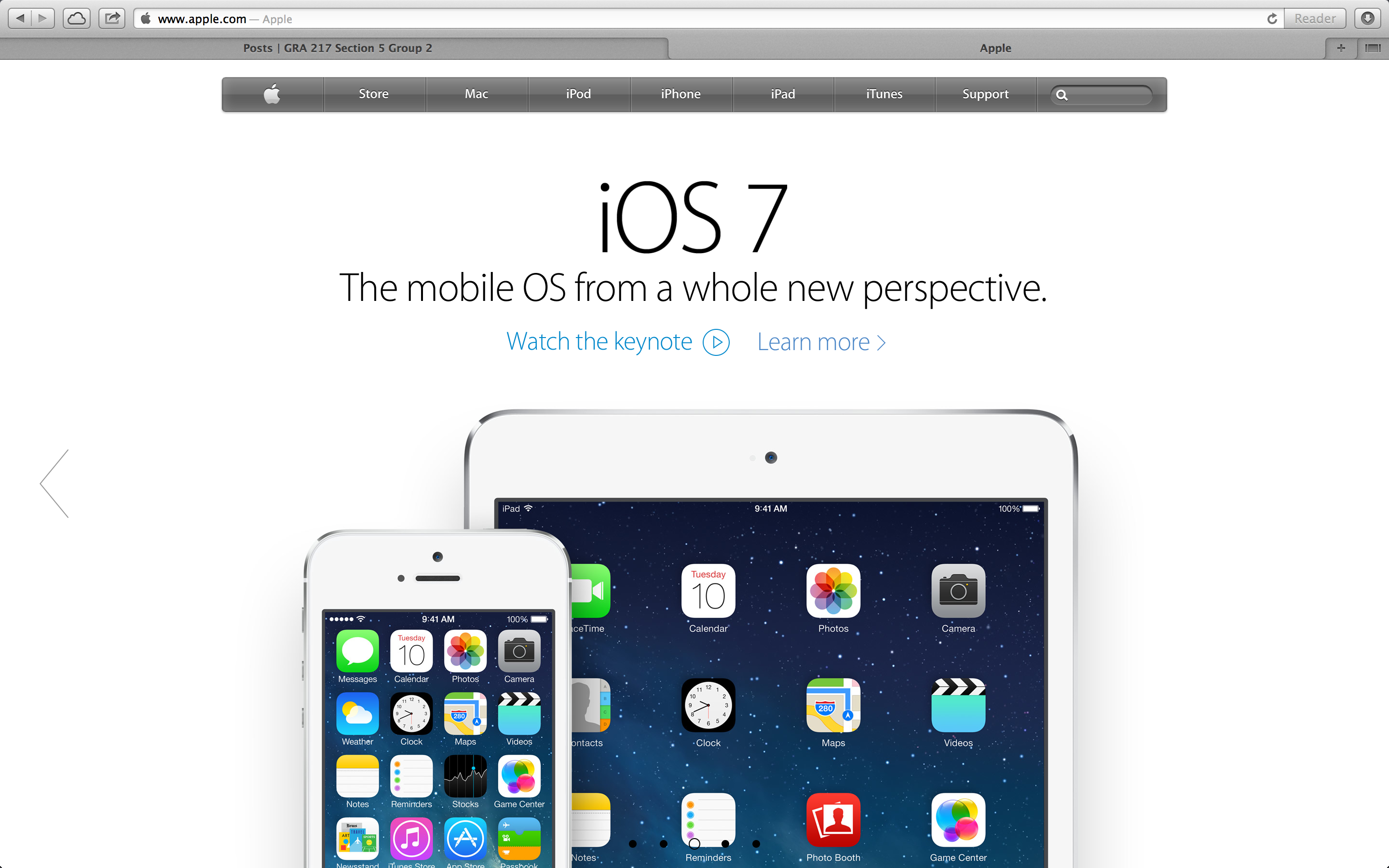
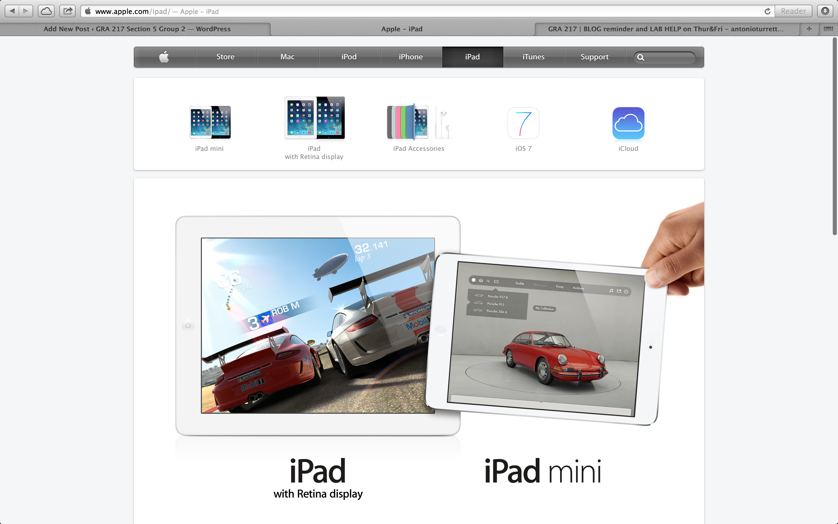
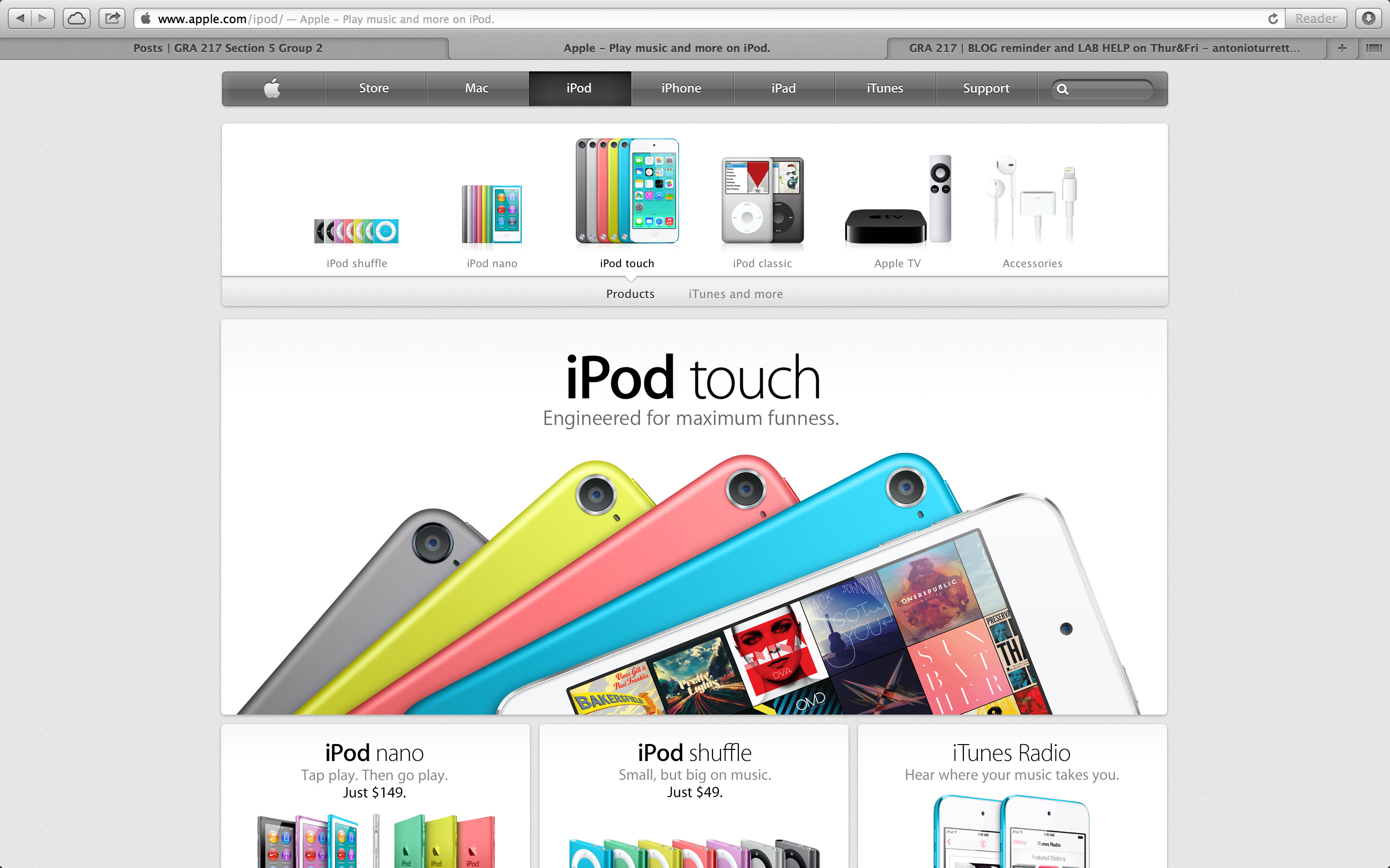
Apple’s site is seductive. It really plays on the iPhone and its other products visual aesthetic appeal.

It is interesting that although we love Apple’s website very much, “it was commented as being “too marketing focused” and does bad in the areas of media relations, general contact information, and investor relations according to our PR textbook. I think it kind of makes sense because Apple puts the “Apple info”, “Media info”, and “Contact us” at the lower right corner of the website where people can hardly notice.
I believe Apple is not alone in being “too marketed focused.” Other sites such as microsoft.com and adobe.com both have their products as the main focus with their “about,” “info,” and “contact us” at the bottom of the page.
Apple’s site is seductive. It really plays on the iPhone and its other products visual aesthetic appeal.