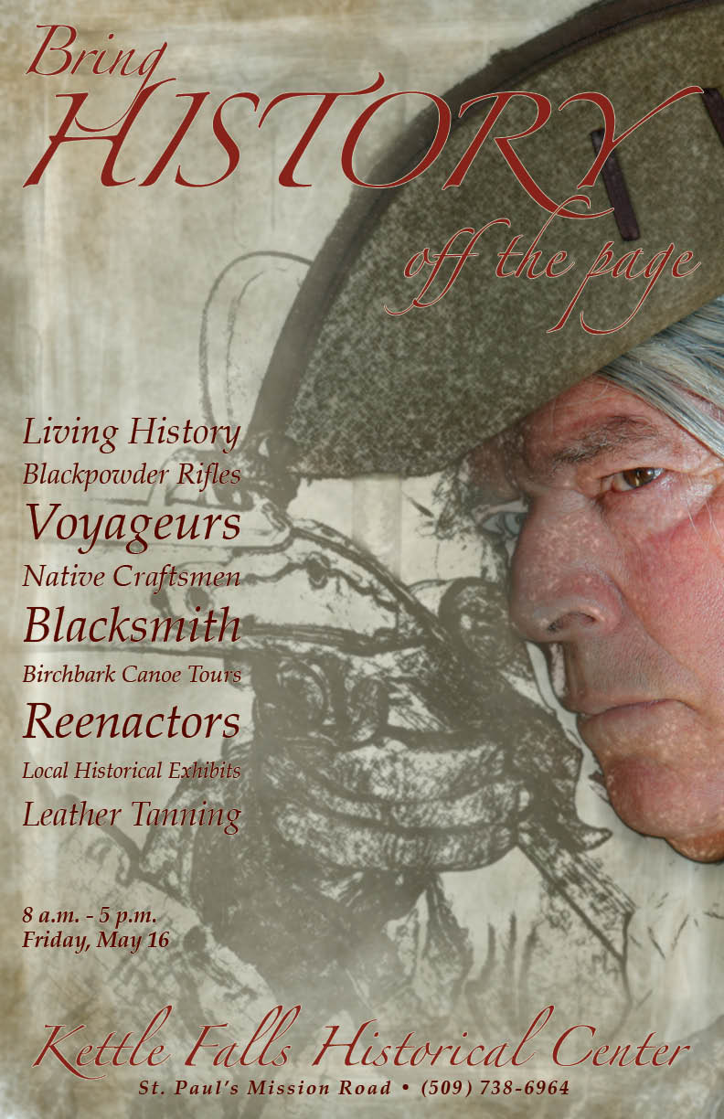
I really like all of the elements used in the poster design. Your conceptual headline works well with your key image, and the text is spot on. All of your elements create a really effective poster.
I really like the visual, whose eyes are very powerful. I think that the “bring” and “off the page” of the headline can be bigger, so that the headline can be more readable and outstanding.