Davroc Interiors

Davroc

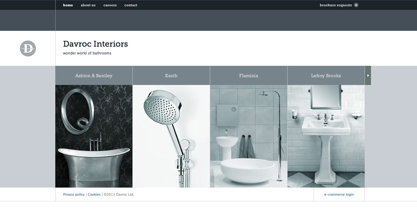
The Davroc Interiors website  uses sever gestalt principles including a very narrow color palette of various shades of bluish gray to simplify the design and ensure that the photos all compliment each other. The site also uses generous whitespace throughout and a minimum of text in simple fonts to reiterate the minimalist design. Everything also uses a very clear alignment to keep order to the flow of the site.

Brewery Ommegang – Simple – Beautiful

Brewery Omegang

The website for Brewery Ommegang is simple and clean, using the same plaid motif they decorate bottles with, but in two shades of gray to allow other content to stand out in the bold yellow they chose for text and icons. When the mouse is rolled over any of the icons, the diamond containing that icon switches to a colored graphic with more information. Icons are silhouettes of designs used on bottles for each variety of beer they make along with complementary icons to represent the brewery, news, events etc.

Typecycle

Bike

I really like this image of a bike built using typography because not only does the name of each part create that part of the picture, but also because of the way certain letters in key positions are styled to better fit the shape of the part it represents.

Tim Burton’s A Nightmare Before Christmas

375629.1020.A
I think the Nightmare Before Christmas poster  is exceptional because it embody the graphic style and essence that come to signify Tim Burton’s work using a simple and contrasting, but complimenting color pallet. Color is used sparingly to bring just enough detail from the black background to create the image. The ornate, whimsical and somewhat ornate typeface also sets an accurate expectation for the feel of the movie — fun but freakish.

Metalica and Dewalt wordmarks

metallica_logo

I selected the Metallica wordmark because I think it does a very good job using the highly stylized M and A to evoke thoughts of edgy, metalic, sharp items like concertina wire, spear, fishhook or even lightning bolts, all of which embodies the style of the band’s electrifying heavy metal music.


dewalt-logo

I chose the Dewalt Tools wordmark for their simple, solid construction using all capital letters. I think the yellow and black that make up the wordmark are well chosen because they mirror the traditional color of larger construction machinery as well as safety and caution warnings typical to construction sites.