
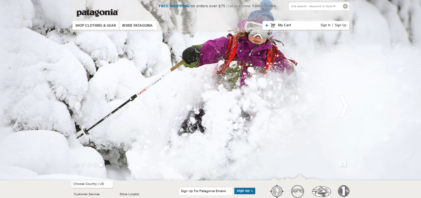
Patagonia is such a great company… and their website reflects it. Their homepage features spectacular photographs that take up the majority of the page. The photograph depicts people wearing their clothing while out exploring. Their clothes are made to be worn outdoors while performing arduous activities. This specific photograph exemplifies that their clothing can stand up to harsh conditions the person puts it through. It also is perfect for this time of the year when people are preparing to buy apparel and gear for winter season sports. It is a beautiful quality photograph… it has a nice white background which allows for the bright pink jacket to stand out… it also uses the rule of thirds… and the ski pole leads our eye to the Patagonia jacket.
This is a good photo. There are actions going on in the picture, reflected by the “flying” snow. The picture is of very good quality — it’s sharp and clear. As Bridget suggests, it also uses rule of thirds to make viewers’ eyes centered to the product, which is the red outfit. White is a bright color, but fortunately, it doesn’t make the red less prominent. On the contrary, it makes the red pop out and catch eyes. The photos well serves the company’s intention of introducing and selling their product.