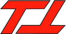
I used the symmetrical and closure gestalt principles to put this logo together. The two capital T’s are the same with one flipped upside down so the logo looks the same ride-side-up and up-side-down. The two letter are slanted to create an effect of an unfinished/open-ended equilateral.


I think you design is very smart. I see a open-ended equilateral, but also very easily recognize the two “T”.
I like the two T’s. i like how it also matches your resume design colors. cool idea flipping the second.