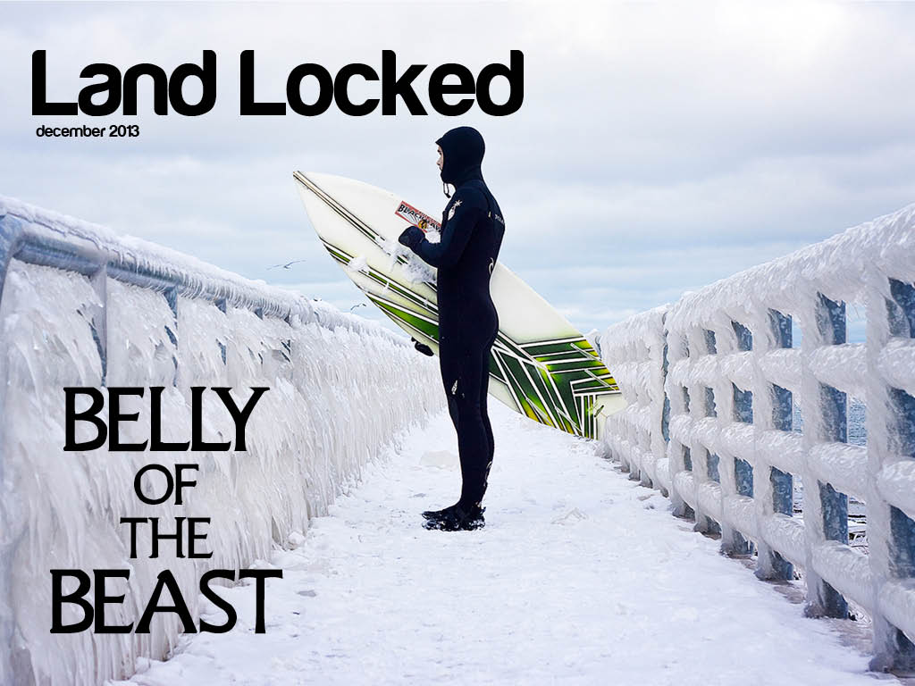
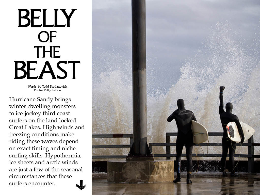
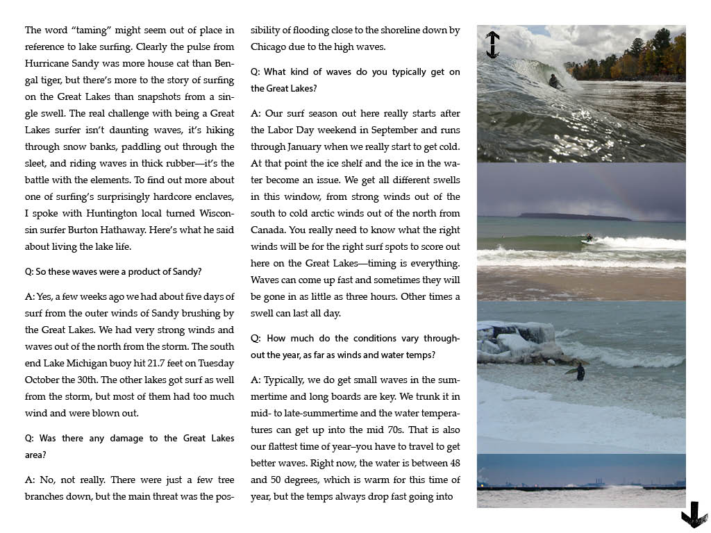
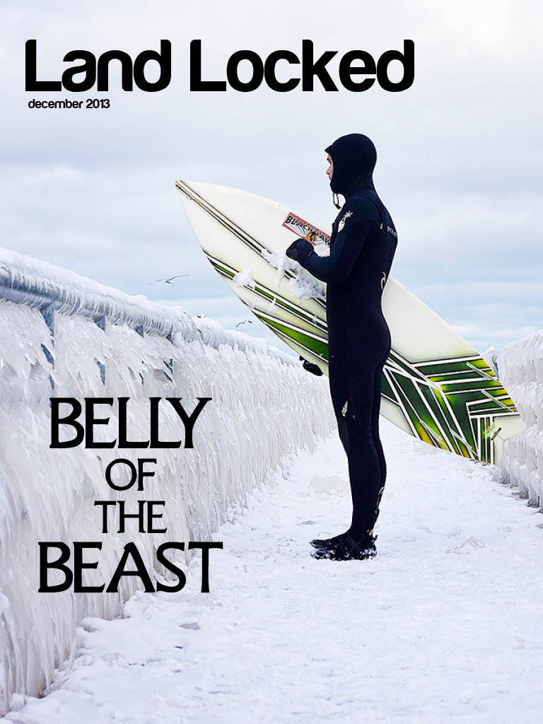
I had a very good time getting to know the formal principles of design and especially the typeface families. I never knew so much went into all the little details. I learned to appreciate the print content that is out there. After taking this course I understand better the value of design in communicating messages. One thing I notice in my everyday life is that magazines seem worth the money to buy now that I know how much goes into making the product. I’ll miss a lot of the faces from this class. Good luck, God speed, cheers. Merry Christmas.
Author Archives: Antonio Turretto Ramos
iPad project
Navy Team Scavenger Hunt
Jon Rasmussen
Antonio Turretto Ramos
Torrey Lee
Dominique Pineiro
#1 Old Style Serif
 #2 Modern Serif

5 Pictographic logo
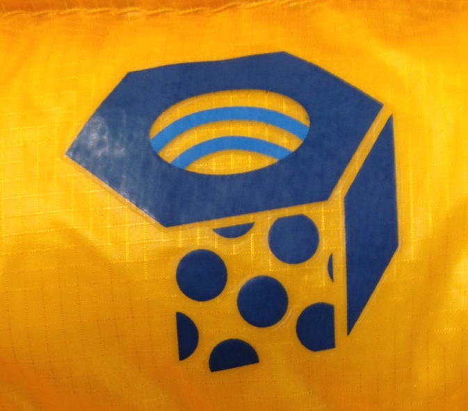 6 Effective logo
 7 Silhouette logo
 8 Analagous color
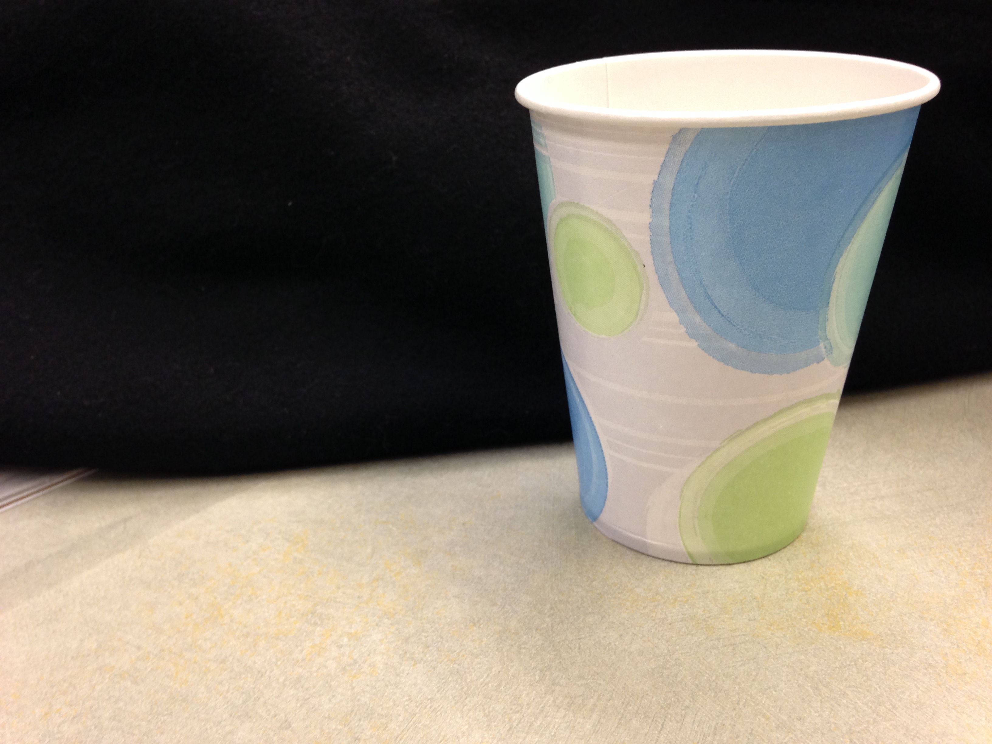 9 Complementary color
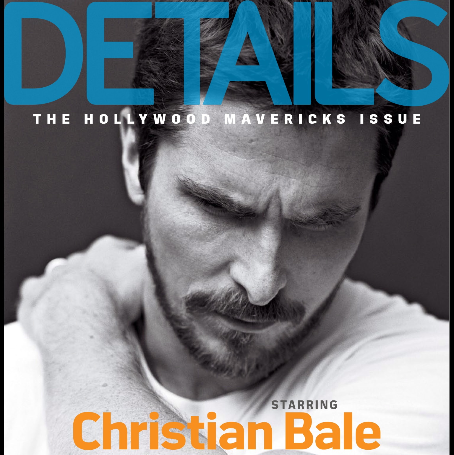
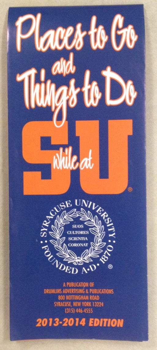 10 Color Repetition from photo to type
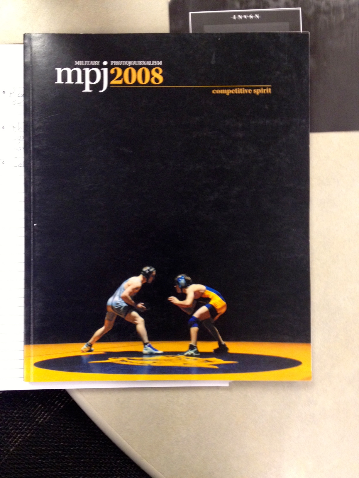 11 Isomorphic correspondance
 12 path or continuation
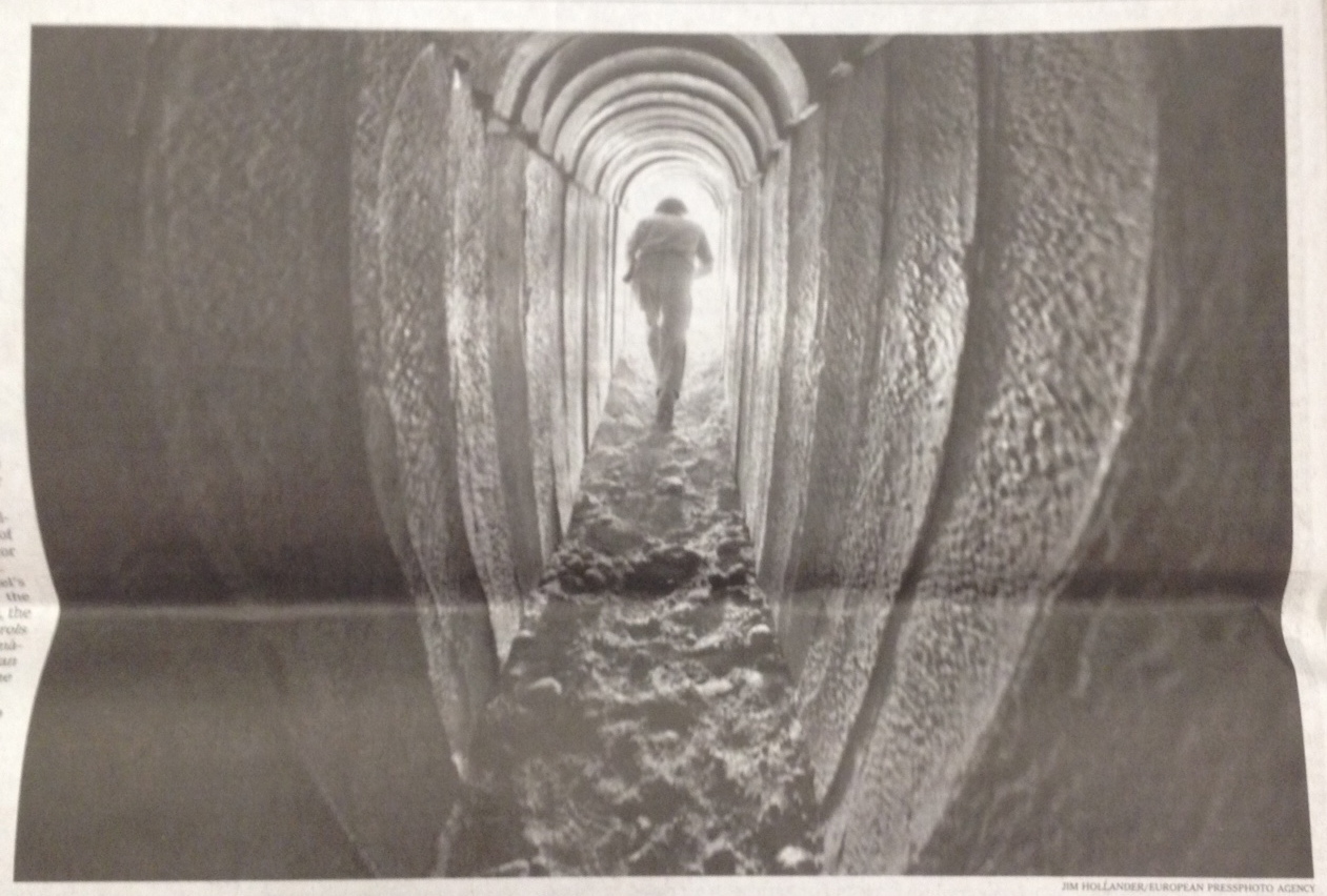 13 Word emphasized in type size
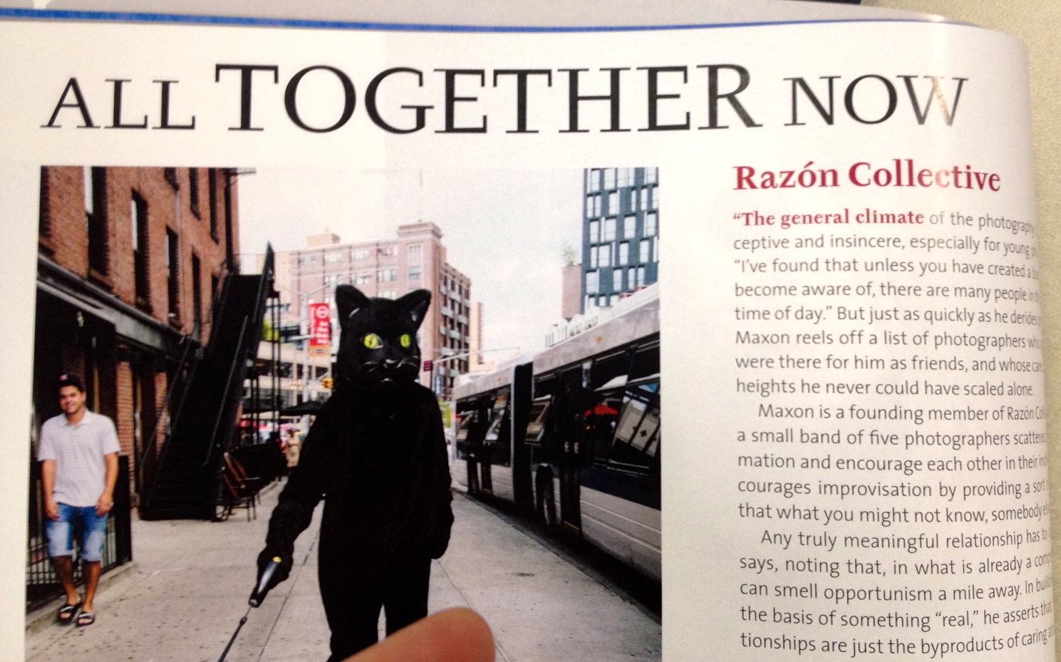 14 word emphasized in color
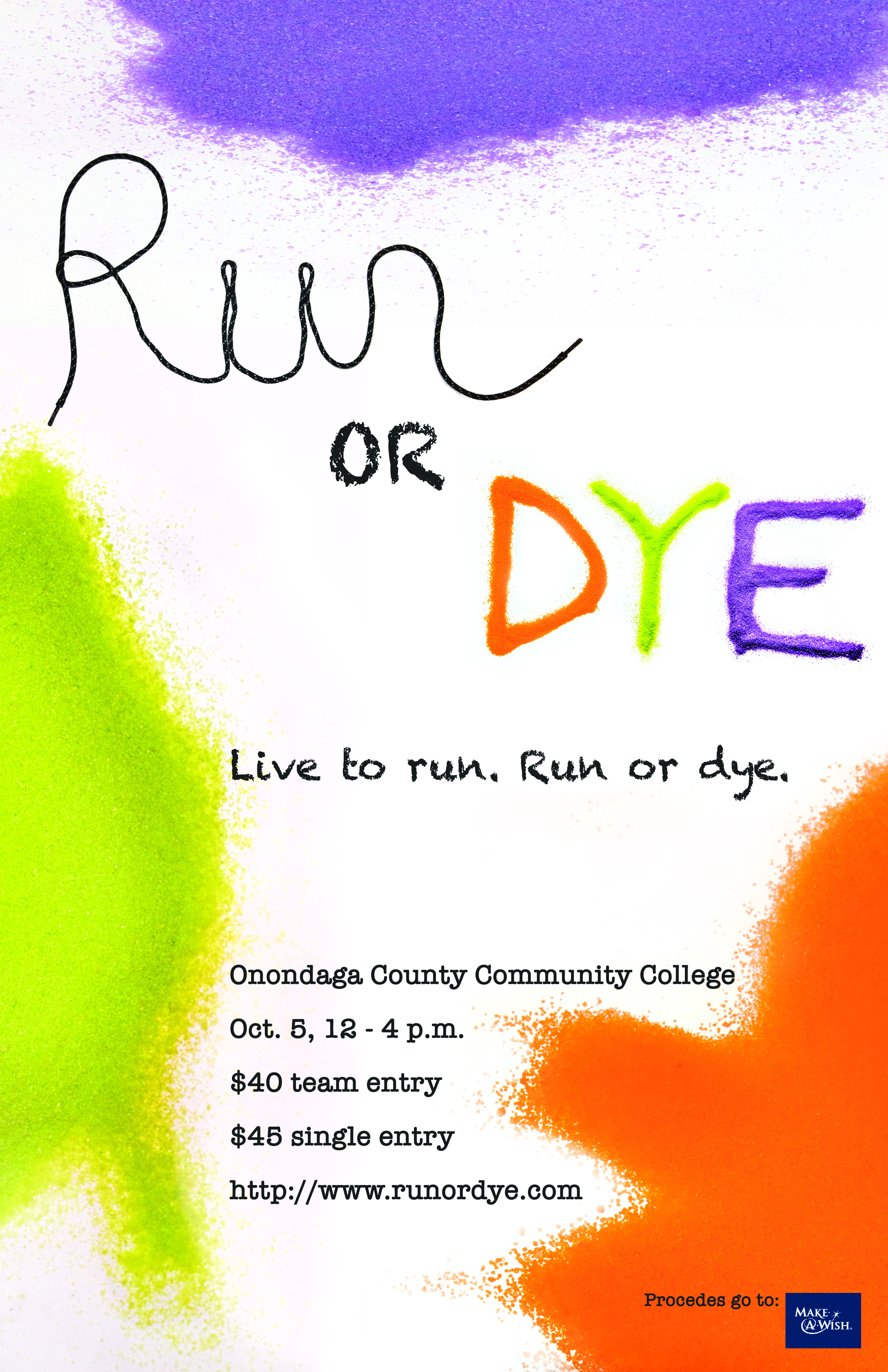
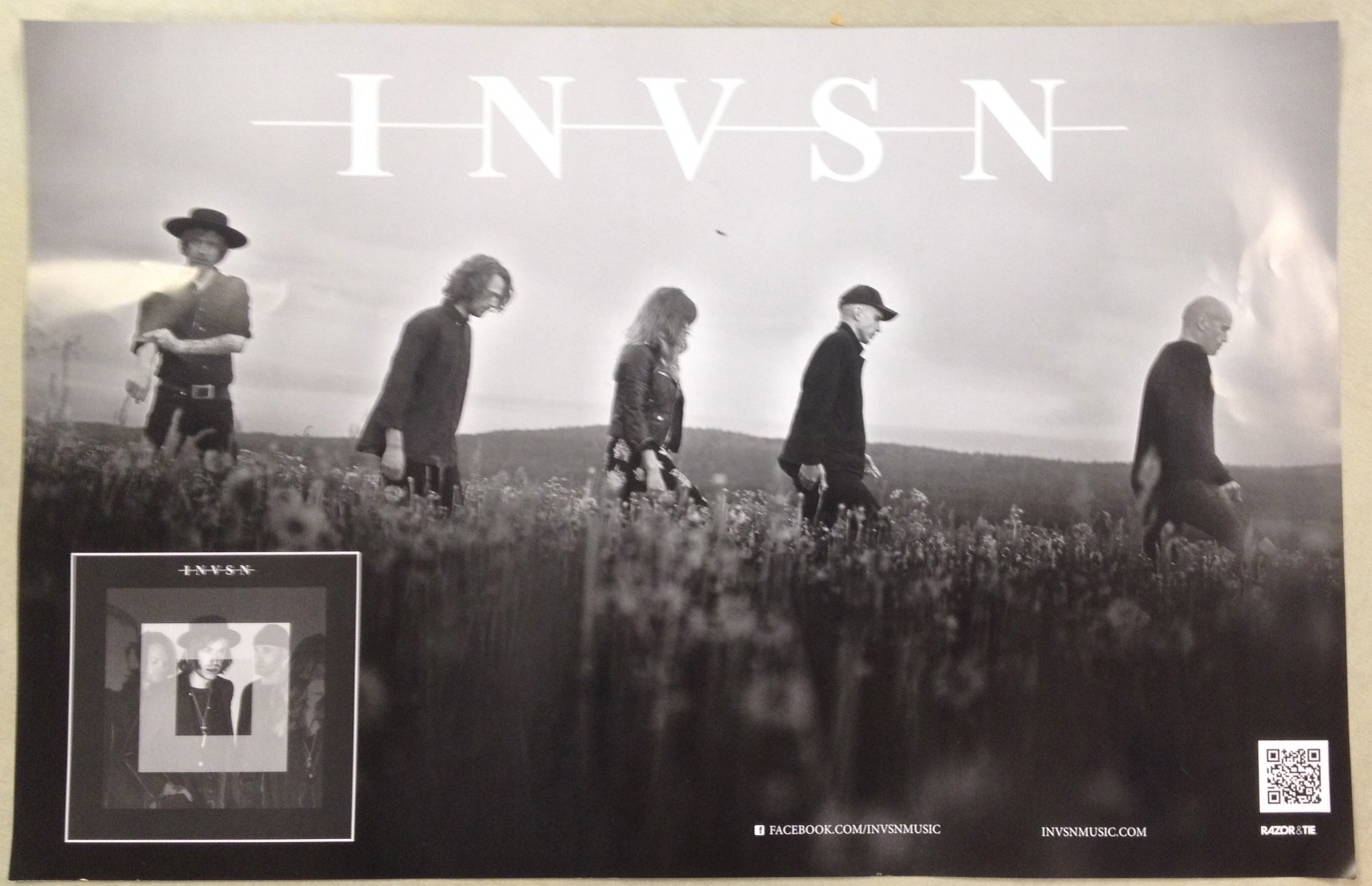
 15 Good poster design
 16 rule of thirds
 17 leading line
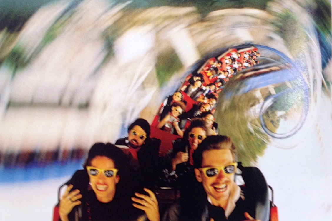 18 picture using stopped action
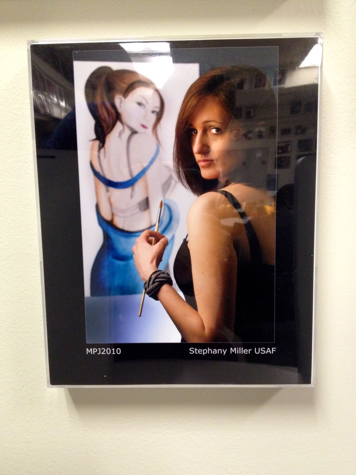
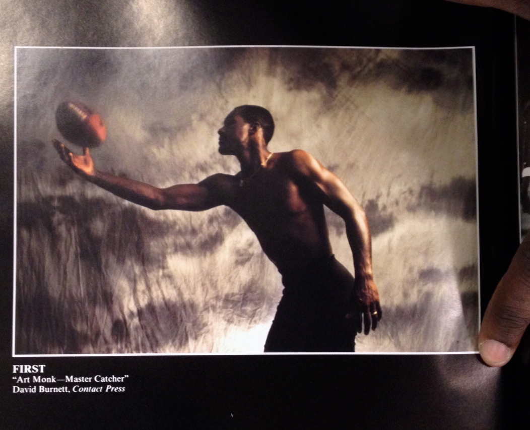 19 Environmental portrait
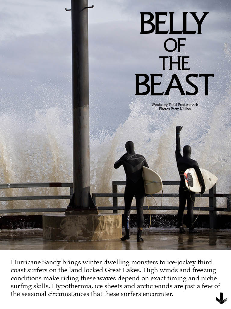
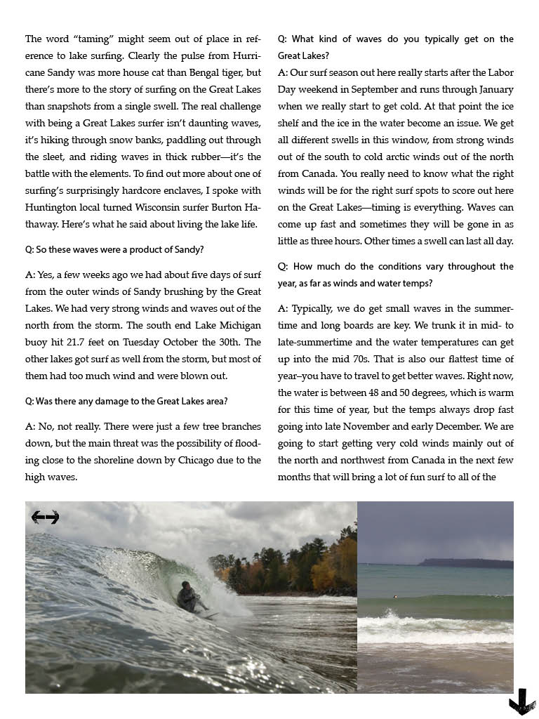
Feature Article in Surfer Magazine
The Alchemy of Gambia
by Will Bendix
Chasing Elusive Perfection on West Africa’s Coast
The sound of metal on metal scraped through the air with a crack, sending the pack of naked boys that waited nervously on the shore scattering into the shallows. Behind them stood a tall, orange creature with fibrous cords covering its entire body like the straw stalks of a scarecrow, with each hand clutching a long, sharp blade. The air was tinged with smoke and steady beat swelled from a nearby drum circle as the creature again smashed the blades together and wailed to the ocean. It was time to lop off some foreskins.
Magazine post
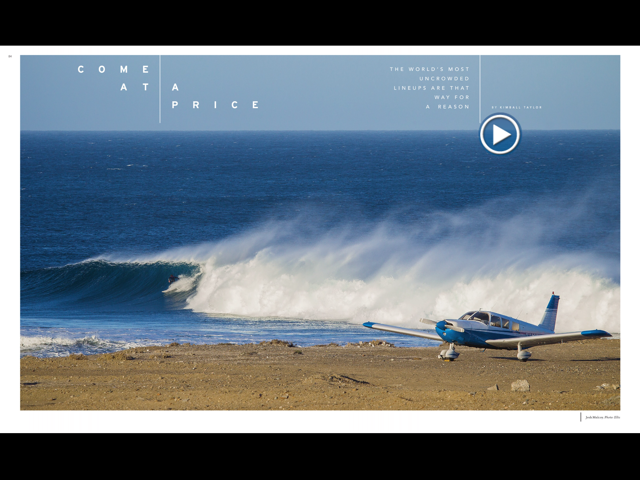
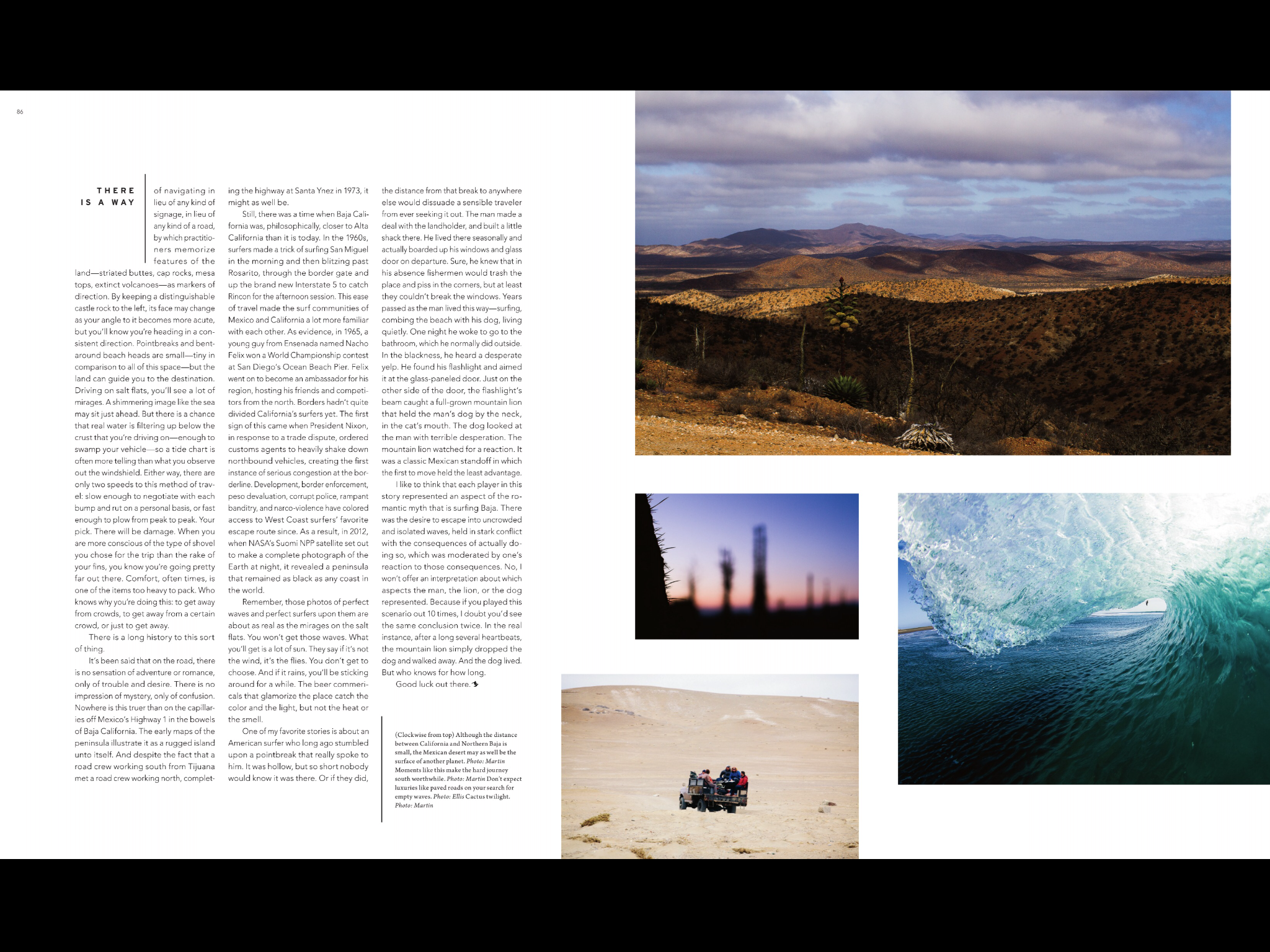
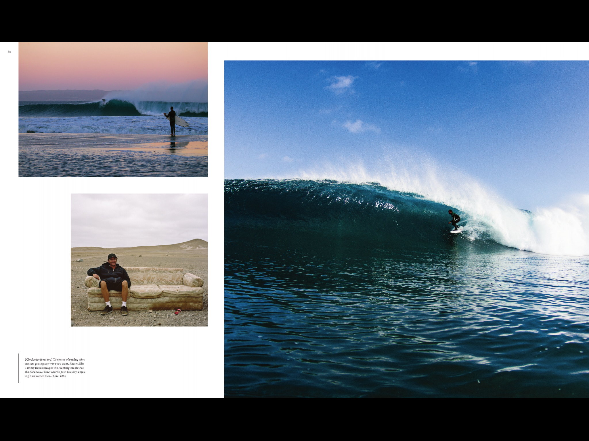
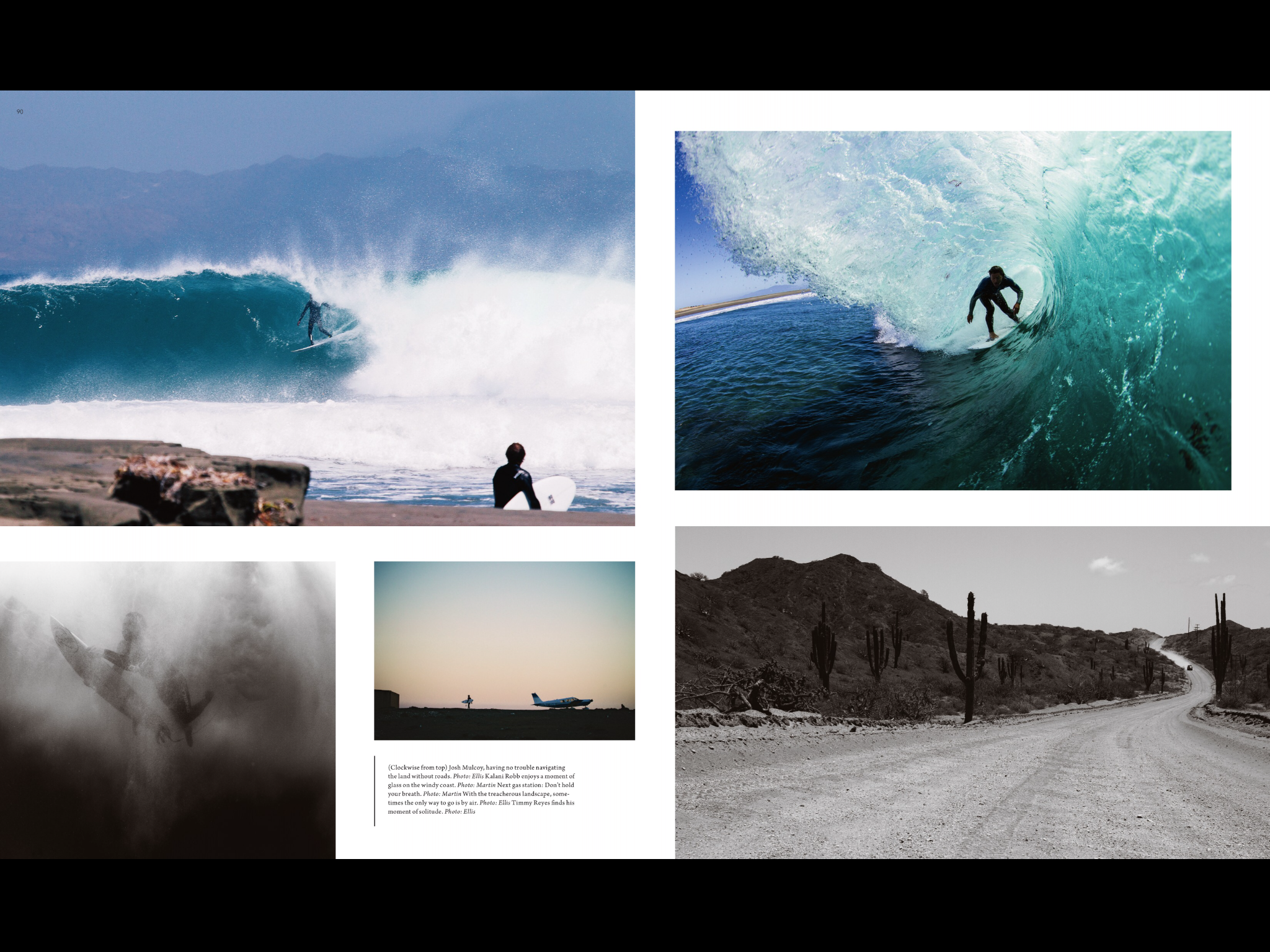
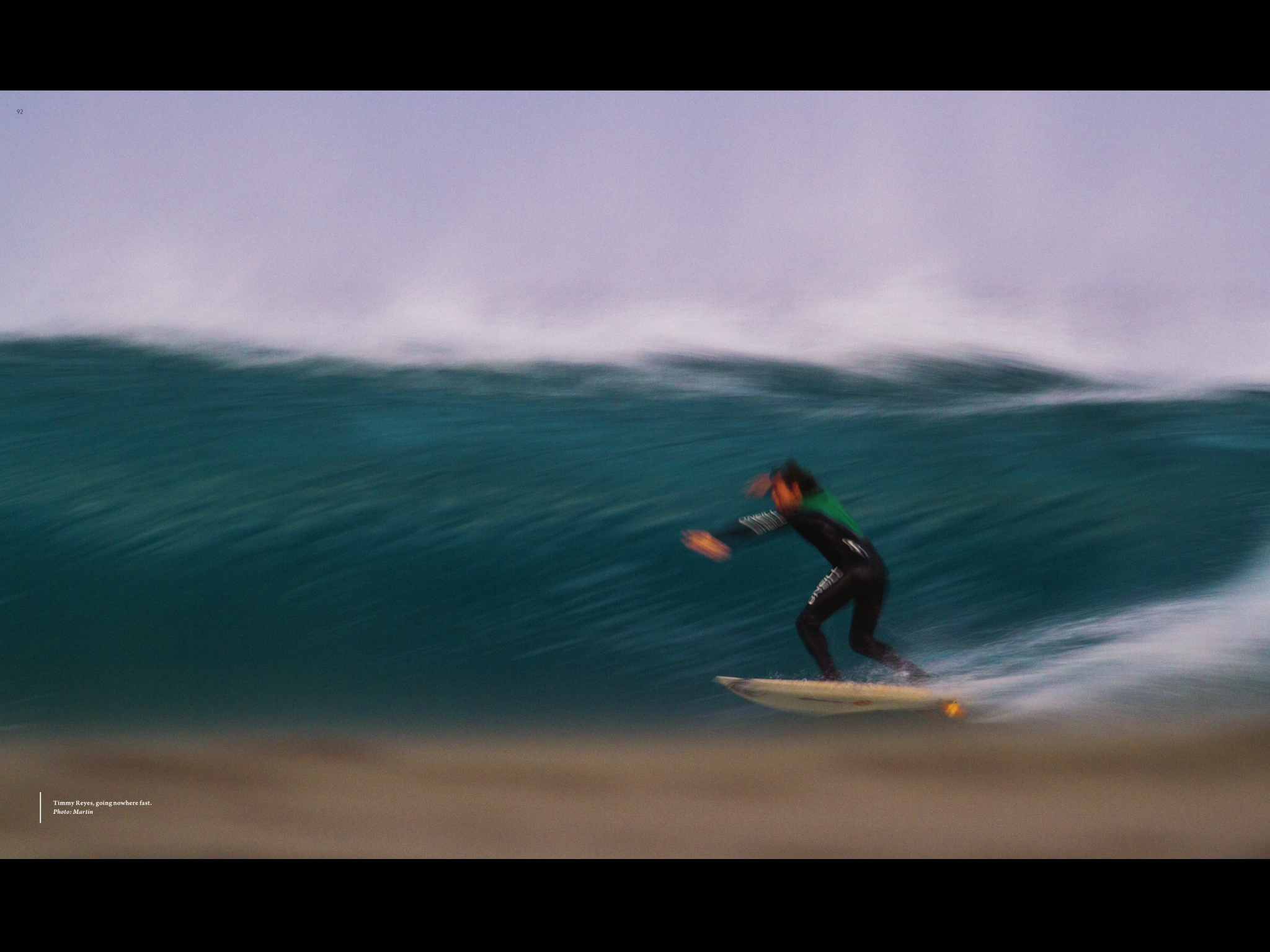 This is an article from Surfer Magazine. I really like this magazines layout because it uses so many pictures to tell the story and it breaks all kinds of rules for magazine layout. Like the center fold is not consistent and so pulls your eye from one page to the next. I also like that they normally put a sweet double truck photo in most of there articles. I also really like the use of color, there’s always a consistent with creating a theme and a feel to each article.
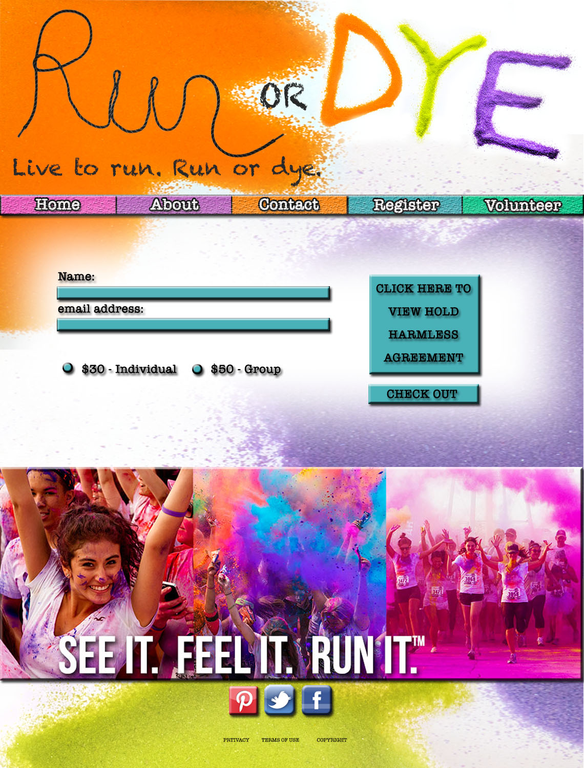
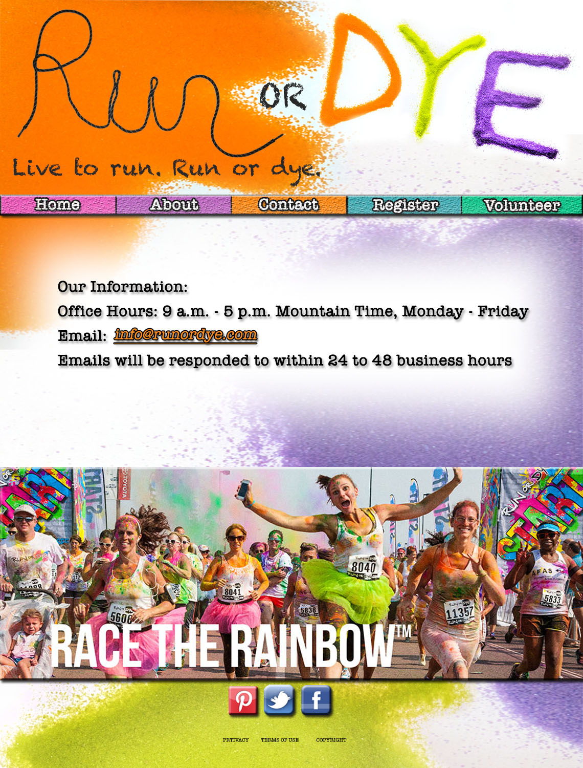
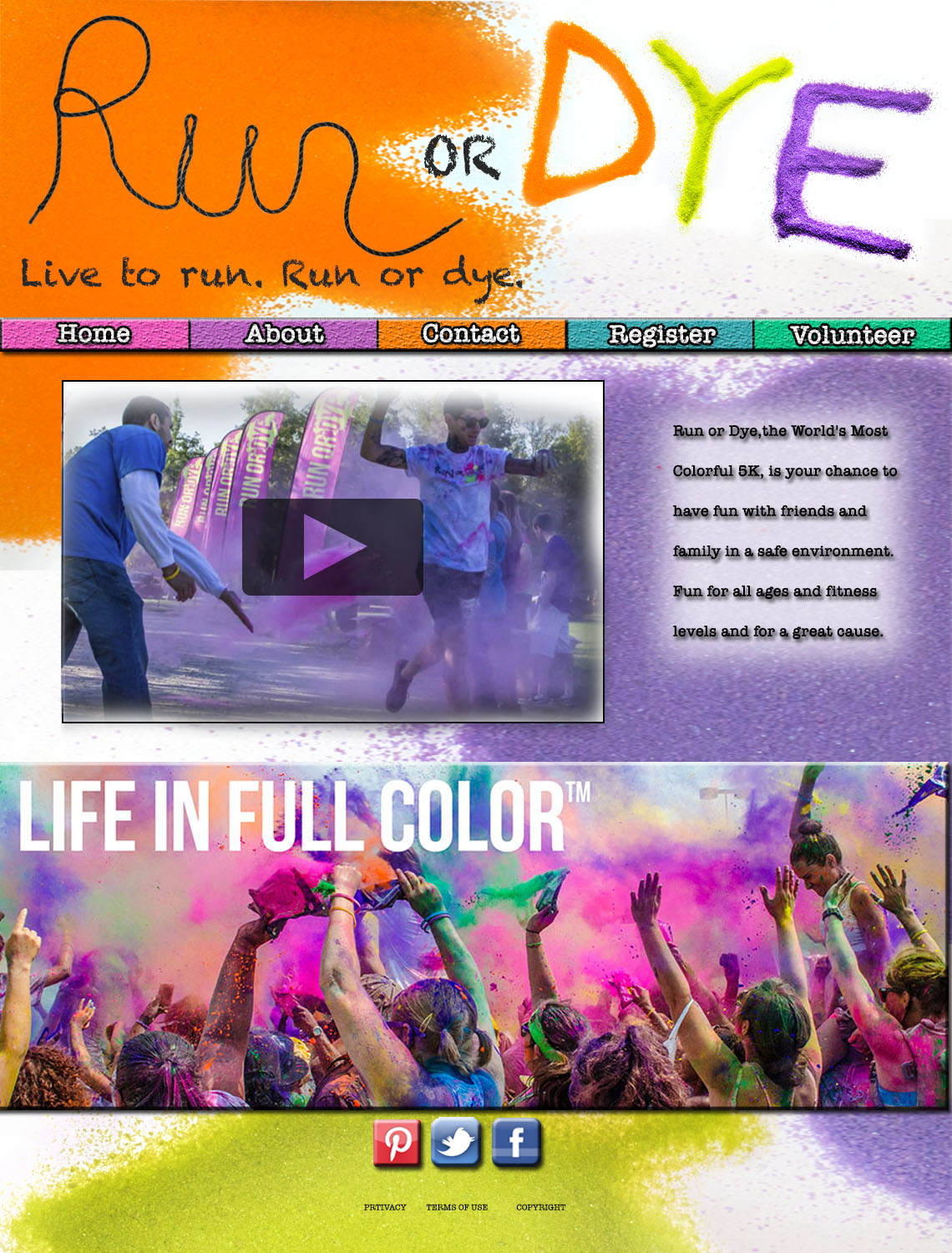
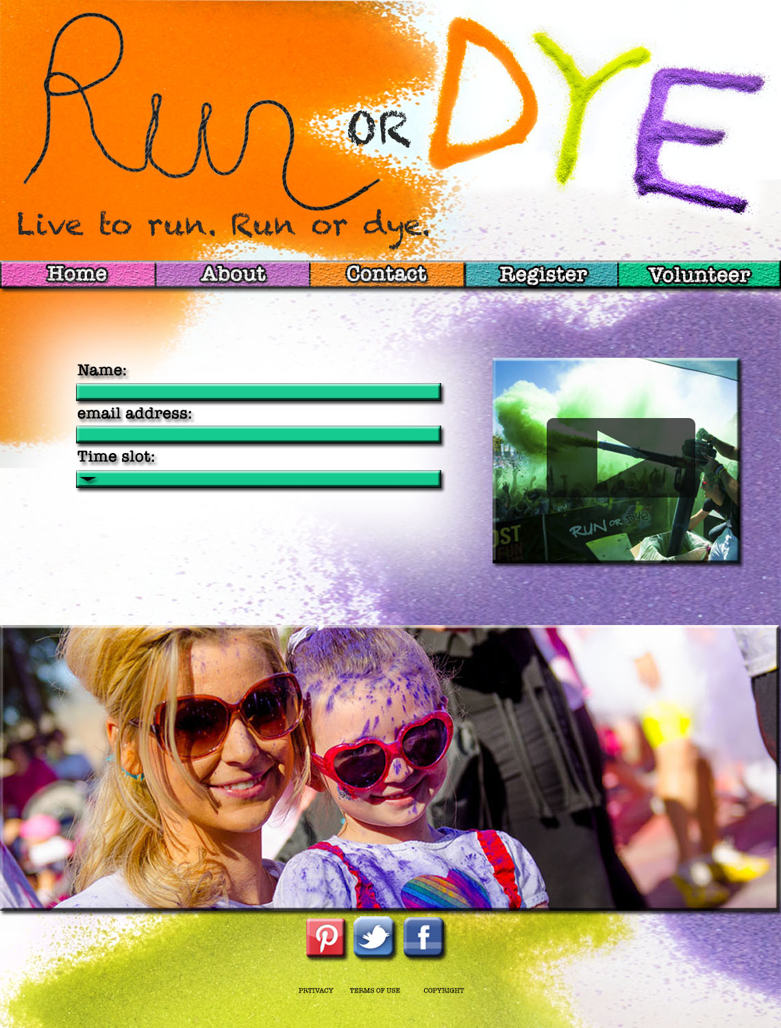
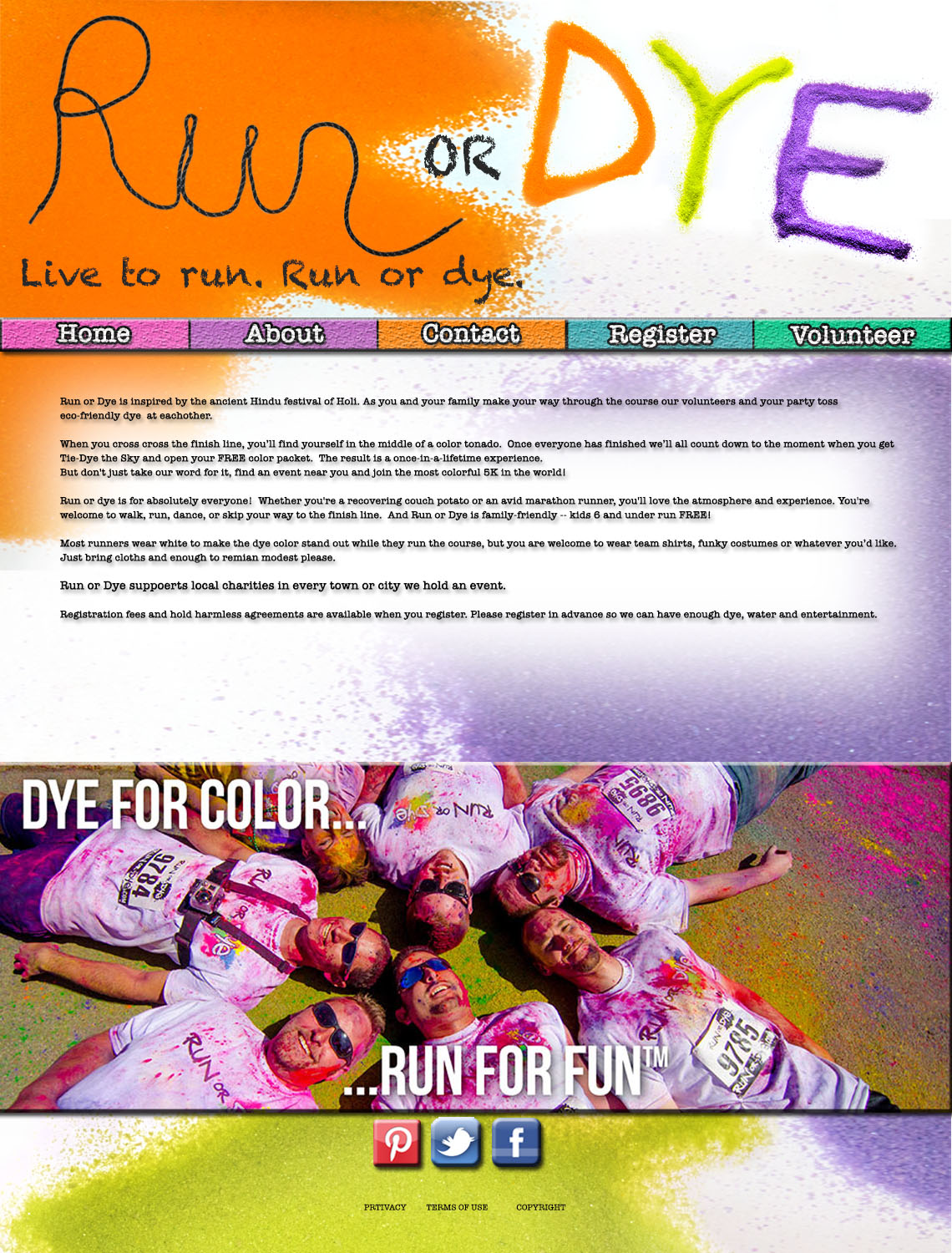
Web design project
Turretto logo
resume redo
Photography in Webdesign
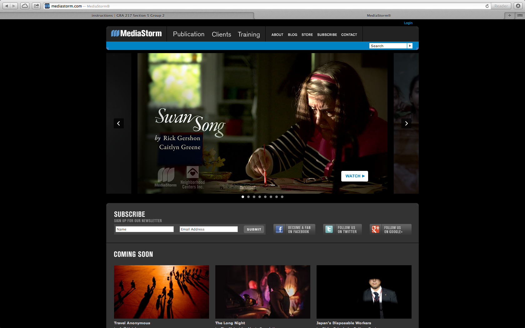
I chose Media Storm as a ideal site that uses photography to draw in an audience. The website is a place to display media and showcase photography. Here they use a key frame to draw the audience into the site and click on the video to see the story. The audience is for everyone, but probably mostly for other content creators to see what others are doing in the field. In this case the key frames in the videos are actually the bulk of the content making it user friendly and easy to navigate.

