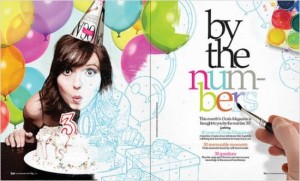
I love this feature spread about being 30. I think the way that the picture starts out in color but gradually turns into a sketch is very fun. I also like the way the hand is then painting in the colors on the headline. My eye is automatically drawn to the headline because the hand is pointing right to it. I also love how the picture overlaps from the left page to the right. It keeps my eyes interested and leads them straight to the text. Overall, this is a very fun magazine feature spread layout.
GRA 217 Section 5 Group 2
The official blog for GRA 217 with Sherri Taylor

