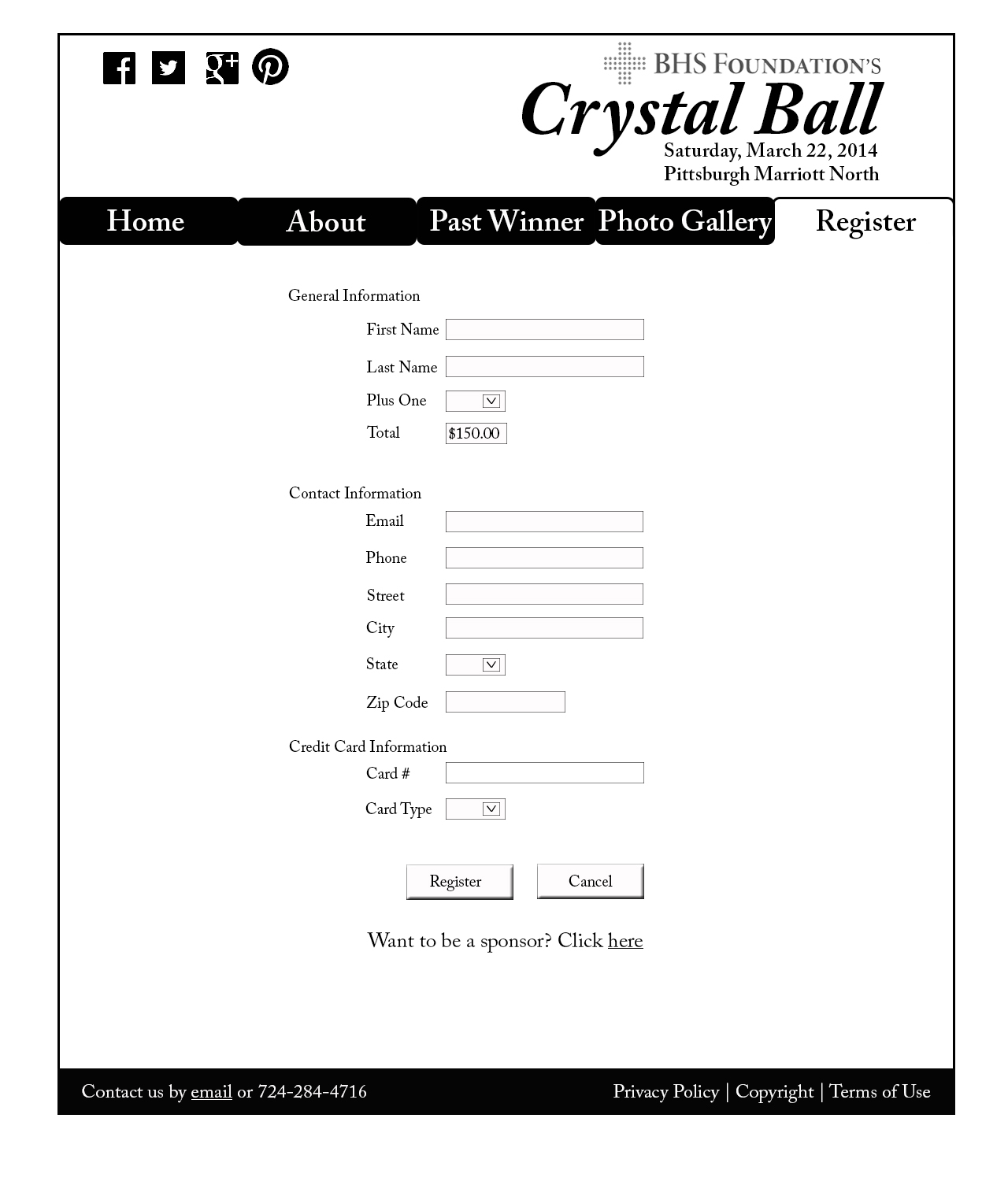
Brilliant design! The site looks very clean and neat. Black navigation bar works perfectly with the black footer, which creates color similarity. Texts are in appropriate sizes and pictures chosen speak very well to the event. I personally like the visuals on the first page very much. It’s eye catching and makes me wanna read through the rest site.
I like the color scheme–black and white, which is very distinctive and stylish. I agree with Xu, the black navigation bar is creatively. Your choices of typeface works well too. Great job!
I like your website because it is very straightforward, clean, and organized. I especially like how you indicated each page by highlighting the tab, and I also like your use of sophisticated typeface. It really matches well with the event!