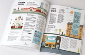
This magazine spread looks fantastic. It looks fun, casual yet very organized. Visuals definitely stand out and catch eyes. I like how the designer positions the visuals, which is really very well balanced. Also, colors in the visual work effectively as well. Red and green dominate the left side page while yellow and blue dominating the right half. Such color combination is smart — it sets the two pages apart automatically, which corresponds to the texts. The red dots throughout the page looks fun as well and introduces “similarity” that appeals to eyes.

