I really like your design. The color scheme is perfect, warm and distinctive. The drop-down menus are also great. I like the history page the most because it is clean and clear. Good job!
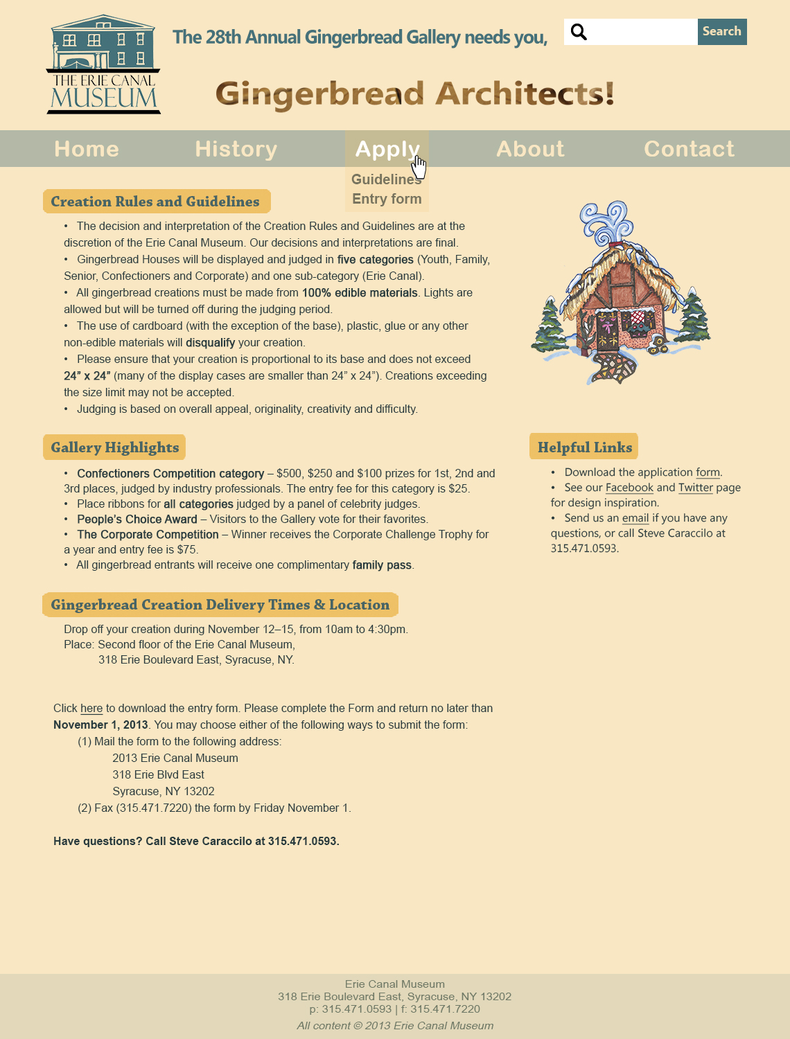
I like how you used the half of gingerbread man in the top right page on the sides. It definitely frames the web very well and just gives a nice vibe. I also like your use of the color scheme (the faint orange and turquois? color) because it works as complementary colors and that attracts the audience.
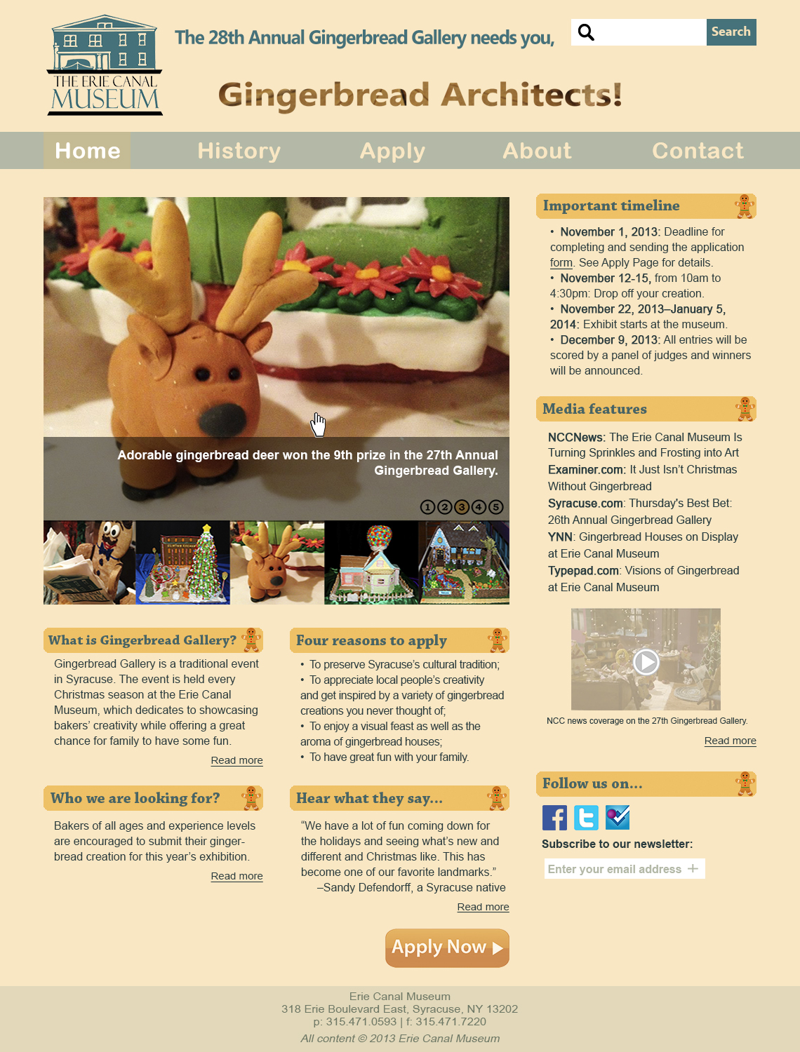
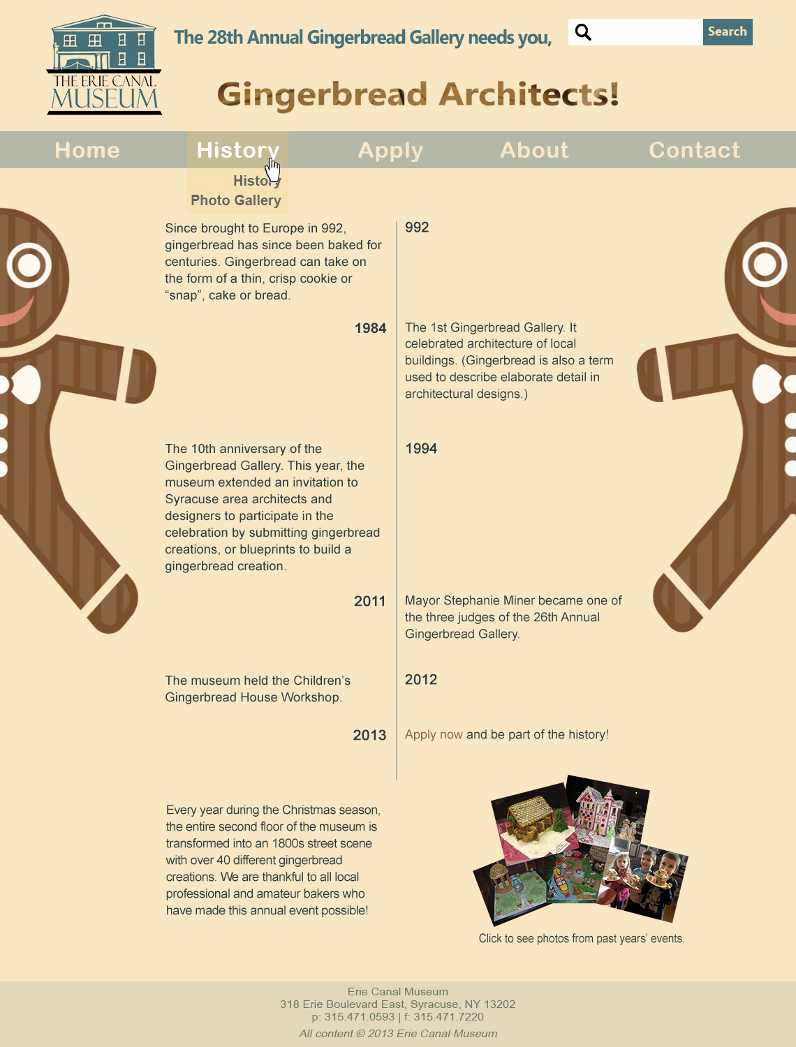

I really like your design. The color scheme is perfect, warm and distinctive. The drop-down menus are also great. I like the history page the most because it is clean and clear. Good job!
I like how you used the half of gingerbread man in the top right page on the sides. It definitely frames the web very well and just gives a nice vibe. I also like your use of the color scheme (the faint orange and turquois? color) because it works as complementary colors and that attracts the audience.