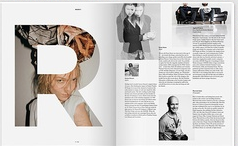
This magazine spread struck me because the “R” is so cool where the picture is coming through the letter. It makes the spread eye-catching. Also the black and white images on the right page organize the information and make it very readable, balancing the left image, in color behind the “R”. The top left image looks like it’s in motion and is also appealing. I just like the overall simplicity of this spread.

