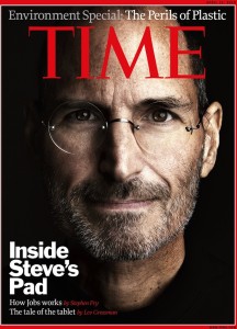
On the left side, it is an iPad cover of Time magazine with Steve Jobs. Steve Jobs’s eyes are look at us, strongly dragging our attentions. “Time” is on the top, covering half of Jobs’s forehead. The visual–his bright face works well with the black background.The feature story’s cover line is at the left bottom, white and bold. Two lines of deck are lower with smaller fonts. This design works well because of strong visual hierarchy.
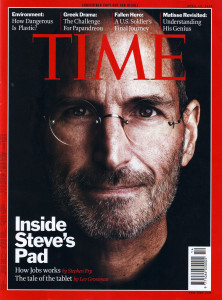
Compared to the iPad cover, the print cover is a little bit different. It includes four other cover lines on the top, and a barcode. I like the iPad cover more because it looks more succinct


The cover photo is an attention getter. The simplicity of the cover design is very effective. I prefer the iPad cover.
With the iPad version, there is a lot more room to focus on the picture, and the extra headlines are no longer needed, keeping the cover clean and straightforward with the main story. The iPad gives more attention to detailing the story, not all the extras.