
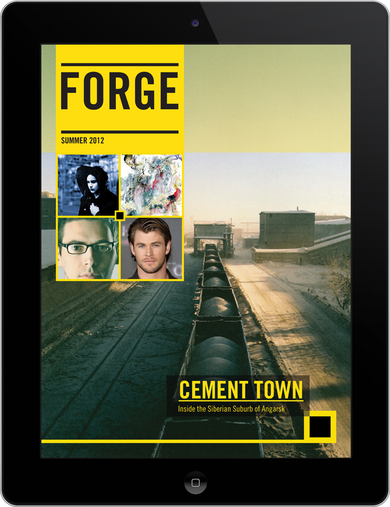
 This cover differentiates itself from other Ipad covers by minimalizing text. Instead of having cover lines, there are photos that I presume can be tapped on to reach the story. Also, the cover makes use of only two primary colors. The combination of black and yellow allows for a sense of illumination, especially when used in text. The photo on the cover has a good amount of perspective, driven by the train cars that get smaller as one looks further back. Often times covers forget that having only a little bit of content on the cover can be good. Covers are often crowded and lack a sense of visual hierarchy.
I agree with you that the color combination of yellow and black is very illuminating. I like how the main visual is leading viewers’ eyes further to the end of the cement truck. Personally I’m a minimalist, so the design of the page appears attractive to me. However, such simple design also makes it harder for new readers to know what this magazine is about — visuals are abstract and don’t give much info as texts/cover lines can do. That’s the only concern I have with this design. But assuming people who download/subscribe to this magazine know what it is about, this shouldnt be a big problem.
I really like the visual leading audiences’ eyes to further and to the “image cover lines.” However, I agree with Jingai that although the cover is succint, too less information may confuse audiences what the theme of this magazine is.