This feature story uses the phrase “on top of the world” as a metaphor for Sandra Bullocks latest notable accomplishment. This use of clever wording in the headline allows the reader to understand what the story is going to be about and lures them with the knowledge that Bullocks new movie “Gravity” is a huge hit.
In the case that a reader perusing through the pages of Vogue is not aware of Bullocks latest theatrical film, the deck goes on to explain what the story is specifically, filling in the gaps of an unanswered questions.
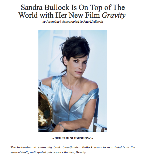
Both the headline and the deck do a really great job of tying Bullocks feature film “gravity” with the story with clever wording including “on top of the world”, “new heights” and “outer-space thriller”. The combination of this language with the picture below work to create a very enticing and effective headline. This is furthermore reinforced with the fact that Bullock is wearing what appears to be some sort of high fashion space suite with her arm resting on a gold space helmet. The sum of the individual parts of this feature story are hugely impacting and work to draw the reader in for more.


I agree that the deck is well written and does an excellent job luring the reader into the story. However, the type and design are underwhelming. It is simple but too simple.
I agree with bridget, and i wish the colors weren’t so light. the image is nice but i feel like they are missing something.